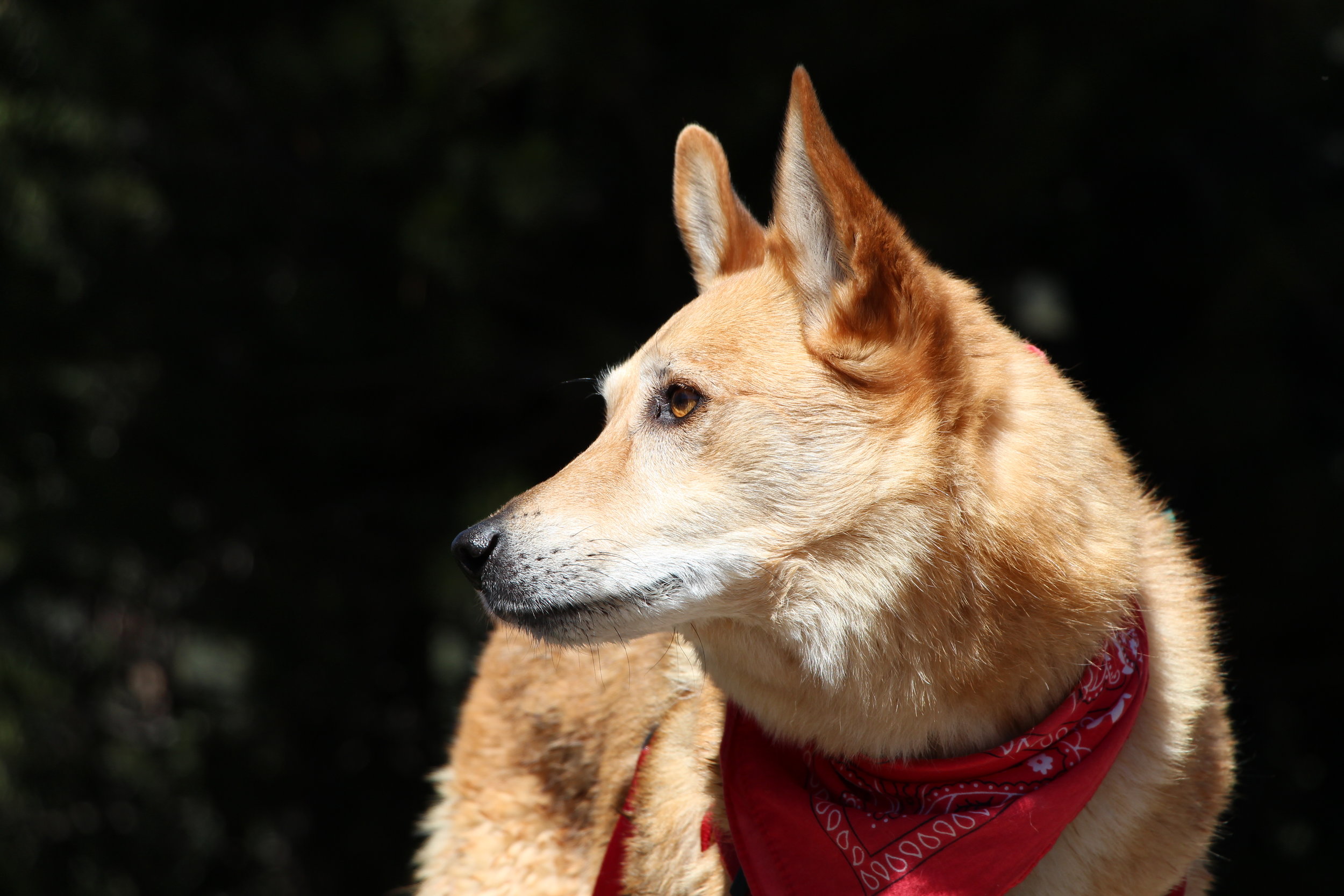
My dad died on Saturday, February 20. He battled esophageal cancer for three years. The past few days, weeks, months and years have been... how do I even say it? Challenging, painful, loving, terrifying, and profound. Time has not felt like the time I used to know. And I am no longer the person I used to know. Cancer changes you. Death changes you.
I've been thinking a lot about how I want to honor my dad. My brain, body and heart have been trying to make sense of everything and my thoughts are like a thousand little tornadoes. I knew I wanted to write something, but I wasn't quite sure how to coherently organize everything I've been thinking and feeling. A few days ago it became clear that I needed to write what I've learned from all of this. So, Dad, this is in honor of you. And in honor of everyone else who has a head full of tornadoes. Why a list of 75? My dad's 75th birthday was on Valentine's Day, just a week before he died. If he could make it to 75, so can I.
1) Talk about cancer.
It's not easy. But it's what's happening. You can't pretend it doesn't exist. It does. Talking about it is healthy.
2) Talk about death and dying.
This is definitely not easy. But, again, it's what's happening. It's very real and it's much more frightening if you don't have a conversation about it. Drag it out from the shadows and talk about it.
3) Everything will be ok in the end. If it's not ok, it's not the end.
I read this quote a couple of months ago. It's commonly attributed to John Lennon, but is actually from Paulo Coehlo. It's a little morbid, but there's such truth to it. A few days before my dad died he told my mom that everything was working out perfectly. He had shared his wants and needs with his loved ones, including very clear instructions on how to pick up where he left off with his woodworking projects - most specifically, the cabinets he was in the process of building for my kitchen. He found a place of peace in his final days. It was ok because it was the end. The end of a long, long fight against cancer.
4) People will surprise you.
There will be loving hugs from those you barely know and silence from those you've known your entire life. There will be those who step up in ways you didn't see coming, and there will be those who slink away in the face of illness. Be ready to be surprised by it all.
5) You will surprise yourself.
You will find yourself doing things you never thought you'd be able to do. My dad needed a lot of help with the smallest things before he died. Things I never thought I could do, I was doing. You'll find something deep inside of you that you never knew existed.
6) Be present.
This. This is so meaningful. Just be there. Be there in mind, body and spirit.
7) Be there for the illness, not just after death.
It's difficult, yes. But showing up only after someone dies is like showing up at the movie theater as the final credits are rolling. You kind of miss the whole point.
8) Replace "What can I do?" with doing.
Asking "what can I do?" comes with good intentions. But this is such a difficult question to answer when you are grieving. When you're grieving you don't even know what you need. So just do. The day after my dad died an old neighbor of my parents dropped off food, flowers and a card at the house. She never asked what she could do, she just did. If you aren't sure what to do, then make a few suggestions such as grocery shopping, filling the gas tank or vacuuming the house. Direct yourself, don't wait for direction.
9) Quiet is ok.
This has been a big one for me. You run out of things to say sitting in a hospital room day in and day out. And you get so tired you just don't want to talk anymore. There's no need to fill the space with sound. Sometimes we need to just be in the quiet.
10) There's nothing to wait for.
Don't wait. For anything. Death is a poignant reminder that we don't have much time.
11) Make friends with grief.
It's not going anywhere anytime soon, so there's no sense in fighting it. You might as well invite it in for a cup of tea.
12) Say what you need to say.
My dad had a lot to say a few days before he died. A lot. He had many beautiful words for us. And lots of instructions, too. I'm so glad he said what he needed to say. And I'm so glad I said what I needed to say. In the end, your words mean so much.
13) Hold their hand.
When you've said what you need to say, just hold their hand. I spent hours holding my dad's hand in the hospital bed, and up until that last day, he held mine, too. We'd never held hands so much in my life. But that was all we needed to say "I love you" and "I am here for you."
14) Send flowers.
Flowers are always welcome. Both during the cancer and after death. I received a beautiful bouquet from a friend of mine this week and it was such a joy to come home to on an otherwise dark day. My dad enjoyed getting flowers, too. When he was home and at the hospital. It brightened his day and it brightened the space. And it made him feel loved.
15) Choose greeting cards wisely.
There are very few cards out there that are appropriate for someone with a terminal illness. It's probably best not to send a card that says "Feel Better Soon" or "Sorry You're Sick". Because they aren't going to feel better soon. And they don't need you to remind them of that. A simple card that says "Thinking of You" speaks volumes.
16) Be mindful of your words.
There is no better time to think before you speak. Your words mean something. Each and every word.
17) Stand in the face of it.
Cancer is scary shit. And so is death. But it does no good to run away from the fear. So set your feet firmly on the ground and stand in the face of it. I promise, you have the courage. Share that courage with your loved ones.
18) Create space.
You have the power to create emotional and spiritual space for yourself and for others. Resist the urge to constrict and shrink that space. Make room for love, and openness and light.
19) Grief can create connection.
Your personal experience with death and cancer is unique. But it is also shared. I have connected more deeply with a few people in my life because of this experience. Know that you are not alone.
20) Take care of yourself.
This is so important. It won't be easy, and you might feel guilty doing it, but it is imperative. You need to take care of yourself so that you can take care of others. If you don't, then others will have to take care of you even more. For me, this means going hiking, writing, taking vitamins, going to therapy, eating right and getting enough sleep. I've also started meditating. Do whatever you need to do to keep yourself as spiritually, physically and emotionally balanced as possible.
21) Be thankful for what you do have.
Some days it can feel like you have nothing. Like you are all alone in this. But I promise, you have something. Be thankful for your own health. Be thankful for memories. Be thankful for the blue sky.
22) Ask for help.
If you need help, ask for it. You are not weak and you are not burdening anyone. If ever there was a time to ask for help, it's now.
23) Being "strong" is overrated.
People will praise you for being strong. But what does that even mean? It implies that you aren't "weak". But having people tell you that you're strong can make you feel like a fraud. Because when no one's around, you are the very opposite of what they are praising you for. Forget about being strong. Just be real.
24) Optimism can feel dismissive.
When my dad was first diagnosed with cancer, someone told me "It'll get better." I thought, what the hell do you know? Instead of asking me how I felt and talking with me about my dad's cancer, she completely dismissed the severity of both my feelings and the illness. Being optimistic might come from a good place, but it's important to make room for the very real outcome of the illness.
25) There is beauty in dying.
We will all die. It is an unavoidable part of the cycle of life. Sharing this transition with another human being is an honor. The cancer may be ugly, but the experience of dying creates some beautiful moments that would otherwise not exist.
26) Hug like you mean it.
Go in big, with your whole self. Hold on a little longer and a little tighter. Hug your loved ones and let your loved ones hug you. Hugs wrap you in love. You're going to need a lot of them, and your'e going to want to give a lot of them. If you aren't a "hugger", now's the time to become one.
27) Make time.
We're all busy. During the cancer and death you just make time. That's it. It's a choice. Make the choice to spend time with your loved ones and to support those who are grieving. You will never regret spending too much time with someone who's dying. Ever. But you might regret not spending enough time.
28) Own your feelings.
If you are sad, be sad. If you are angry, be angry. If you have guilt, feel guilt. Own all of your feelings. No one else is responsible for your emotions. They are created within you. Honor them for they are very, very real. And not a single feeling you have is "wrong."
29) It hurts.
At times the pain is so deep you think you will most certainly die of a broken heart. There is no other way to explain this type of grief. Feel it fully. It will pass. And yes, it will probably come back again. This pain means your human and it shows just how much love you have in your heart.
30) Grieving begins long before death.
I remember the day my dad was diagnosed like it was yesterday. April 16, 2013. I got the call. It was brief. It was cancer. My heart dropped into my stomach and I couldn't breath. I went into shock. Then I cried. The past three years have been filled will grief. Esophageal cancer was what my dad would eventually die from. We all knew this, and it has been a long process of grieving since day one. Now, we are in a new phase of grieving. The one that people expect you to be in. But the truth is, the grieving process began long ago.
31) Ask "How are you today"?
I remember reading a blog post by Sheryl Sandberg after her husband died. In it, she brought up the importance of asking "How are you today" as opposed to "How are you?" It may seem insignificant, but that one word "today" gives room for someone's feelings in the moment. When you're grieving, your feelings are all over the place all day long. "How are you" can be difficult to answer because you don't know what to compare it to. "How are you today" allows room for someone to feel differently than they did yesterday.
32) Time gets really jacked up.
Yesterday feels like six days ago. The entire month of February is a blur. You don't know what day it is and you can't remember when you talked to so-and-so and what you had for dinner last night. If you even ate. Yet you will remember quite clearly what time and day your loved one died. At the end of life, the days drag on forever. Yet, for my dad, there was the realization that he didn't have much time at all. Time becomes sort of meaningless and meaningful at the same time.
33) Appreciate them while they're here.
It can be difficult to settle in on this simple thing amidst the chaos of cancer and dying. When your loved one is dying, remember, they are still here. Appreciate the moments when you can still hold their hand, touch their face and breathe together.
34) Some people just won't get it.
Cancer and death brings out the best in some. And others, not so much. You will be disappointed by someone. That's pretty much a given. You may even be disappointed by a whole bunch of someones. And you may be disappointed by the very people you thought were closest to you. Choose to forgive them or release them. Or both.
35) You will find love in unexpected places.
I have experienced love from people I don't even know. When my dad was in the hospital in December, I received the most loving hug from a woman in the medical records department. She had tears in her eyes as she hugged me, and I was overwhelmed by her empathy and ability to share love with me - a person she had never met before. Yesterday, I was in the waiting room in the doctor's office and another woman I'd never met before was suddenly sharing my grief with me. My clients have sent lovely emails to me when I've had to cancel meetings. The love is always there. Keep your eyes and heart open and you will find it.
36) You will feel overwhelmed.
Cancer is overwhelming. Death is overwhelming. It's ok to feel overwhelmed. This is a very normal response to a very intense experience. Try not to take on too much at once. Lessen your expectations of yourself.
37) Breathe.
Sometimes you forget to breathe. It is the simplest yet hardest thing to do. When you are feeling overwhelmed, close your eyes and take three to five deep breaths. Don't be surprised if your breathing brings tears. It's just creating an opening for your real feelings. And breathe with your loved ones, too. My therapist recommended that when I was sitting with my dad in the hospital room I could just breathe with him and that would be a comfort to both of us. It was. Even as he struggled with his breath, it was always something to focus on. It was calming and it kept me present, with him, in the moment.
38) You are only alone if you choose to be.
It's easy to feel alone in all of this. Alone with your feelings of sadness, anger and overwhelm. Grief can be difficult to share, and you may want to be selective about who you share it with. But you are only alone if you choose to be. Because even though it feels like you are the only one on earth feeling what you are feeling, experiencing what you are experiencing, you are not. You are never alone, as death happens to all of us.
39) Being alone is ok.
It really is. Sometimes you just need to be alone to process your own feelings without being present for anyone else's. Take this time. As much as you need. And make it all about you.
40) Communicate clearly.
It's so important to have clear communication during cancer and death. Secrets are toxic. And miscommunication can cause a lot of hurt. Be clear, be open, be honest.
41) If you don't know what to say, say just that.
Word can escape us. Especially when we are trying to comfort someone while they are sick and dying. You don't have to know exactly what to say all the time. No one expects the perfect words. Just speak from the heart and you will be fine.
42) Peace and calm are yours to give.
Visiting someone with cancer takes a lot of focus. I found it tremendously helpful to think about the energy I wanted to bring with me each time I saw my dad. Each time I visited, I would take a few breaths and focus on being peace and calm. No one needs a frazzled mess around them while they're dying. If you have trouble focusing, try a mediation or breathwork recording. (My therapist provided one for me that was extremely helpful, and that I continue to use.)
43) Appreciate the moment.
About a month before my dad died, we spent time a Sunday afternoon and evening at my parents' house. He was quite sick at that time having just spent a month in the hospital, but felt well enough to play cards. We listened to his favorite jazz record, and we looked at old photos of his life in Wisconsin. I didn't know then that would be the very last time we would play cards, but I treated it like it was. Appreciate the moment because it might be your last.
44) You might not cry when you think you should.
I haven't cried very much since Saturday. I'm more numb than anything. Apparently, this is still the "in shock" phase of grief. I thought for sure I'd be bawling all week. I know the tears will come, but I don't know when. There's nothing wrong with not crying, but it sure wasn't what I expected.
45) There is relief when it's over.
When you're on the cancer journey you find yourself holding on so tightly every single day. It's exhausting. When my dad finally succumbed to the cancer, there was a huge sense of relief. Not a relief that he was gone, of course, but a relief that we didn't have to hold onto the cancer anymore. A relief that there would be no more waiting for what's next. A relief that he didn't have to be in pain anymore. It's like you finally get to exhale after holding your breath for a really long time.
46) There's room for all of your feelings.
Oh, the feelings. There are so many. You might not even be able to name everything you're feeling. Some days you're really sad. Other days you are angry beyond words. Some moments you'll feel tremendously grateful. You might experience all of these feelings within the span of five minutes. Let them flow without judgement.
47) There's room for everyone else's feelings.
Your feelings may be exactly the same as everyone else's. Or they may be the exact opposite. Allow room for everyone to feel what they feel when they feel it.
48) Learn about the disease.
When someone you love is diagnosed with cancer, educate yourself on that disease. Not all cancers are the same. For instance, esophageal cancer makes it terribly difficult to swallow. My dad, a man who loved food his entire life, could no longer eat easily. When you educate yourself on the disease it is easier to support your loved one.
49) If you don't know, ask.
It's perfectly normal not to know what's going on with the cancer. Symptoms can change from day to day from the cancer itself as well as the treatments. No one expects you to understand everything about the disease and there is no way you can possibly understand exactly how your loved one is feeling, both physically and emotionally unless you have experienced the same exact illness yourself. So ask. And if you are uncomfortable asking, then ask if it's ok for you to ask. Most likely, your loved one will be open to talking about it. And if they aren't, at least you showed that you cared enough to ask. The worst thing you can do is assume.
50) Listen.
Sometimes the best thing to do is just listen. Let your loved one talk. Let them say everything they need to say without interruption. Especially at the end. It wasn't easy for my dad to speak in his last few days, but he had a lot to say. So we listened to his every word. And that helped him find his way to peace.
51) Just check in.
A simple "hello" text. A quick stop by the hospital room. An email of support. Just checking in with someone means so much. It doesn't take much time, but it means the world to those who are sick and grieving. If you can't be physically present, send a text, a card, an email or leave a voicemail. You may not hear back, but your love is felt. Be persistent in your support. Cancer and grief are emotionally and physically exhausting and all those check-ins provide little boosts of energy to help your loved ones get through each day.
52) There is opportunity for growth.
As painful as all of this is, you will grow from this experience. Cancer and death forces change upon you. Take this as an opportunity to become a better version of yourself.
53) It's not weak to feel pain.
Feeling pain, both physically or emotionally is not a sign of weakness. It means you are human.
54) Vulnerability is a gift.
When we are vulnerable, we are able to connect on a very deep level. In my dad's most vulnerable moments, during his last few days of life, I felt more love from him and for him than I have my entire life. It was a beautiful gift that we shared with each other.
55) It's ok to not know how to be.
No one really knows how to be around cancer and death. You do your best. You show up. You open your heart. That's it. There's no perfect way to be, so forget trying to be perfect.
56) The spirit is far more powerful than the physical self.
I wasn't aware of the magnitude of my dad's spirit until his last day of life. I sat with him all day, knowing that I was no longer sitting with him. His body was there, struggling to breath and swallow, but he was no longer present. It was only in the absence of his spirit that I realized what a powerful presence he really was. I missed him already, even as I was sitting with him. When I left him that evening, for the final time, I knew he was already gone. I take comfort in his powerful spirit now, as I know he will always be present.
57) Expect the unexpected.
Cancer throws a bunch of curve balls. We didn't expect my dad to have cardiac tamponade two years ago and almost die. And then we didn't expect him to recover so quickly. We didn't expect him to lose hearing in one ear from the chemo. And his oncologist didn't expect him to take his chemo treatments so well. Just when you think everything is going pretty good, something awful will happen. And just when you think something awful is going to happen, something amazing happens. That's cancer versus the human spirit.
58) Don't be so polite.
Be kind, yes. But forget about being polite. There's nothing polite about cancer. It doesn't ask permission and tip-toe around your life. There's no Emily Post advice that's going to help you get through this, so show polite the door. It's not strong enough for cancer.
59) Trust your intuition.
There were a number of times during my dad's illness that I knew something was seriously wrong. I would feel it in my bones. When that intuitive hit strikes, act on it. Make a phone call. Go to the doctor. Do something - do anything but ignore it. It's very real and is usually right on.
60) You are more resilient than you can imagine.
You have no idea. Every time you think "I can't do this anymore", you find the strength to keep on going. I have felt like a rubber band these past three years, stretched until I thought for sure I'd break. And I did break a few times. But somehow, you find that you have this ability to come back again and again. When you trust that you will be able to heal tomorrow, somehow that makes today's pain much more bearable.
61) Grief can be isolating.
There are days when you will feel completely alone. Really, really alone. Even in the presence of others. Or especially in the presence of others. There is something quite isolating about grief. Trust that others somewhere know your pain. Trust that this is just today, jut this hour, just this minute and that tomorrow you may feel a little less alone.
62) You don't have to be "ok".
When someone asks how you are, it's easy to get into the habit of saying "ok" because you really don't know how else to answer that question. But that word starts to become completely meaningless - even dishonest - in the face of grief. If you feel crappy, say you feel crappy. If you feel depressed, say you're depressed. No one expects you to be "ok." Feel what you feel and tell people what you feel. Chances are they are feeling like you are and you can bet what they're feeling is anything but "ok".
63) You matter.
You. As in YOU. You have something to give, you have something to share. This is not the time to feel insecure about yourself and your relationship with your loved one. This is the time to know that you matter and that you can make a difference. Your love can has the power to change the experience of cancer and the experience of dying.
64) Share memories.
My dad had the most amazing memory. When he was in the hospital he shared lots of stories - some I'd never heard before. He talked about being stationed in Germany when he was in the Army. We pulled up photos on our phones of all the old cars he used to drive. We talked about playing cribbage, my wedding, and his favorite jazz artists. The memories were like little mental vacations for all of us. For that time, we were somewhere else. Somewhere other than the hospital room. Somewhere where cancer didn't exist.
65) Share yourself.
We all have ourselves to share. When you are left wondering what more you could possibly do or offer, just share yourself. When I held my dad's hand in the last few days I actually felt like I was sharing my life force with him. My heart was beating, my blood moving through my veins, and my breath strong. I could feel a transfer of energy. So even on the days when you think you have nothing to share, remember that you have a beating heart and breath in your lungs. You have life to share.
66) You can never give too much love.
Never. It's absolutely impossible.
67) Appreciate the little things.
When the big things are too daunting, shift your focus to small things that you can appreciate. It may be the sun shining or a kind nurse. Maybe you can appreciate that your loved one has pain medication. Or that they still can smile. Look for something small and you will find it.
68) Know when to surrender.
Cancer feels like an uphill battle. You fight and fight and fight. But at a certain point, the fight has to end to make room for peace. Know when to surrender for your loved one. It will make the transition easier for everyone.
69) Be gentle with yourself and others.
You are not perfect. None of us are. You will make mistakes during this journey. You may say hurtful words to someone you love. You may let cancer and grief get the best of you at times. Forgive yourself and forgive others during this process. Be gentle with your own heart and with the hearts of others. There has never been a more tender time.
70) There is no right or wrong way to grieve.
Grief comes in many forms. It can sneak up on you and make you irritable. It can drown you in tears. It can come in a huge wave or little pin pricks. It might go into hiding. It might make you restless. It might make you infuriated. There's no one single emotion you should or shouldn't feel, and there's no particular order to it. Recognize that grieving is a process, and it's very personal to you. Also recognize that you may not understand another's grief, but that doesn't mean that it's wrong.
71) The person is not the disease.
Your loved one is not the cancer. They are not a "cancer patient." They are who they are. Who you've always know them to be. Their spirit, their essence, is exactly the same as it's always been. Treat them with the same love and dignity you always have. If you have trouble seeing past their changed physical appearance, close your eyes and feel their energy. You are with the person, not the disease.
72) There will be good days and really hard days.
A good day may mean a successful surgery. A hard day might be finding out the cancer has metastasized. Over the past three years there were many good days, and many hard days. If I have one regret, it's that I didn't celebrate the good days with my dad enough. Good, as in "normal" days. At the time, you just think normal is normal. As the disease progresses, you wish you could have more "normal" days because those were actually the good days. Try not to take those good days for granted.
73) Cancer really does suck.
It just does. There are no redeeming qualities to cancer. It's a crappy disease and we need to find a cure.
74) Cancer and death can be a catalyst for healing.
You may find that the cancer helps heal. That the death helps heal. I had some beautiful conversations with my brothers in the last couple days of my dad's life and after he died. Healing happened. My dad's cancer brought emotions to the surface and opened up a channel for expression. Take advantage of that opportunity. It's a true gift.
75) Celebrate life until there is death.
My dad died the week after Valentine's Day, which was also his birthday. It was nearly impossible to figure out what to do for him. He couldn't eat, so birthday cake was out of the question. He couldn't read anymore, so no books. His wardrobe consisted of a hospital gown, so no new flannel shirts. I decided on a huge, silly, pink monkey stuffed animal. He hated it. It was perfect. He nicknamed it Obnoxious Ollie. My brother also got my dad a gift. He bought us all a beautiful set of wind chimes and told my dad that when the chimes blew, we would all think of him. Needless to say, we were all crying our eyes out with that sentiment. It was perfect, too. We knew gifts didn't matter, but then again, they did. If we didn't bring him something, we would be acting as if he was already gone. And he wasn't. It's important to focus on life until death. And then after death, to celebrate life again.