
I haven't yet weighed in on the whole Pantone Color of the Year thing. And to be honest, I wasn't sure if I had too much to say about it. But, apparently I did back in January 2012 when Better Homes and Gardens interviewed me about violets! I was doing some file purging on my computer this past week and was kind of excited when I realized how ahead of the color game we were. Kudos to BHG for featuring a hue that was just a hair before its prime. (See the orchids in the styling? Kinda makes you wonder where Pantone gets its inspiration...)
In case you have been living under a color-deficit rock, Pantone crowned Radiant Orchid as the official 2014 Color of the Year in December. And shortly after that, paint giant Sherwin Williams officially named Exclusive Plum as their own Color of the Year.


There are many opinions floating around out there on these hues. Some love them, some are haters. I like to look at the colors of the year as more of a concept, rather than actual specific paint suggestions. And, as a concept, I think violets are gorgeous. I've actually found violets, in general, to be extremely popular with my clients for at least the last five years. I've been spec-ing different variations of them for exteriors and interiors, as well as bathroom and kitchen tile! I wonder if I'll be getting more requests - maybe bolder requests - in the near future. I'll be sure to keep you posted.
In the meantime, I'd love to share the full Q&A I did with Better Homes and Gardens for their January 2012 issue. Enjoy!
Oh, and to clarify, the BHG color story was focused on red-violets. Radiant Orchid falls in the red-violet category, while Exclusive Plum falls more in the blue-violet category. A quick color lesson: the red-violets tend to read a little sweeter, warmer and more feminine than the blue violets. Not always, but it's a pretty good rule of thumb.

Q} For each color represented on a lid, tell me how you’d use it in a room and what color(s) it pairs well with?
A} "Purple Davenport" (deepest red-violet):
Love the idea of a bed or bath painted in this hue. It could be used in place of more traditional reds, perhaps in a dining room or a front door. Also could be as an accent color in pillows, upholstery fabric and drapery.
Pair with:
Buttery creams or warm, pale greys for a more sophisticated palette. Black, dark browns, grays and even indigo blues for a more mysterious effect. Other equally saturated hues such as turquoise, jade, grass-y or limey greens, golds and oranges for a playful, energetic look.
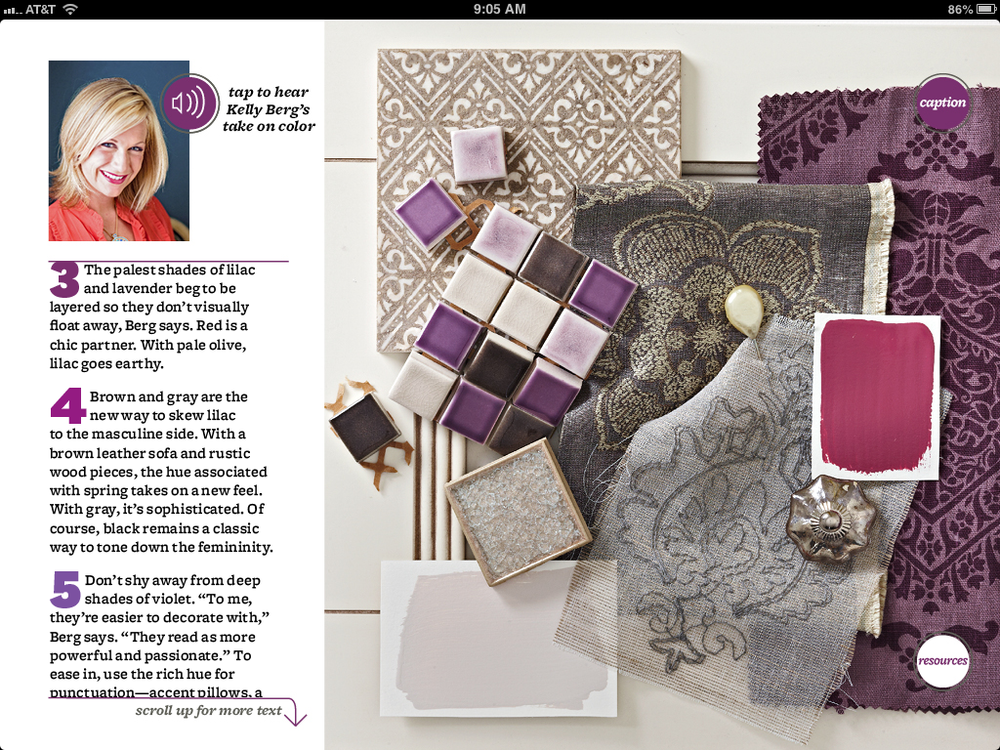
Bath Materials Design board by Story & Space for BHG's digital edition
"Mouthwatering" (bright berry violet)
Would be stunning in a bathroom or entryway. It’s pretty potent, so use it in a space where you want to get attention. As an accent, like "Purple Davenport", would be lovely in pillows, upholstery and drapery.
Pair with:
Whites, greys and blacks for a more graphic, contemporary feel. Like "Purple Davenport", could also be paired with any of the equally saturated hues listed above. Would look amazing with deep charcoal greys which would bring an edge of sophistication and mystery. Also a good match for creams which could soften this boisterous hue.

Inspiration Board by Story & Space. Violets and Navy = yum!
"Sweet Surrender" (nearly-white violet) :
Could be used as trim and ceiling for a room in painted in "Purple Davenport" or "Mouthwatering".
Pair with:
Because this hue is so pale, it can handle being layered with other deeper red-violets...and even truer reds. For a softer effect that doesn’t go too girly, use it with pale silvery greys.
"Spangle" (dusty pale violet):
Beautiful hue for anything silk or linen. A duvet in this color fabric would be heavenly.
Pair with:
Would work well, like the others, with blacks, whites, and greys. Also could work with very pale olive greens or khakis, which ground this heavily scented hue.

Color Design project by Story & Space. Violets layered with greens.

Just a touch of violet in these greys. Color Design by Story & Space.
"Storybook Charm" (mid-tone dusty violet):
Fun color for a laundry room. Also could work as trim and ceiling color for a room in
"Purple Davenport" or "Mouthwatering".
Pair with:
Like "Sweet Surrender", this hue can also be paired with other red-violets. It would also look stunning with the deepest blue-violets and smokey taupes.
"Red-violets aren’t just for girls. The deepest of these hues can be mysterious and powerful."
Q} What mood does violet set?
A} This particular group of hues is comprised of red-violets, as opposed to blue-violets which means that they have more of a red undertone. This inherently makes them warmer-feeling than their blue-violet counterparts.
Each of these hues will provide a very different mood when painted on all four rooms of a space. "Purple Davenport" would create a somewhat rich and mysterious space that wouldn’t necessarily read as feminine, depending on what colors and textures it is combined with. "Storybook Charm", on the other hand, lends itself to a softer much more feminine feel. "Mouthwatering" is red-violet with a little spunk. It is a fearless hue, for sure. This paint color would have a candy-like presence with a sweetness you can almost taste. "Sweet Surrender" is the softest of the group, with just a shimmer of red-violet. A room painted entirely in this hue feel like a whisper of pink...soft and romantic. "Spangle" might look dainty, but get it up on all four walls and it’s no shrinking violet. Like the other lighter hues, it is sweet and romantic, but it would also have a strong presence. This is by far the girliest hue of the bunch.

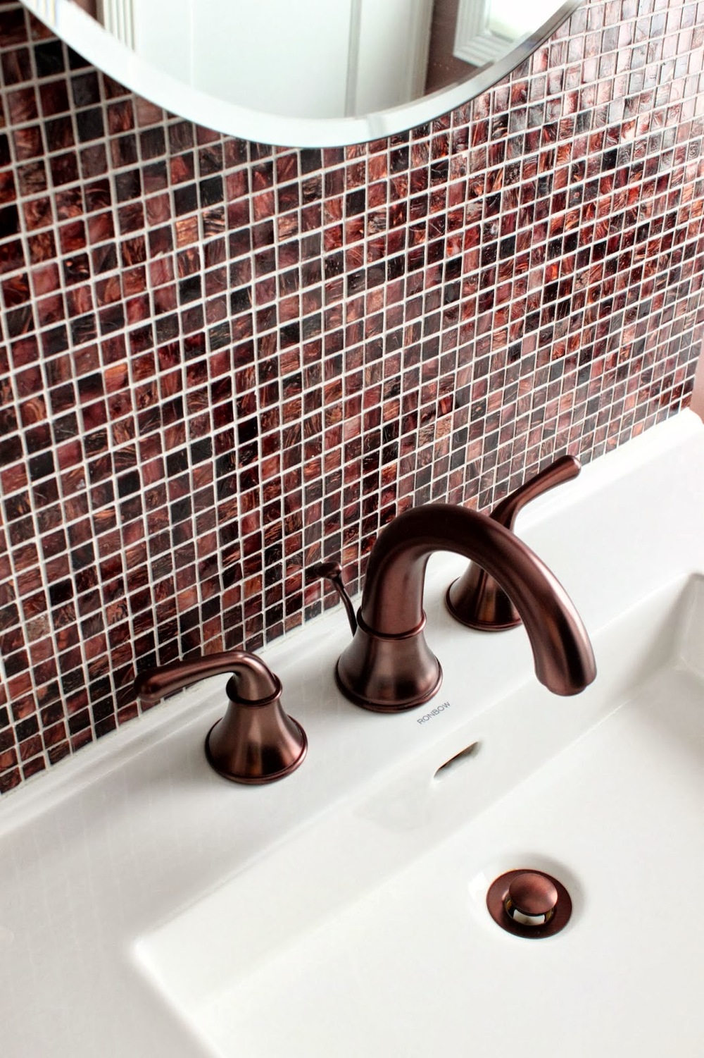
Kitchen Design by Story & Space. This client went bold with the backsplash - so much fun!

Q} How can you make violets look less girly?
A} We all have very complex psychological associations with colors -not just violets - that are based on our cultural upbringings, amongst other things. Although there is an inherent sweet and floral association with many of these red-violet hues simply because they are the color of familiar flowers, much of our perception of red-violets is taken from what we’ve learned over time. Violets weren’t always associated with girly-ness. Purple was, and still is, a color of royalty. Red-violets can be very powerful and mystical...it just depends on the exact hue we are referring to.
With that said, color is never viewed in a vacuum. That means that we experience a color with everything else that surrounds it. When we use a paint color on the walls of a room there are always other design elements that come into play and affect how we perceive that hue. To keep a red-violet room from becoming “too girly” it’s important to consider the other colors and textures in the space. Adding lace, dolls, floral fabrics and more red-violets to an already “lilac” room is only going to emphasize the girliness.
"The palest red-violets are like a sweet, fragrant whisper, while the deepest shades are a symphony for the senses."
To create a less girly space, it’s important to bring in elements that are inherently less girly. Black and white photography, industrial inspired decor, streamlined furniture designs are just a few ideas on how to tame the romantic quality of red-violets. Also, pairing red-violets with colors that are not perceived as feminine, such as greys, blacks, browns, deep blues, etc, can help combat that girly feel.

This client took a deep eggplant-y violet accent from inside to out. Color Design by Story & Space.

Q} What tricks are there for using violets? Does a little go a long way with the richer shades?
A} The deeper shades of red-violet are actually less feminine and, in my opinion, easier to decorate with. The deeper the hue, the less sweet and romantic they are. The lightest tints of red-violets read as the most delicate and feminine, whereas the deepest shades read as more powerful and masculine. They also read more passionate. I would suggest to anyone painting their walls in these hues who is trying to steer clear of a romantic effect to go deeper in value.

Look closely - that's a deep red-violet on those pillows! Color Design by Story & Space.
Q} How can you make lilacs/violets/purples more livable?
A} I think the first thing to do is to eliminate that assumption that they aren’t livable. And the idea that violet/lilac/purple is one hue. There is a huge range of violets, and, like any other hue, different variations create entirely different moods and effects. Next thing, remember that colors do not live in a vacuum. These red-violets can look very different depending upon what colors and textures they are paired with. Think about the overall mood you are going for in a space and then select a violet that supports that mood. Sophisticated and mysterious can be achieved using red-violet just as well as sweet and romantic can.
Q} What rooms are they best used for?
A} They can be used in any room. Depends on what mood you are trying to create and what specific red-violet is being used. Also depends on your personal preference, color tolerances and psychological associations. I wouldn’t ban or promote violet for any particular space.

This client went violet all the way! Bath Design by Story & Space
Q} Is it a trendy color? Classic? Timeless? What tricks are there to giving it longevity?
A} Any color can have longevity as long as it speaks to you. If you love violet, use it. If you don’t love it and you are using it simple because it’s trendy, it won’t have any longevity.
"Think red-violets aren’t versatile? Think again. While the softest tints speak of romance and sweetness, the deepest shades are rich and powerful."
Will you be using Radiant Orchid or Exclusive Plum...or any other variation of violet in your home this year? Are you inspired, or ready to move on already?