Potato Leek Soup with Homemade Herbed Croutons

One of my favorite fall recipes is Potato Leek Soup. Easy, hearty, healthy and veggie - can't get much better than that! The original recipe came from my parents who pulled it from some food magazine, but I've made it so many times, I don't follow a recipe any more. And the Herbed Croutons are my yummy little addition. As far as I'm concerned, everything's better with croutons.

Potato Leek Soup

2 leeks

1 white onion

6-8 potatoes (I used Yellow Wax, but other varieties are fine, too.)

2 TBSP olive oil

6 cups water and/or veggie broth

salt and pepper

Herbed Croutons

stale bread

olive oil

salt and pepper

dried herbs (I used Penzey's Pasta Sprinkle and Turkish Oregano)

1) Trim, wash and chop the leeks.

2) Slice the onion.

3) Heat olive oil in stock pot.

4) Saute onion and leeks until soft, about 15-20 minutes.

5) Peel and cube potatoes.

6) Add potatoes and broth (and/or water) to onions and leeks. Bring to a boil. Turn down heat to medium low and simmer until potatoes are soft. About 20-25 minutes. 

7) Bust out the immersion blender. This is an amazing kitchen tool. Go buy one if you don't have one. (You can also transfer soup to a blender in batches, but it's a little trickier.)

8) Puree soup to desired consistency. Add salt and pepper to taste. 

For croutons...

1) Pull out your rock hard stale bread...whatever you have on hand.

2) Chop bread into cubes. (If it's really hard, you'll need a sharp Chef's knife, not a bread knife. And you may need safety goggles to protect your eyes from shooting bits of crust.)

3) Transfer bread cubes to bowl and generously coat with olive oil and/or butter. Season with salt, pepper and dried herbs. (I use whatever's on hand, but 

Penzey's Pasta Sprinkle is a really delicious blend.)

4) Toast seasoned cubes in toaster oven (or bake/broil in regular oven) for about 5 minutes. They are easy to burn, so keep your eye on them!

Perfect little croutons! I rarely buy store-bought croutons anymore because these are so tasty and easy...and they use up something that might otherwise be thrown away.

And there you have it - Potato Leek Soup with Homemade Herbed Croutons. Mmmmmmm.

I tend to make a lot of soups in the fall and winter, so maybe I'll share more recipes as the cold weather kicks in. Soups are such a wonderfully comforting food.

Enjoy!

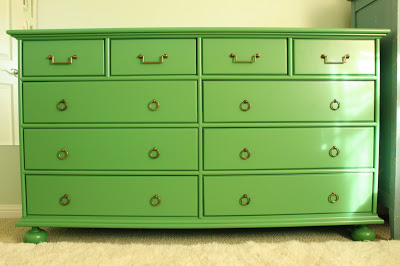
My New Kelly Green Dresser

My new green dresser was delivered last week...and I'm in love!
If you happened to read my previous post, you'll know that my dad made this beautiful piece. He's been making furniture and cabinetry for years now, but just keeps getting better and better. I think this is his best piece yet!


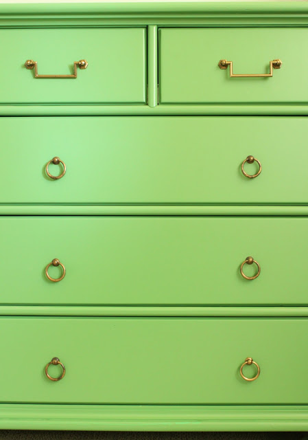
I found the pulls at Belmont Hardware, a local hardware store. This is usually the first stop for me when I am searching for hardware for clients, as they have a really broad selection. I spotted these guys first in a discontinued bin...but there were only four of them. 
They were so cool, I was determined to make them work. The dresser has four small upper drawers, so I just needed to find a coordinating pull for the other 6 large lower drawers.

Bingo! Found.
I got all 16 pieces for just under $100. Not bad.

Now, I'm sure you all want to know about the color.

I had been dying to bring a Kelly Green into the bedroom, as that was my alternate choice for the wall color when we painted. Opting for Fleeting Green by Sherwin Williams, which is a lovely but very pale blue green, I needed to introduce some highly saturated colors to bring more energy to the space. "Soft" and "soothing" is just not my thing.
After studying MANY greens in different lights, at different angles (probably even in my dreams), I landed on Benjamin Moore #566. Just the right amount of yellow without being too lime-y.
I just realized today that this color actually has a name, and not just a number. My large paper sample didn't have a name on the back - just "566". And I didn't bother to check the paint deck. This information probably would have saved my dad a big headache, but then I wouldn't be able to share the following color story...

It all started when I told my mom over the phone that I had chosen a color for the dresser. 

"I finally chose a color for the dresser. Number 566 by Benjamin Moore," I said. 

"Ok. What color is it?" she asked.

"Well," I responded, "it's like a Kelly Green."

"Oh - that sounds pretty. I'll tell your dad."

"Ok, Mom. Number 566. You're writing it down, right?"

"Yes," she said. "I'm writing it down right now."

A few days later my mom sent me photos of the painted dresser. (My dad works at warp speed.) It looked a little more blue-green than I thought it should, but it was probably just a lighting issue.
Pretty, right? 

Anxious to clear out the "shop" (aka garage) for other projects, my parents came down to deliver the piece just a few days later. Once I saw it in person, my suspicions were confirmed.

"Ummmm....is this the color I spec'd? Number 566?" I asked, hoping that I was imagining the blue-ish undertones.

"It's 'Kelly Green'," replied my Dad. "That's what your mother told me."

"Yeah, well, the number was 566. It is 'like' a Kelly Green. Did you get number 566?"

"No...I got 'Kelly Green'. When I went to buy the paint, the guy said that Kelly Green and number 566 didn't match. So I got Kelly Green cuz that's what your mother told me."

Uh-oh. Here's "Kelly Green" by Benjamin Moore next to #566, also known as "Bunker Hill Green."
Yeah. Not quite the same. The "Kelly Green" is quite a bit more saturated and has a lot of blue in comparison to the "Bunker Hill" I brought a few of the "Kelly Green" painted drawers into the bedroom to see if I could make it work, but it looked really funky and childlike. I like playful colors, but it was a little too playful.

So, we loaded everything back in the van and I handed my dad the #566 paper paint swatch. We all determined that it needed to be re-painted.

The moral of the story is that it is very important to communicate clearly (to your parents or otherwise) when you are speaking the language of color. Don't tell your mom that a color is "like" a color that might actually exist in a paint deck. And double check to see if your paint color has a coordinating name for its number. And, when in doubt, double check the specs! 

Fortunately, it was an easy enough fix (for me, anyway!) and the end product is just beautiful.

Thanks, Dad! Next time we talk color, we'll be a bit more careful. 

Does anyone else have a funny color communication story they'd like to share?

If you are ready to eliminate fear from your color and design decisions... please call me at 650.867.3896, or shoot me an email at kelly@artestyling.com to discuss your project.


Branding and Collaborating through Interior Design and Color

I recently wrapped up a commercial interior design project for Top 1 Oil in San Mateo. I was brought in by the client, whom I had previously worked with on some residential color design, to assist with paint color and materials selection for their new office space. It was such a pleasure having a client like Top 1 Oil, which is entirely family owned and operated. Founded in 1979 by William A. Ryan, the company is thriving due to the hard work and dedication of three generations of Ryans. And the most dedicated of all? 90 year old Kate Ryan who works for the company every day...and looks fabulous!
Before - Lobby/Hallway 
After - Lobby/Hallway
Colors used: Benjamin Moore's Key West Ivory, Nimbus and Moroccan Red
Before - Second floor workstations
After - Second floor workstations
Colors used: Benjamin Moore's Key West Ivory, Moroccan Red, and Blue Nova with Nimbus trim; Carpet - Atlas Limbo in Iron Charm. 

One challenging aspect of working on Top 1's color design was in staying true to the branding colors, which are basically primary red, yellow and blue, while at the same time creating an office design that was professional and not overly childlike. I brought in the gray - Nimbus - to give an edge of modern sophistication, and also to replicate the look of the existing aluminum door frames. We also opted for a very dark grey and black carpet to bring a sense of groundedness to the space. I loved that it simulated asphalt - very apropos for the company!
Before - Second floor offices
After - Second floor offices
Colors used: Benjamin Moore's Key West Ivory and Blue Nova
During this project I had the privilege of working with Debra Disman, decorative painter extraordinaire, of Artifactory Studio in San Francisco. I met Debra last year through an IACC seminar, and though I had seen her work via facebook, Twitter, etc., we hadn't yet had the opportunity to tackle a project together. As a matter of fact - this was the first time I had worked with any decorative painter on a job. The project went incredibly well. So well, in fact, that the client has recently asked Debra to come back and do MORE work for them in the space. Isn't that the ultimate compliment?

Debra did two installations on the second floor of the offices. Both were nearly exact replications of the company's logo. This might sound easy - it's just copying, right? Yeah - it's not quite as simple as that. I was really amazed at the process myself. Kudos to Debra for making it look effortless.
Before
It was at the Feng Shui consultant's suggestion that we incorporated the company logo on the back wall of the second floor. She also highly recommended that we have a heavy dose of red on the back wall. Rather than bathe the entire logo wall in red, however, we opted to place the red just on the pony wall. The primary red and blue sitting right next to each other would have created too high of a contrast and would have taken away from the impact of the logo itself. A pale yellow (Benjamin Moore's Key West Ivory) became a more appropriate background color - and it was actually used as the main color in the entire office.
After 


Debra's finished product. The graphically designed logo (from print and web) was used as a guide for actual Pantone colors, proportion and scale.
Debra hard at work.
The other decorative installation was added to an adjacent wall on the same floor. We did a very wide stripe design taken from the lower section of the large logo. (Debra has a few better photos on her article.)
After - Debra's Top 1 Oil "stripe" with Benjamin Moore's Key West Ivory
The collaborative process was really fun on this project. We worked hard, had lots of details to decide upon...and a few moments of "ok...who's gonna figure this one out?" But that's pretty much how every design job goes. The beauty of this project was that we had such a great group of people - the clients, contractor, architect, subcontractors - everyone was really fantastic to work with. Debra took note of this exceptional collaboration and wrote about it in her most recent article for the Bay Area Women's Journal, "Business Branding: It Takes a Village to Paint a Logo!

For the article, Debra asked the client and I to answer a few questions about the collaborative process. I'd like to share with you a little more of our Q&A that didn't make the final edit. Enjoy!

DD} Do you see collaboration as a key part of the design process for the new Top 1 Oil office building? Why do you think collaboration is important in the design process?

After - Second floor office
Colors used: Benjamin Moore's Key West Ivory and Nimbus
KB} I couldn't have done my job without collaborating with the client. Although I had worked with Mary and Kate Ryan on residential work prior to the Top 1 Oil job, it was imperative that I learned about the company before moving forward with any design specifications. Frank, in particular, had very distinct visions about the company image and how it was to be portrayed through the interior and color design. Meeting and working with Top 1 Oil representatives was a must for me. If I had done any work without their input it would not have been as authentic...and the end result would have been more of my vision for the space - not theirs. The collaboration allowed us to create the space together, and to achieve an end result that supported the needs of the client as well as their clients.
Before - Another shot of the second floor back wall
After - Another shot of Debra's masterful work!
On another note, we also collaborated with a Feng Shui consultant. Before any design work begun, the Feng Shui consultant did a report and developed an energy flow strategy for us to use as a guideline. This turned out to be a very good starting point for the design and we did our best to respect the suggestions she made.
Debra showcasing the finished product. (And yes - this was summer in California and she has a winter coat on. It was FREEZING that day!)
Additionally, collaborating with Debra, the decorative painter was a wonderful experience. Debra and I worked closely on the design and layout of the company logo, which really is the showstopper in the the space! The client knew from the beginning of the project that they wanted to incorporate the company logo somehow, and when I suggested we bring in Debra, they were thrilled with the idea. She did an amazing job! Although it took several meetings and emails to decide on the exact placement and scale of the logo, it was well worth the hard work. And the collaboration with the client allowed them to feel like they had a hand in the design. Without the client input  a disassociation can occur. Why not bring them in on the design decisions? It only allows for a better end product - one that truly represents the client, the company and the brand - when they are intimately involved. I wouldn't have it any other way.
And a pic of me. (Per Anna's request.)

How do you feel about collaboration on design projects? Please share your experiences!


If you need assistance with color and materials for your commercial space, and value branding and collaboration, call me at 650.867.3896, or shoot me an email at kelly@artestyling.com to discuss your project.

Home-Baked "Vintage" Banana Bread

Here's what greeted me in the kitchen this morning:
A bunch of bananas past their prime. 

Now, I know some of you will gobble these up no problem, brown spots and all, but I really dislike eating these guys once their freckles appear. As far as I was concerned, these bananas had three choices. 

1) They could go into the new compost bin. (We just got new bins yesterday, and we can dump yard waste and compost all in one container. Yay!)

2) They could get gurred up in the blender with some other fruit friends to make a smoothie. 

Or...
3) They could find their way into a batch of home-made banana bread.

Feeling like Betty Crocker, I opted for the third option. Those lucky bananas!

I typically use my red-and-white checked Better Homes and Gardens cookbook for banana bread, but, feeling a wave of nostalgia as I glanced at the beginnings of my vintage cookbook collection, I decided to pull a recipe from my 1953 edition of The Joy of Cooking. I also own a 2006 edition, but somehow that didn't seem as fun.
For those of you who don't know, The Joy of Cooking was first published in 1931 by Irma S. Rombauer - with $3000 of her own money - and remains one of the highest selling cookbooks in history. (Read more on Irma Rombauer here. What a fascinating lady!)
Obviously, this recipe had been used before. I discovered a huge ring perfectly centered on the banana bread page. Maybe this was a good sign?

I also found this funny little piece of paper, no doubt leftover from the previous owner's trip to the Hawaiian Islands.
I got started by measuring my butter, sugar and lemon zest. Then I let the butter sit until it reached room temperature. Sometimes I have been impatient with butter softening and have been known to pop it in the mircowave for a bit. Although this speeds things up, it's not really a good idea. If the butter gets too soft, it can compromise the entire recipe! (Tip from my brother, the chef...and baker extraordinaire.) Besides, Irma didn't have a microwave...and I wanted to do this vintage-style!

If you don't have a microplane grater, you MUST get one. They are phenomenal at zesting and grating hard cheeses, as well as chocolate. Just be careful, because they are sharp as heck (as I personally discovered last week when I took out a big chunk of my thumb. Apparently, my injury was called an "avulsion", a term I just learned from my husband and his new job at a hospital. Ahhhh...the perks of married life!)
My collection of vintage Pyrex bowls. I love the candy colors.

My little baking area. The hutch was my grandmother's and is on my to-do project list. Needs a little color boost. Any  ideas?
Mashing up bananas the old-fashioned way in my Harvest pattern Pyrex bowl.
Reading through the the recipe, I came across something funky. (Yes, I know. You're supposed to read through a recipe in its entirety before you get started, but it's banana bread! How hard could it be?) There were a few different options for baking powder. Apparently, back in the time this book was published, bakers had the choice of "Tartrate or Phosphate Powder" or "Combination Type." Is that like combination skin? What the heck?
Thankfully, on pages 501 and 502 it was explained to me what these things were...and when I pulled out my own baking powder, I realized I had - and have never seen any other kind my entire life - the "Combination Type", otherwise known as Double Acting Baking Powder.

And then I read the last ingredient: "1/2 teaspoon soda." My mind totally blanked. What kind of soda? Club soda? A splash of tonic? Oh. Dum-dum. She means BAKING soda. I have just been so conditioned to see the word "baking" in front of soda. "Soda" means a bubbly, sugary drink. I was almost ready to call my brother and ask him what Irma meant by "soda", but knew it was probably going to be something stupid that I could never live down. I'm glad I gave myself a few extra minutes. Whew!

At least one good thing happened while I was in my state of confusion - the butter softened! Time to mix. I pulled out another Pyrex bowl, grabbed a wooden spoon and went to town. No electric mixer here!
Then I beat in the egg with this funky old thing, found at an estate sale. I thought about using my Kitchenaid mixer, but, again, I wanted to do this as no-frills as possible. Besides, mixing everything by hand burns a few more calories, which means I can eat more of the finished product!
After I mixed up the sugar and egg, I sifted the flour, baking powder and baking soda. Although I usually skip this step in other recipes, I know it's kind of a no-no. The sifted flour, as I understand, makes a lighter, more delicate end product. Besides, there's something so beautiful about sifted flour. Looks like a snowy Swiss mountaintop!

Side note: Something you should know about me - I'm kind of messy in the kitchen. 
Here's the lovely banana bread batter. 
And what do you think it will be baked in?


That's right! Another vintage Pyrex dish. The recipe called for an 8"x 4" pan, and this turquoise beauty was a match made in heaven. By the way, whoever said turquoise was a "new" color trend needs to take a trip back to the 1950s and 1960s. There's nothing "new" about turquoise. I'm just sayin'.

Here's my little baby all ready to go into the oven.
And here it is all baked up and ready to eat.


Only I'm restraining myself and I won't actually eat any until tomorrow. We are going up to my brother's mountain cabin in Twain Harte tomorrow, and I decided to bring it up to share. Yes, it's hard to resist with the smell of freshly baked banana bread wafting through the house, but that's the kind of sister I am.  So I'll have to have a taste test and report back to you later!

Enjoy your long weekend, everyone! And please feel free to share any of your favorite vintage recipes and baking tips. I'd love to hear them.


(All photos taken with my new Canon EOS T1i DSLR camera. What do you think? I'm hoping there is a little improvement over the old point and shoot!)


A Fresh and Fruity Interview with Better Homes and Gardens

I am honored to be featured in February 2010’s issue of Better Homes & Gardens. If you haven’t picked up your copy yet, go get one!  It’s the annual color issue and is packed with lots of good info and inspiring, colorful photos. If you turn to pages 43-44 you’ll find a few quotes of mine on how to use citrus colors in your home. For those of you who want a little more color guidance with these tart and tangy hues, I’m including the full Q&A right here! 

BHG} We’re taking our inspiration from the whole citrus fruit (mostly grapefruit and blood orange): the peel, the pith, and the flesh. What makes these colors so appealing?

KB} Citrus fruit colors are appealing because they stimulate the senses on several levels. There is a strong synesthetic quality to them, meaning you can taste and smell the colors just by looking at them. In addition to being energetic and warm, they also emulate freshness and a bit of playfulness - characteristics that any interior can benefit from.

BHG} What sort of message do some of these brighter pinks and oranges send, especially when used in an interior?

KB} They send the message of energy and warmth. They are youthful, playful, fresh, sassy, friendly, approachable, social, lively and open. When you use these colors in your home you are expressing these qualities in yourself. Citrus-infused colors tell everyone who comes into your home that you are full of warmth and energy. If that’s the message you want to send, then these hues are right for you!

BHG} What about the nuances in this color—so many people just see bright pinkish orange when they look at these paints—what gives them depth?

KB} Too-bright citrusy hues can have an overbearing and overstimulating effect. Tropical Tangerine might look great on the chip, but when it’s on your walls it could make you feel like you’re swimming in a giant pool of orange juice. That’s why it’s important to add your own artistic interpretation to these hues when using them in your home. There’s not much room for literal translation when working with

citruses. Find the right colors for your home by experimenting with different versions of oranges and pinks. Most likely you’ll find that a muted version - one that looks almost too muted on a paint chip - will work best. You may need to gray down your grapefruit before it goes up on the walls!

BHG} We struggled a little bit with this color because it is so strong. How do you make it livable?

KB} Citrus colors can be bright and light or deep and dramatic, depending on how saturated and clear they are. When selecting citrus tones, it’s important to first think about the overall mood you want to create in a space. If it's depth you want, go bold and rich with a deep blood orange. If it’s airy and flirty that’s got you hooked, get your inspiration from a less dramatic clementine. And don’t forget to keep color balance in mind. A room’s depth and interest does not lie in the hands of any single color. Depth is created through balance and contrast, both in color and texture. A quick way to cool down citrus? Add a splash of turquoise. It’s like adding water to fire - a perfect balance, one that humans gravitate towards.

BHG} So, as a reader, if you’re faced with paint chips ranging from pink to orange and you’re looking for that great stand-out color for an accent wall or on the back of a bookshelf, how do you isolate a great citrus tone? Do you look at undertones? Do you match it to fabric?

KB} If you don’t already have some form of red or orange in your space, go with the citrus colors you are most attracted to. The ones that make you feel best. Then alter them a little to work within your room. For example, a ruby red grapefruit paint color that you just love on the chip might need to be muted a little to balance with your existing furniture. Instead of grabbing hold of the first paint chip you see and

shouting “This is the one!”, explore some different variations of ruby red grapefruit. And ALWAYS test these samples on your walls before you commit.

If you currently have a red or orange color in your space, try to pick a citrus tone that has the same undertone. If cranberry red already has a presence in the room, lean towards a deep red-orange citrus for continuity. Already have a fuchsia infusion? Lean towards a more pink-y hue. Sometimes you can trick the eye into believing two different colors are the same!

It’s important to remember that colors are relative and contextual, meaning they will change appearance as you introduce them into different environments. When introducing any color to a space, always pay attention to existing elements, including lighting, architecture, furniture, flooring, wood and metal finishes. Everything has a color, and every color has an undertone. By paying attention to the details you’re more likely to introduce a new color successfully.

BHG} What colors traditionally pair well with these citrusy colors?

KB} That depends on the overall mood you are trying to achieve. If you are searching for sophisticated and dramatic, pair them with dark chocolates or aubergine. Want fresh and cheery? Mix them up with soft, buttery yellows. Looking for playful and beachy? Set these colors off against a bold turquoise. Citruses can also look great with a crisp white, which emulates the pith and rind of the fruit. But just be aware, if you go bold you’ll end up with a bit of an orangey glow...and that crisp white might not look so white anymore!

You can also look at a citrus fruit’s natural environment for color pairing inspiration. Think about the colors that would surround a grapefruit in nature - the greens of the tree leaves, the browns of the branches, the whites and yellows of the blossom, the blue of the sky...the stem, membrane and seeds of the fruit. Use the color harmony of nature to inspire the color palette in your home.

BHG} What about fabrics and accents—what are some ways to get this in small doses and what else should be in the room (textures, metallics, etc.) if you’re using this as an accent?

KB} If you’re a little commitment-phobic, introduce these hues in small accents. Citrus colors pack a powerful punch and can liven up any room with a few artfully placed accessories. A blood orange pillow on a solid colored sofa will quickly bring a lively energy to the room. Just remember to balance your accent color throughout the room. If you use a grapefruit throw pillow on your sofa, carry that color through the space in other ways - vases, flowers, artwork, candles, lampshades, draperies, etc.

If the color isn’t evenly distributed all attention will be on that one little pillow, and the room will feel off-balance. And you aren’t relegated to solids! Stripes and florals are a great way to bring in a little pop of citrus color without making a full-fledged commitment.  Because grapefruits and blood oranges are so bold, you don’t need much to enjoy the benefits of their warmth and energy.

BHG} What about pairing this with wood tones, say flooring or trim—any tips there?

KB} Citrus colors work beautifully with most wood tones. When combining these hues with woods, however, it’s important to think about balancing the depths of color. A deep mahogany floor can handle a more intense citrus, whereas a light maple might require a less saturated hue. And again, consider the overall mood you want to create in your space. The deeper the floor and wall color, the more dramatic and rich the room. The lighter the floor and wall color, the more refreshing and playful the space.

BHG} How have you used this in any of your projects—I know you said you just used it in your bathroom. How did it go?

KB} I recently painted my bath in a medium saturated hue of grapefruit. It is just gorgeous! It might not be the right color for everyone because it is pretty bold, but I love it. It’s fun, full of energy and casts a beautifully healthy glow on my skin. And at night, with a few lit candles, the wall color completely illuminates creating the perfect environment for a relaxing bath at the end of the day.

Thanks, BHG, for giving me the opportunity to be a part of your annual color issue! And thanks also to my very talented friend and photographer Vanessa Stump for shooting my surprisingly color-coordinated headshot.

How to Find Your Design Style (Hint: Not Through A Quiz)

If you're looking for a quick 10 question quiz you've come to the wrong place. But don't worry. There are plenty of those online. A few more clicks and you'll find one. And at the conclusion of a series of spiritually empty questions that you find yourself struggling to answer due to the fact that you can't understand what the photo is trying to communicate,  it will tell you if your style is "French Eclectic","Farmhouse Chic" or "Modern Traditionalist."You'll have all the answers in the palm of your hand and can effortlessly move forward with confidence in all your decorating decisions.

Yeah, right.

The big problem with these quizzes is that they don't really help anyone. Sure it's fun to take a quiz. We plug in a bunch of answers to some questions sprinkled with pretty pictures hoping in excitement that a miraculous discovery about ourselves will be made. That, somehow, the magazine page or computer screen will have access to our deepest, most intimate thoughts and will be able to give us something useful - some sense of identity. A greater understanding of who we are and how we relate to our homes.

I took a few of these quizzes the other day. I wanted to see who they thought I was. One quiz confused me with it's photos. I liked a picture of a dog so I selected it. And I also liked a photo of a dad and son playing outside in the grass, so I picked that too. And there was a shot of a bedroom that had bold colors. I liked the color combination. At the end of the quiz I was defined as having a predominantly "Asian" style (their words, not mine.) There is definitely nothing "Asian" happening in my place. Another quiz deemed me "French Eclectic." I'm not quite sure what that meant and wouldn't have the faintest idea how to create it. Besides, I can't pronounce French to save my life. Maybe that's the "Eclectic" part?

This is just one of the many rooms I found that calls itself "French Eclectic." Pretty, but not really me. Where's the color?

I could go on and on about these quizzes and how I think they do more harm then good, confusing us with labels, and perpetuating the useless idea that we all need to fit into some sort of style mold. But I won't, because the topic of this post is "How to Find Your Style." And I personally try to keep my posts on topic so you, the reader, can get what you came here for.

So, how do you go about finding your design style? If you don't have any quizzes to take, and no labels to attach yourself to, how can you possibly figure out who you are?

1) The first step is to slow down. No one finds their style in 10 minutes. You might realize you like a color in a few minutes, or a new textile design. Or you might page through a magazine and fall in love with an image of the most beautiful room you've ever seen. But these are only pieces. And our personal design styles are made up of many, many pieces. Pieces of memories and experiences and color preferences and travels and relationships - all those little things that make us individuals. The truth of it is, our design styles are as unique as our DNA.

2) The second step is to forget about trying to label yourself. Because we have such unique, individual styles there is no way we can all be defined by 5 or 10 different variations of design themes. Don't feel obligated to call yourself "Urban Chic" just because some quiz labeled you as such. These labels are pretty useless. They might help you search for and pull images for a blog post, but they don't define you. Nothing defines you but you.

3) The third step is to look inside ourselves for the answers. This might seem a little granola-y, but it's the truth. No one can tell you what you like or don't like. That's the beauty of design! You get to decide for yourself. You really do hold the answers to your own style. Trust yourself. Tune out the outside noise and listen to your inner voice. It knows more about your style than any quiz.

Finding your own design style isn't always easy. That's probably why so many of us don't do it. It takes time and fearlessness - two things many of us often struggle with in our day to day lives. But it really is the only way to create a home worth living in. And, who knows? Maybe you'll come up with your own label someday that accurately depicts who you are and how you live. Just promise me you won't make up another style quiz about it. We have enough of those.