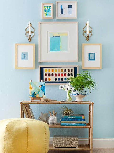
So You've Pinned it. Now What? Exploring the Influence of Pinterest on Interior Design


Pinterest has gotten crazy popular this year. Everywhere you look there's pinning, pinning and more pinning. And the most popular category for pinning? The home. According to RJ Metrics over 17 percent of all pins fall under "Home", with the second most popular category being "Arts and Crafts" and the third, "Style/Fashion."


Pinterest's mission is to "connect everyone in the world through the 'things' they find interesting. We think that a favorite book, toy, or recipe can reveal a common link between two people. With millions of new pins added every week, Pinterest is connecting people all over the world based on shared tastes and interests."

Is this true? Is it really about connecting?


No doubt, it's about "things." Things we see. Things we like. Things we love. Things we want. Things that inspire. Things we want to make. Things we want to eat. Things we want to say. Things we crave. Things we envy. Things that make us laugh. Things that that make us think. Things that we want to share. Things we want to promote. Things we want to buy. Things we want to sell. Things we want to save for a rainy day. 

Yes, Pinterest is certainly about things.

But what does it all mean? With "Home" being the most popular category, what effect does this have on how we view our homes, other's homes, and interior design in general? And with all this image collecting, aren't we just breeding a new kind of clutter? Is pinning the new hoarding?

Maybe, maybe not. I think the answer lies in what we do with what we pin. 

I actually really enjoy Pinterest. I have a number of boards that I've created and I pin and re-pin, collecting images that I think are cool, pretty, inspirational and such. I also pin my own work as a way to share images that I hope might be inspiring to others. And, I'm not gonna lie. I get a steady flow of blog traffic directly from Pinterest.

But then what? I worry that the interest in any single image is so short lived. And that pinners are pinning just to pin. Or that perhaps it's turning into a popularity contest. Who has the most pins? Who has the most followers? How many re-pins does an image have? Doesn't all of this just add up to a bunch of extra social media pressure? Just one more thing to curate and stay on top of? Not to mention the quality of images pinned is AMAZING, making anyone feel like a complete degenerate for not having highly styled, beautifully lit, professionally shot photos. 

And what about those of you who aren't designers? How many of you implement these projects in your own home? Do you ever feel like you have image overload? Are you gathering with the intent of re-designing areas of your home? Have you actually used Pinterest images in real-life decorating and interior design? Does all the pinning help you? Or does the whole thing fill you with despair because it's just one more reminder of how beautiful everyone else's home is, and how yours will only look good in your dreams, or, well, on your Pinterest board which you've aptly named "Dream Home."

I'd like to think that Pinterest is contributing to a greater good. That, at its core, it's about connecting. That it fills our minds and hearts and homes only with joy and happy, creative inspiration. That it's about collaboration rather than competition. But I'm just not sure. As I write this post, I feel a strange sense of duty to pin a few pretty images of doors and calla lilies and the perfectly flowing pair of white linen drapes against a backdrop of the perfect shade of barely-there turquoise. And I'm not sure if that's good or bad. So until I figure it out, I guess I'll just keep on pinning.

Living Room Makeover in Benjamin Moore's Dragonwell - Before and After

© Kelly Berg, 2012

It's been a few months since I painted my living room in Benjamin Moore's glorious full spectrum green, "Dragonwell." I've posted a few pics here and there, but never got around to showing the full before and afters of the space. It's been quite the process, and even though it's not "done" to my complete satisfaction, the fact of the matter is it's how we live and it is our real space. Since I'm all about authenticity and bravery, here goes!


The living room looked like this for the first 4-5 months. Totally unfinished. I bought a rug our first month here and, well, that was pretty much it. No sofa. Bare walls. And a paint color that I really couldn't stand. The furniture was a complete hodgepodge. And, did I mention...no sofa?


To be completely honest, I agonized over paint color for some time. For many reasons. (One of which I will get into eventually on The Brave New Home, but it's along the lines of this post.) I purchased the rug quickly because we needed something for our dog, at the request of our landlord. I found this beautiful rug on Overstock by Safavieh.

But then what?

We finally picked out a sofa and it was delivered in December. Another agonizing decision. However, our fabric selection - a dusty turquoise velvet -  got us one step closer to the wall color. The pillows helped, too. I picked these little guys up at Ross for $8 a piece. Total score considering I've seen the same thing at Anthropologie for five times the cost.


And here's the state of the room after the sofa. Oh geez. Sometimes things have to get worse before they get better. What an eyesore!


There was a big problem at this point. And it's a problem I see again and again with light colored walls. I have found that when you bring in richly saturated pieces of furniture into a space, like I'd done here, and you don't give the walls some good depth of color, you end up creating a feeling that your furniture is floating. Of course, there is also the problem that there is nothing on the walls. That is definitely contributing to the overall sense of unbalance. But artwork can only go so far. And I wanted this space to feel cohesive, and rich and funky and cozy. I wasn't going to get that with those pale yellow walls.

So, I tested some greens. It's hard to see, but there is a bit of olive green in the area rug. And I was  completely inspired by the crazy green of my Ross pillow. Oh, and also the color of wine bottles. I became a little obsessed in my quest for the perfect "Wine Bottle Green." 


That's Dragonwell on the bottom. It was the clear winner.


Ahhh. Much better.

However, now there was an issue with furniture layout. At first it seemed like the most obvious place to put the sofa was directly across from the TV armoire (which couldn't move, by the way, because of the cord situation.) But, as we lived in the space, we realized it wasn't working out. You had to sit sideways and strain your neck if you wanted to stretch out and watch TV. Not to mention the horrible glare coming from the big picture window. So...the sofa moved to the wall. 


I purchased a few new/old things throughout the decorating process, mostly from estate sales. You may remember my very excited post about the pink chair. And the vintage bird prints were quite a find at 10 for a dollar. They are actually old menus from Swiss Air from 1958.


I also found a great brass sconce (shown in the far left corner of the room) after falling in love with some from Schoolhouse Electric. It's ingenious because it needs no wiring. It plugs right into the wall and the cord is hidden with a brass cover. Two screws and a couple of minutes and it was installed!

And these wall plaques I picked up at Tuesday Morning. I was hoping for something vintage, but they were so beat up they certainly looked the part.


The rest of the styling was done with stuff I already had. Mostly vintage. Books, silver dishes, candlesticks, an old game of dominos. Oh! And I did give my yellow mirror a coat of pink paint. Inspired, of course, by the lovely pink chair. (And it just so happens to be the same pink I used on the bedroom walls: Embroidered Flower, another full spectrum paint by Benjamin Moore.)


Here's some "final" befores and afters. And I use the word "final" loosely and in quotes, because I don't think a room should ever be "done." As I've said before, our homes are ever-evolving just like us. Or, at least, they should be. So, even though I'm done...for now, I know that this is just one version of our living room. Whether here or in another home entirely, this space will always be changing. And that's good, because that way I'll never run out of blog post ideas!

Before
After

Before
After
And a few more shots, since I only took about 300 of the space! 


Need help with your home's evolution? Give me call at 650.867.3896 or send me an email at kelly@artestyling.com to discuss your project.

Why is Color Important When Selling a Home?

Photo © Vanessa Stump; Color Design and Styling by K. Berg

In 2009 I was interviewed for a couple of articles on the Better Homes and Gardens Real Estate website about using color in the home. I was quoted several times, but never shared the full questions and answers on my blog. Well, why not now?

Here's one of my favorite questions that seems to have a perpetually elusive answer. We still keep getting bombarded with the whole "beige is best" mantra. As you'll see, I'm not in the colorless camp. I have a much different perspective than many real estate experts who far too often take the position of "'neutral is best...because using anything else will offend potential buyers.

BHG} Why is color important when selling a home?
KB} Home-buying is a very emotional experience and colors and emotion are completely intertwined. We make conscious and unconscious associations with every color we see, so it is important when preparing a home for sale, that the colors used are very carefully considered. A cohesive color palette is one that doesn’t have jarring contrasts - colors that work together to create an overall mood for the space. Prospective buyers want to feel invited into a home, so the color palette should reflect a feeling of comfort and warmth. If the color palette isn’t cohesive, and the wrong feeling is conveyed through improper color use, a potential home-buyer can be left feeling cold and unwelcome - definitely not what you want someone to feel when they are looking for a place to call home.

Anyone have any tips or stories you'd like to share about color and your own home-buying or home-selling experiences? 
Photo © Vanessa Stump; Styling by K. Berg

Do you need help selecting colors for a home you're selling? Give me call at 650.867.3896 or send me an email at kelly@artestyling.com to discuss your project.

Supergraphics, Anyone?


Apparently "supergraphics" were a thing in 1971. And, apparently, men didn't know anything about them. In case you are not privy to the art and beauty of supergraphics, this ad for Lucite Wall Paint in Better Homes and Gardens explains:
"Supergraphics is using color and space to create an effect in a room. To put your personality into your home. If you like wild stripes, paint them up one wall and down the other. You can always change them tomorrow."
And don't forget to wear your matching supergraphic dress.

Oh, how I love vintage Better Homes and Gardens magazines.


And aren't those melon balls divine?

Color Design Project in Burlingame: Before and After


Hello, everyone!

I've got some cool before and afters to share today of a project I worked on in Burlingame, CA. I was hired by my client to develop a color design plan for the social areas of the home. This house was gorgeous when I arrived - before we added wall color. And now it's even more gorgeous. It's such a blast to work on projects like this...and just as fun to share the results.

Dining Room Before
Dining Room After
French Doors Before
French Doors After
Working on the color palette...
Dining Room Before
Dining Room After
Dining/Hallway Before
Dining/ Hallway After
French Doors/Dining Before
French Doors/Dining After
Living Room Before
Living Room After
Dining/French Doors After
Dining Room After
Entry After
Fireplace After
Hallway After
Kitchen Before
Kitchen After
Kitchen After
Now, I can't go into too many details about this project at this point, as it was recently scouted by a shelter magazine. Crossing our fingers that it makes the cut! 

Looking to add more color to your already beautiful home? Give me a call at 650.867.3896 or send me an email at kelly@artestyling.com to discuss your project.