A Colorful Trip to the Ace Hotel in Palm Springs - Part II


Last month I took a trip to Palm Springs to participate in a color experiment. I stayed at The Ace Hotel and Swim Club, which I highlighted in my previous post, "A Colorful Trip to the Ace Hotel in Palm Springs, Part 1."  I've been looking forward to sharing the rest of my experience, as it was truly unique. So, here goes!

Backing up a bit, the project was a collaborative effort between The Comex Group, Arkitip and The Ace Hotel. The Comex Group is a major paint and coatings company based out of Mexico. Arkitip, Inc. is both a PR company and art publication in Los Angeles. And The Ace Hotel, is, well, a hotel.

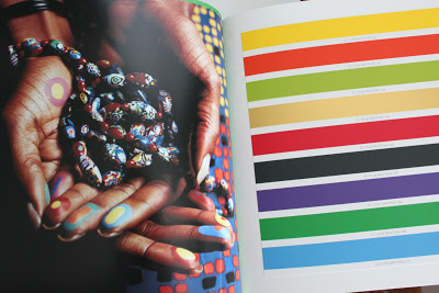
For the experiment, five of the normally all-white hotel rooms were painted in some pretty vibrant hues from the 2012 Comex color palette.

A few of the selected room colors.
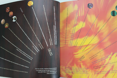
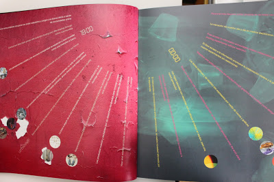
The entire 2012 palette,"Inspiring Cultures," is based around "a central theme, outlining the global factors affecting trends and our emerging color and design choices." Within the 2012 palette are four trend stories which represent a different time of day, "going full-circle round a 24 hour day, and in turn completing a life cycle." These trend stories are: 1) 06:00 Inhale, 2) 12:00 Rhythm, 3) 18:00 Urbanage and 4) 00:00 Digital.


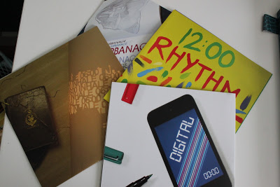
Pretty cool concept, actually. And they have illustrated it beautifully in this gorgeous 90 page hardcover book. 


The purpose of the experiment was to have all of the participants experience firsthand the different moods that environmental color creates. As Eddie Harari, head of Color for The Comex Group, wrote in his welcome letter, "The importance of color in our lives is immense, even if we don't notice it. Just think of your favorite sunset, an icy landscape, a jungle, or your favorite Sunday at the beach. Maybe you visit a friend's house who is a fantastic interior decorator, or travel to the Caribbean, India or Latin America where they embrace dramatic color. We hope the colors chosen for your rooms affect you like these experiences have, so that you feel genuinely transported....We hope that this experience will help open your mind and influence you to no longer be timid when choosing the color that surrounds you. Be brave, and bask in your magnificence!"

Amen! I'm all about being brave. (Shameless plug: The Brave New Home.)

Here's a shot of the "regular" rooms at the Ace hotel. I did not stay in one of these rooms during my trip. I'm not sure how I would have felt in this space - probably would have been craving a bit more color? It's hard to say. I think I might have to go back for another Palm Springs vacation experiment to test it out.

source

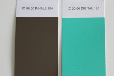
The first night I stayed in a room painted in Comex' Digital 185 and Inhale 154.


The second night, the room was in Rhythm 164 and Rhythm 167.


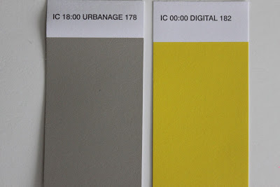
And the last night, the colors were Urbanage 178 and Digital 182.


Those are some crazy hues, right? Aren't you dying to see how the regular rooms look with the colorful overhaul?

Here's a little peek, but you'll have to come back to read Part III for the full story on how these rooms looked, how they made me feel and my thoughts on the entire experiment.  There's just too much to say, and I don't want anyone falling asleep before they get to the end of my blog post.


How To Bring Joy Into Your Space


Get a pink chair.

Seriously.

Ok, so maybe it doesn't have to be a pink chair, exactly, but the point is - bring something into your space that is quirky, playful and unexpected.

Let me share my little story about this pink chair and how it's not only reminded me how to decorate, but also how to live.


I've been working on our home lately. Painting, buying stuff, moving furniture around - trying to visualize how all the pieces can fit together. What to keep, what to get rid of, what to re-furbish. And, of course, agonizing over color decisions. We've got some stuff, but not a lot...and it really is a mish-mash. Don't get me wrong - I love a good mish-mash! But it can definitely be a challenge to pull together.

After purchasing a sofa, and painting the living room (with the help of my wonderful friend Rachel at Hue Consulting), I started to get a pretty clear vision of the space. With walls the deep yet translucent green hue of wine bottles, accents of turquoise and rich, velvety red, and dark brown and black wood furniture, I knew I wanted to create a a moody, victorian-esque space. A space with deep, rich colors perfect for dinner parties - and even more perfect for a Halloween-themed dinner party. Moody and dramatic and sophisticated. It was time to be grown up in my space, once and for all. Yes - that's it! A real grown-up space for a real grown-up girl.

Then I found the pink chair.


It was sitting quietly in the corner of the living room at an estate sale, minding its own business, when it caught my eye. Then I heard it calling my name. I mean, really calling me. Especially with its $60 price tag. I sat in it for about five seconds and that was long enough for me to decide that it was seriously one of the most comfortable chairs I've ever sat in. Sold.

With sheer determination (well, and a whole lot of adrenaline from my shopper's high) I hoisted that chair out of the living room by myself, only narrowly missing the Lladros, Hummels and other shoppers, and dragged it to the car. When I ventured out yesterday morning, was I looking for a pink velvet wingback chair? No. Not at all. But on a subconscious level, I must have been. Because it found me.


When I brought the chair home and placed it in the living room I loved it immediately. It looked like a piece of candy. It made me happy. Not just because it was a great find (although that helped), but because of its color and shape and what it did to the room. It made it playful.

But wait - I wasn't going for playful. I was going for grown-up and sophisticated and moody! Well, that chair had different plans for me. And, you know what? It's a smart little chair with really good plans.

You see, that chair makes me smile. And, quite honestly, before I brought it into the space, nothing made me smile. I was trying so hard to create a space that felt a certain way that I forgot about joy. We get so much out of our spaces. They help to make us feel one way or another. The colors, textures, shapes, sizes, and smells, all create an experience. Without something - or many things - that make us smile, it becomes very difficult to experience joy in a space. The pink chair was just what the space  needed - just what I needed.


As I look at the pink chair in the morning light, I am reminded not just to bring more joy into the physical space of home, but to remember to bring more joy into everything, every day. Because, ultimately, it's really up to us to create our own joy.

With a little help from a pink chair, of course.


What brings you joy in your space?

If you need help bringing joy into your home, please call me at 650.867.3896 or shoot me an email at kelly@artestyling.com to discuss your project.

New Office Paint Color


Hey, everyone. I've been busy working on my own place these past few weeks - such a luxury! After nearly six months in our new house it was time to dedicate some serious design thinking to the place I call home. There's still lots to do, but I wanted to share a few pics.

Before...

After

The new color is Pratt and Lambert's New Glarus (21-20.)


I was looking for the perfect shade of "jade" - something that looked like two of my favorite pieces of jewelry - and this was it.


Are any of you working on home projects right now? Please feel free to share photos on my facebook page.

Ok. Now back to organizing. Hope to share more progress soon!

New Office Paint Color

Hey, everyone.

I've been busy working on my own place these past few weeks - such a luxury! After nearly six months in our new house it was time to dedicate some serious design thinking to the place I call home. There's still lots to do, but I wanted to share a quick before and after of one corner of my office. (Just one corner because the rest is a disaster with a capital D!)

Before

After
The new color is Pratt and Lambert's New Glarus (21-20.)


I was looking for the perfect shade of "jade" - something that looked like two of my favorite pieces of jewelry - and this was it.


Are any of you working on home projects right now? Please feel free to share photos on my facebook page.

Ok. Now back to organizing. Hope to share more progress soon!

New Year, New Color Story in Better Homes and Gardens


Ok, so this may be old news to those of you on facebook, but...

I'm featured in my third color story in the January 2012 issue of Better Homes and Gardens! I started working with BHG last summer on the concept of red-violets and it's finally here. I just adore these hues. 


BHG included a lot of great info from our interviews in the print edition, but if you want more be sure to check out the digital edition on your iPad. (Print subscribers now have free access.) There's a bathroom inspiration board I designed, as well as an audio clip and additional color tips. 


And in case that's not enough, here's a little more violet insight from the interview just for my blog readers. 

BHG} How can you make lilacs look less girly?

KB} We all have very complex psychological associations with colors -not just violets - that are based on our cultural upbringings, amongst other things. Although there is an inherent sweet and floral association with many of these red-violet hues simply because they are the color of familiar flowers, much of our perception of red-violets is taken from what we’ve learned over time. Violets weren’t always associated with girly-ness. Purple was, and still is, a color of royalty. Red-violets can be very powerful and mystical...it just depends on the exact hue we are referring to. 

"Red-violets aren’t just for girls. The deepest of these hues can be mysterious and powerful."

With that said, color is never viewed in a vacuum. That means that we experience a color with everything else that surrounds it. When we use a paint color on the walls of a room there are always other design elements that come into play and affect how we perceive that hue. To keep a red-violet room from becoming “too girly” it’s important to consider the other colors and textures in the space. Adding lace, dolls, floral fabrics and more red-violets to an already “lilac” room is only going to emphasize the girliness. 

To create a less girly space, it’s important to bring in elements that are inherently less girly. Black and white photography, industrial inspired decor, streamlined furniture designs are just a few ideas on how to tame the romantic quality of red-violets. Also, pairing red-violets with colors that are not perceived as feminine, such as greys, blacks, browns, deep blues, etc, can help combat that girly feel.


BHG} What tricks are there for using lilacs/violets/purples? Does a little go a long way with the richer shades?

KB} The deeper shades of red-violet are actually less feminine and, in my opinion, easier to decorate with. The deeper the hue, the less sweet and romantic they are. The lightest tints of red-violets read as the most delicate and feminine, whereas the deepest shades read as more powerful and masculine. They also read more passionate. I would suggest to anyone painting their walls in these hues who is trying to steer clear of a romantic effect to go deeper in value. 

BHG} How can you make lilacs/violets/purples be more livable?

KB} I think the first thing to do is to eliminate that assumption that they aren’t livable. And the idea that violet/lilac/purple is one hue. There is a huge range of violets, and, like any other hue, different variations create entirely different moods and effects. Next thing, remember that colors do not live in a vacuum. These red-violets can look very different depending upon what colors and textures they are paired with. Think about the overall mood you are going for in a space and then select a violet that supports that mood. Sophisticated and mysterious can be achieved using red-violet just as well as sweet and romantic can. 

"The palest red-violets are like a sweet, fragrant whisper, while the deepest shades are a symphony for the senses."

BHG} What rooms are they best used for?

KB} They can be used in any room. Depends on what mood you are trying to create and what specific red-violet is being used. Also depends on your personal preference, color tolerances and psychological associations. I wouldn’t ban or promote violet for any particular space.

BHG} Is it a trendy color? Classic? Timeless? What tricks are there to giving it longevity?

KB} Any color can have longevity as long as it speaks to you. If you love violet, use it. If you don’t love it and you are using it simple because it’s trendy, it won’t have any longevity. 

A Colorful Trip to The Ace Hotel in Palm Springs - Part I


Last weekend I had the amazing opportunity to visit The Ace Hotel and Swim Club in Palm Springs. I was invited, along with a handful of design and lifestyle journalists and bloggers, to participate in a color experiment sponsored by The Comex Group and Arkitip, Inc. Comex, based out of Mexico City, is the parent company of PPI (Professional Paint, Inc.) which they acquired in 2004. In California, you might recognize their paint brand Frazee. Arkitip, based out of Los Angeles, is limited-edition art publication and also the curator of a "plethora of creative endeavors." For this project, Arkitip worked with their client, Comex, to create a color-focused installation at the Ace Hotel. This was a new experiment for all involved, and I have so much to talk about I think it's best if I break the story into a few parts.


Let's start with the Ace Hotel.


The Ace Hotel Group, brainchild of hotelier and uber-cool guy Alex Calderwood (whom I had the wonderful pleasure of meeting) currently has four locations -  Portland, Seattle, New York and Palm Springs - with plans of expansion underway. Each hotel has its own style and feel, and careful consideration is given to the architectural and cultural history of each place. The Palm Springs location is no exception.


The 180-room hotel itself is "built on the foundation of a 1965 Howard Johnson hotel" while the adjacent restaurant, The King's Highway, is a resurrected Denny's restaurant. If you're lucky, while you're dining you can catch a performance by "Linda Fabulous", the resident show tunes belter/hostess who used to be an understudy for Barbra Streisand on Broadway. And The Amigo Room, with it's delicious artisanal cocktails and cave-like atmosphere, is an old school bar you don't want to miss. Much of the decor was kept in tact or re-purposed, providing the bar with colorfully rich layers of character and history.

The King's Highway set against the mountains.

The entire property is a visual feast. Its location is perfectly framed against the desert mountains, almost creating the sense that you are on your own little island...your own oasis in the desert. So, rather than talking your ears off, or, rather, writing your eyes off, it's probably best if I finish up this post with some photos of the property. And I'll continue my Palm Springs adventure in Part II...

The doors to the hotel lobby. Vespas (in reflection) are for rent.


Could that be Pantone's "Tangerine Tango" on the doors?

One of the exterior fireplaces featuring ceramic art installation by Stan Bitters.


Look closely - there's a beautiful violet-headed hummingbird in there!


"We have been called a boutique hotel. We're not sure what that is. We just love doing things our own way, and creating a neat experience based on a sense of place." 
- Ace Hotel website

Have you been to any of the Ace Hotels? If so, what did you think?