A Kitchen Remodel Inspired by...Hummingbirds?

Sometimes kitchen remodels start with a very specific inspiration. In this case, that inspiration was these little guys.

Hummingbirds.

I'll be honest. This was a first for me. A lot of designers probably would have insisted that the hummingbirds be eliminated, but I was determined to make them work. It presented a bit of a design challenge, yes, but also an opportunity to help my client create a unique space that she and her family would absolutely love. 

So I began this project hunting for tiles and granite slabs that would play nicely with these little feathered creatures.

I found the granite first. Madre Perla. Perfect shade of green and a very subtle pattern...almost like marble. (For locals, it was from 

Da Vinci Marble

 in San Carlos.) My client fell in love with this immediately.

Then I found this beautiful onyx and marble border piece, which was actually being discontinued as we were looking at it. My client loved this too, and we bought it up right away.

We knew we wanted to use the hummingbird tiles behind the stove, and I had to find a way to incorporate them without making it look cheesy. And although my client said it would be no problem to get more hummingbirds if we needed them, I assured her that would not be necessary. 

After drawing up a number of tile design options, we landed on this one. I opted for a 4x4 creamy white field tile to match the background color and shape of the hummingbird tile. I put them on a diagonal for a little variation since everything else was running straight. (Coincidentally, I'm just noticing that the interior mosaics are also running at a diagonal. Huh. Must have been one of those subconscious design decisions...) And I wanted to set the hummingbirds off against a bolder background, so I incorporated a mini-brick mosaic in the same green marble as the decorative border piece. The green brick was framed with a ceramic liner in a similar hue. Geez! It sounds so complicated when I write it all down! The truth is, though, tile design can get very tricky. Especially when there are hummingbirds involved.

We kept the rest of the backsplash pretty simple with creamy white subway tiles intersected with the border piece at about 2/3 the height of the backsplash.

My clients opted for white cabinetry everywhere but the island. I love how the rich wood tone helps keep the space warm. We also went replaced the existing flooring with a wood to match the rest of the house. 

The woven barstools are from Cost Plus World Market. They were too high for the counter, but the contracter fixed that problem easily by chopping a couple of inches off the legs.

The pendant light fixtures are from 

Schoolhouse Electric

. They have such cool glass shades. 

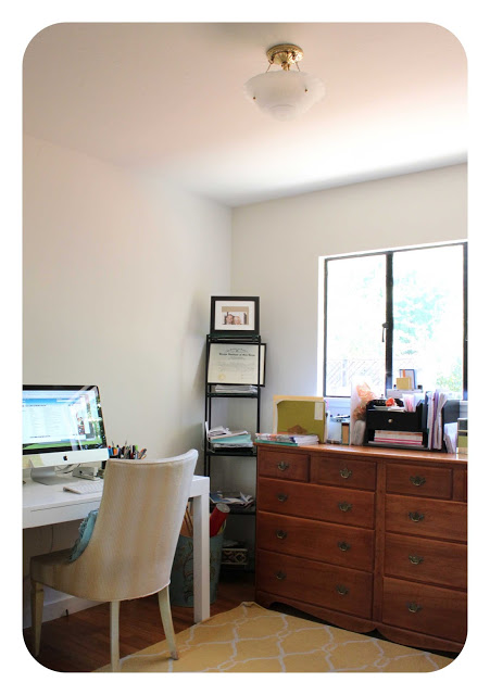
And here's a little before and after of the kitchen office area...

Before

After

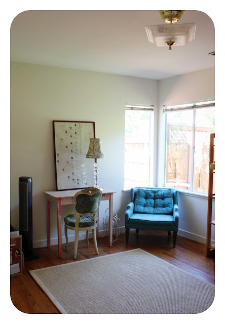
And the adjacent bar...

Before

After

And the overall kitchen, which you might have seen on my 

Facebook 

page...

Before

After

Aren't those chairs great? I suggested my clients keep their old ones and paint them this fun coral color. (There's a bit of coral in those hummingbirds.) And the table they scored at a bargain price from another client of mine who was getting rid of it. See? It can really pay to work with a designer. Contrary to popular belief, we can 

save

 you money. Or, at least help you spend it in the right places.

This was such a fun project to work on. My clients were amazingly open to so many of my ideas and executed many of them themselves long after I was done consulting. They said they learned so much from me - so much that I pretty much taught myself out of a job! Not sure if that's the mark of a successful designer or not. Oh, well. Bottom line: they love their new kitchen. And that, to me, is the ultimate mark of successful design. Well, that and working peacefully with a group of hummingbirds. Those little guys can be pretty demanding, but we made it through without any major battles.

If you need help designing your kitchen around hummingbird tiles, or any other feathery friend,  give me a call at 650.867.3896 or shoot me an email at kelly@artestyling.com.

Vintage Trays as Wall Art


I haven't done a ton of decorating in the new house yet. Mostly because I'm taking a little time to figure out some "hows". How do we use the space? How does the light hit each room at different points of the day? How do we want each room to feel? How do we want this home to be different than the last? How do we want it to be the same? How much of of furniture and decor do we keep? How much do we replace? (Old Ikea dining table, I'm talking to you!)


While I focus on these "hows", however, we continue to live in a house full of flat white walls. The chalky kind that show each fingerprint and were painted so hastily that we constantly find bits of scotch tape and other interesting decorative elements stuck into them. And it's starting to drive me crazy.

To tide me over until we paint (funny how long it takes to give myself a proper color consultation), I did a quick art installation the other day. I collect vintage trays at estate sales. They didn't have a proper place in the home yet, and are quite colorful, so up they went! I arranged them on the floor first and then stuck them to the wall with Command damage-free picture hanging strips. They are like velcro, basically, and work perfectly for things that you don't want to impale with a screw or nail. 

And it's really as simple as that. 

If you want help with your color or DIY projects or give me a call at 650.867.3896 or shoot me an email at kelly@artestyling.com.

"Holy, &@#%. We Just Painted Our Room Purple!"


Over the weekend I received this email from a client and it was so awesome I just had to share. It made me laugh, mostly because there is so much truth to it. How many of you have had a freak-out moment when the first coat of paint went up?

But it's also a testament to the power of fearlessness. Lose the fear, gain the love.

"Hi, Kelly,  
Just wanted to write a quick note to properly thank you for your color consultation. At least now I know for sure that the THANKS are truly in order since we finally painted and we are thrilled with the transformation!  
We're still bringing lighting and furniture back into the rooms. I have to say, the Benjamin Moore Riverbank color gave me a sleepless night when the painters had completed the first coat and left the white tarps covering the floors. I came home from work and stared at it and thought, "Holy, &@#%. We just painted our room purple!" I went upstairs and hid in our bedroom and reassured myself that when the floors, furniture and lighting came back into the equation, it would look a lot different. And it completely did! We love the richness.  
Thank you for guiding us to the colors that make our house feel more like our home!"

Congratulations to my clients for being brave! And may their story inspire others to take a colorful leap of faith.

Violet Bath Design in San Mateo - Before and Afters


Here's a project I recently wrapped up in San Mateo. My clients were so much fun to work with, and weren't afraid to embrace color....all...the...way!


Here's what we started with:

Fine. Nothing wrong with this bathroom, except that it wasn't quite finished.

But my clients were craving color. And drama, and sophistication. So, violet stepped in and helped us out.


Big change, right?


My client fell in love with this glass mosaic tile by Sicis. And from there we rode the violet wave, adding field tile by Sonoma Tilemakers in India Ink and Benjamin Moore's luscious Mulberry Wine.

Tub/shower before - tiles were painted white. 
Tub/shower after
We moved the niche a bit higher up the wall and filled it with the mosaic tiles.
We also ran the mosaics all the way to the ceiling behind the vanity. 
This was such a fun project to work on because a) my clients were super cool and b) they weren't afraid of color. And - guess what? They LOVE their new bath. No fear = great reward.

Have you ever taken a no-fear approach to a project? 

If you want help with a no-fear bathroom design project give me a call at 650.867.3896 or shoot me an email at kelly@artestyling.com.


Our New House: One Month Anniversary

Our new front door

Today is our one month anniversary in our new house. We are still pinching ourselves - is this really ours? Such an odd feeling. A good feeling, but odd and unfamiliar at the same time.  There is also a tremendous sensation of freedom as we have no landlord to answer to. We can pretty much do what we want, when we want. (Unless the city has a problem with it, then it becomes another story.) And with that freedom comes the ability to dream. Before, as renters, we always stopped ourselves from thinking about what could and should be done with our homes because we didn't want to invest too much of our own money into something that wasn't ours. But now, we can open up that creative channel and dream away. It's a fun place to be.

And we will be doing a lot of dreaming because our home definitely needs some updating. Actually, some major overhauling in certain areas. It's a great house and we adore it, but it's obviously been ignored for a long time. To some new homeowners, the condition of this house would be a total drag. To us, it's perfect. 

So, after a month in our new abode, I'm ready to give you a little tour. We haven't done much yet. Just unpacked our boxes (most of them) and moved in our furniture. We really want to live in the space for awhile before we make big changes. And, to be totally honest, we are out of money. So the bigger projects will wait...but that won't keep us from dreaming!

living room before and after


fireplace before and after

our little entry
our weird doorless entry closet...that has become a major junk collector - ewww!

kitchen before and now. not much difference! this is first on our remodeling to-do list.

kitchen before and now, again

more kitchen
yucky interior cabinets. yes, they smell. even new contact paper doesn't help.
so the food goes in our makeshift pantry
and an extra dresser stores lots of dishes and kitchen gadgets
my vintage linens fit right in!
the afternoon sun in the dining area
the bath had stinky cabinets, too.
it's in the process of a mini-makeover for now. (more to come later...)
bedroom before and after. what to do with that silly shelf?


bedroom before and after

our beautiful half bath that had to be ripped out per the city of San Rafael.
for now it's housing some jewelry
the window I broke on our first day in. yup - those are originals!

office before and after


extra bedroom before and after. we're not used to having an extra bedroom. it feels so luxurious!

our front porch. big dreams here.
and our side yard. we're thinking bocce. (so much more yard, but I'm saving for another post.)

As you can see, lots of dreaming to be done. And then lots of doing. As a designer, it's hard not to just jump into everything and try to make it all perfect - especially before putting it all out there for the world to see on my blog! But this is the reality. And making a home takes time and thoughtfulness. Even if we had unlimited funds, we would still wait before making any major changes to the house. I truly believe you have to live in a home a bit before you know what you need from it, and what it needs from you. 

So, I hope you'll join me on this journey! Here's to a little dreaming...

Quoted in Better Homes & Gardens Color Book!


I've been so busy, I forgot to share this amazing news!

I've been quoted in a new Better Homes & Gardens book on color. Not once, not twice, but four times! (Are you kidding? Of course I counted!)

The book is called "Color: The Complete Guide for Your Home." And it's good. Really good. The photos are definitely Pinterest-worthy. In fact, I'm sure many of them have already pinned. (Kate of Centsational Girl wrote a great summary of the book on her blog for BHG.)

My first quote is smack-dab on the "getting started" page. So cool!


Q: How do I know a color is right for my room?

A: Let the idea go that there is one "right" color or you may fail to recognize some very beautiful possibilities for a space. Many colors you think are wrong simply create a different effect.

This is my favorite quote - I can't stress this enough! So glad BHG included it.


So go pick it up if you are looking for some major color inspiration. And - if you still need help, give this designer a ring. I'm for hire.