
A few years ago I worked with my brother on the exterior colors of his mountain cabin in Twain Harte, CA. Then I blogged about it. Turns out, this has become one of my most popular blog posts! And when Deanie from Oregon came upon the story, she did more than read it. She took those colors and painted them on her very own mountain cabin...with some pretty fabulous results.
"Hi Kelly.
I had emailed you earlier in the summer about using your mountain cabin colors for a house we have in Bend, OR. I decided to go for it and I couldn't be happier! We needed new siding and we decided to push out the front porch too. While looking for color inspiration I came upon your post and was sold! The house needed to look more like a mountain cabin and less like a unmemorable suburban house. The builder working in it was extremely hesitant, but I was confident! He now has changed his tune and loves the colors! Here is the before and I'll send the after... Thanks again for your inspiration!!!"
- Deanie S.
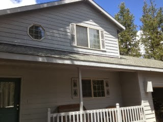
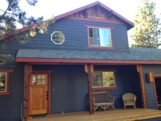
Here's Deanie's before and after:
And here's my brother's cabin:

I think it's kind of fun to see the same colors applied to a different structure! I also thought it'd be fun to ask Deanie a few questions on her paint selection process. I sent her a long list and she was kind enough to answer my questions thoroughly and thoughtfully. Thanks, Deanie!
Q} How long have you owned your cabin?
We bought the house about 8 years ago and we rented it out yearly for the first 4 and we've used it for ourselves as a vacation house for the past 4 years.
Q} What prompted the new paint job?
The house was built in 1993 and is a pretty standard "suburban" type house...not very interesting architecture at all. We needed to replace some damaged siding on two sides of the house and the house needed painting also, so we thought it would be a good opportunity to make some other exterior changes.
Q} What were you hoping to achieve through color?
We really wanted to change the look of the house completely. It was a house that you could drive by and not really notice at all. It also looked like it belonged on any suburban neighborhood street, not in a mountain vacation community. The houses across the street from us have the Deschutes River right behind them and they are million dollar homes with a lot of great architecture and character. Some are beautiful log homes with slate roofs or cedar shake with dark green trim. Our house just didn't fit. We wanted to make the house look more like a cabin and more like it fit with the other homes look and feel without it costing a million dollars! :)
Q} Was it difficult to find a palette?
Yes!!! We worked with a builder who was helping us with the design elements like adding the cedar shingles on the top gable, adding braces, and enlarging the front porch. I'm sure in his line of work, it is better to go safe, but safe would have defeated some of the purpose of this project....completely changing the look! He was trying to steer us very safe with very neutral, I thought boring, colors. I had first been thinking of a cottage red, but I ended up thinking the house is a little too big and didn't have the right architecture for a cottage red.
Q} What process did you go through to find the "right" colors?
I have a Benjamin Moore color wheel that I've had for years and I've used for the interior of the Sunriver house and my house here in Washington. I pretty much carried it with me and drove around neighborhoods I liked comparing colors. I spent a lot of time on Houzz looking at cabins and craftsman type homes looking at their color selections. I also bought about $150 worth of samples from Benjamin Moore and had a big piece of plywood in the garage that had all my choices on it...but I still wasn't really inspired by any of the colors.
Q} What eventually led you to my blog post? What was it that intrigued you about this particular color palette?
I knew I wanted to go dark and rich for the colors and felt that it would make the house feel more substantial and give it more character. Besides Houzz I hadn't looked online and didn't really know where else to look. Then I just thought about what I wanted the house to look like and even thought it didn't look like a mountain cabin now, that is what I wanted it to look like, so I just typed into Google "Colors for a Mountain Cabin"...and I think your post was the first thing that popped up! And WOW! I knew it was perfect right away! I showed my husband and he really like it too! We really wanted some cedar accents and so the front door was also exactly what we wanted too! And since I had the Benjamin Moore paint wheel, I could look at the colors right away and I went down and got samples.
The interior is all Benjamin Moore too, Solitude (blue/gray) on a couple of walls and Pale Celery (soft creamy yellow) with red and green accents, so I also was excited about how the exterior would complement the interior.
Q} You had some initial resistance from others to the color selections. What were the big warnings and fears?
I brought the paint samples down to Sunriver in July and painted one big section and of course next to the faded, washed out gray/blue that the house was, the French Beret looked REALLY dark! As I said, the builder wasn't confident and seemed to be afraid that with the Hot Apple Spice trim was going to make it look "gingerbread-ish". He was still trying to steer us toward tans and beiges.
Q} What made you eventually "go for it"? How did you find the confidence to trust yourself?
I just knew myself and I knew that I would really regret it if I just went the safe route. My husband said,
"What's the worse that could happen? We don't like it? We don't like it now and it's a light color and even if we don't like it after, at least it won't be the same and it probably can't be any worse!"*
And we were paying a lot of money to make the house look very different, I would have been disappointed if we had paid all that money and just have it look a little different, so I just thought "What the hell...Go for it"! The builder absolutely LOVES the colors - the neighbors LOVE it, and we LOVE it! It achieved exactly what we wanted! The house looks like a mountain cabin now! The colors are rich and masculine and fit so well with the neighborhood and with the dark green evergreens and the rusty, red volcanic dirt of the high desert area.
(*I love this! What a smart man. It's the truth, right? )
Q} What would you recommend for others who are searching for the perfect exterior colors for their mountain cabin?
That you go outside of the box for a mountain cabin. I wouldn't have painted my house in Washington those colors. We have a farmhouse style house here with dormers and a big covered front porch. The house is white with green trim and fits perfectly the type of house it is. With a cabin, or a house that you are trying to make look cabin-ish, I really like the dark, forest-y colors that actually blend in better than light colors in those surroundings.