
There’s a huge amount of fear that creeps in with color selection for many clients and projects, but exterior color brings a whole collection of emotional challenges. “What will my neighbors think?”
Read moreNapa Craftsman Gets a Beautiful Color Makeover

I worked on this home's exterior color design last year and finally just got around to taking some pictures. Isn't she gorgeous? All the paint was C2 full spectrum. Such a fun project with a wonderful client. I'll let the photos do the rest of the talking.


Before

After
Why It's Time to Retire This Whole Color of the Year Thing

It's that time of year again. No, I'm not referring to the season when cheesy holiday tunes start prematurely blasting through TJ Maxx (although I did experience that just a couple of days ago.) I am referring to that time of year when the ubiquitous Color of The Year is announced. Again and again. And again.
This is not a conversation I generally participate in, ironic as that may be. The Color of The Year happens and I nod or shake my head, depending on the particular chosen hues, but continue going about my business. Because, honestly, it doesn't really matter.
Yep. I said it. It doesn't matter. Not to me, not to you. Unless you are a color forecaster whose job it is to select these hues or are part of the marketing team of a major paint company. Then it matters. It gives you something to hang your hat on. And it has the potential to make lots of money. Let's face it - the Color of The Year is a big marketing gimmick.
And why is that a problem?
It's not really. It just doesn't have much of a point. And it doesn't really help anyone with anything. I struggle to find a purpose to it all.
I'm not saying the Color of The Year is a bad idea. I think it's actually rather ingenious. It creates a lot PR buzz that lasts year-long...and then can start up all over again the next year. And the year after that....and the year after that...and the year after that. It can really go on forever because there are an infinite amount of colors that can be featured. (I think this is true. I might need a color scientist to step in here and correct me if I'm wrong.) But infinite, as far as you and I are concerned, especially if we're introducing just one color a year. This could pretty much go on forever.
So why does it need to be retired? A little strategic marketing never hurt anyone, right?
It's not that it hurts anyone. In fact, the crowning of a particular hue as the Color Of The Year can be validating. This year, with two whites (yes, I'm calling them whites because that's what they are), is EXTREMELY validating for gazillions of us. White has been making the decorating world go round for at least the past five years and arguably since the dawn of man. Or at least the dawn of paint.
And it may make some people very happy. "Yay! White! I love white. Now it's The Color of The Year! That makes me happy." And I'm happy for you. And I was happy when "your" color was chosen last year. And the year before that...and the year before that. And I was right there with you that year it wasn't your color, and you were very upset. I was upset, too. Then I had to ask myself why. I was upset because I didn't like it. And because I didn't think I would be able to use it. I was upset because I felt left out of the color party. Because the Color of The Year can be very ostracizing if you happen to be one of those people that just doesn't "get it." (You've been there, right? Hello, Marsala! For me, anyway. )
Before I am deemed a color forecast hater, I should clarify that I think color forecasting has a very useful place in this world. Color forecasters track the pulse of color trends over time and it's important information from a historical, cultural and sociological perspective. So I'm totally on board with general color forecasting.
But the Color of The Year? Again, I struggle to find a purpose. Because what are we supposed to do with it? If a paint company calls out a single color as their favored hue for the entire year, what are they saying about all the other colors in their paint deck? And what if we just don't like this year's Color of The Year? Do we have to wait an entire year to see if we'll like the next Color of The Year before we paint our homes or buy a new sofa? Does this mean we'll be seeing more white, for example, in 2016? I'm not sure how that would even be possible.
So maybe we can just do away with this whole Color of The Year thing and celebrate all colors, every year. Or at least you can celebrate the colors you love. Because when it comes down to it, it just doesn't matter. Let's have a color party every day that everyone's invited to. And Simply White, you can totally come, too. You can even bring your friend Alabaster.
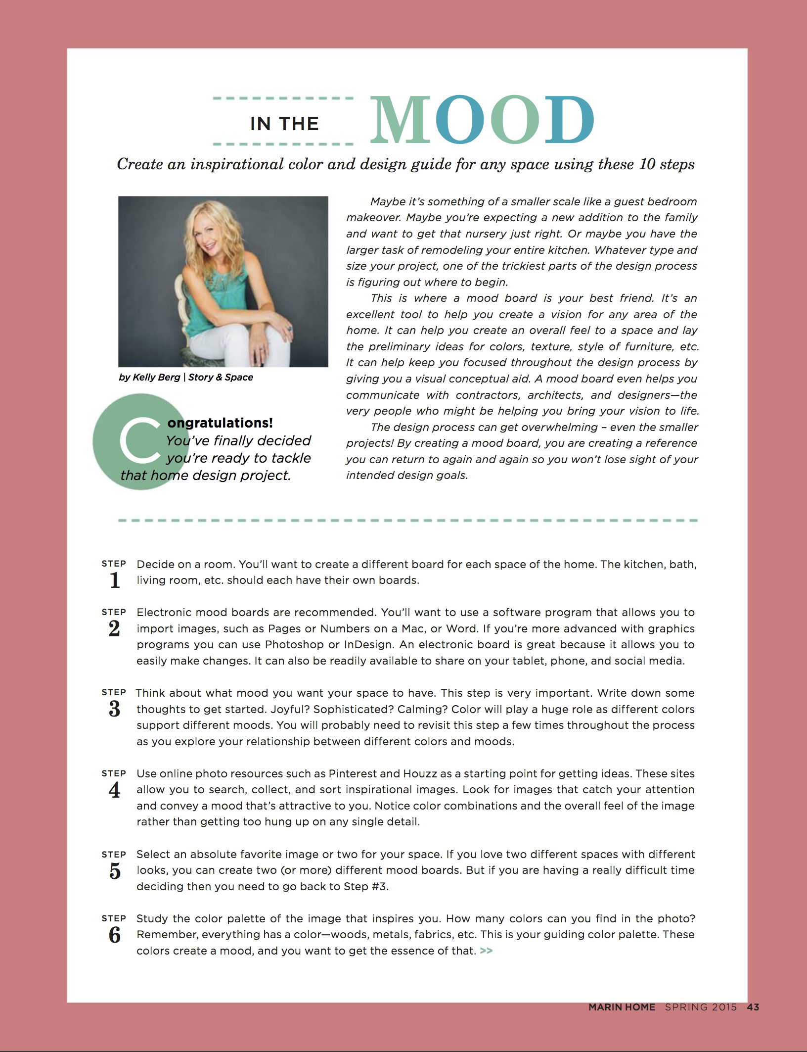
How to Create a Mood Board
“The design process can get overwhelming - even the smaller projects. By creating a mood board, you are creating a reference you can return to again and again so you won’t lose sight of your intended design goals.”
Hey, everyone. Just wanted to let you know that the latest issue of Marin Home Magazine is out. My article, "In the Mood", has some great tips on how to create an inspirational mood board. Hope you'll pop on over and read the FREE digital edition on issuu! Lots of great stuff in there, including an article on Frank Lloyd Wright's Civic Center design. (I can see the gold spire from my backyard - cool, huh?)
I know I haven't posted for awhile, but I'm still here. :) For those of you who have wondered whether or not I'm still taking on clients - yes, I am! Please don't hesitate to reach out to me. I'd love to talk to you about your upcoming color and design projects.

The Deets on My Apartment Therapy Room For Color Contest Entry

It's time for Apartment Therapy's Room for Color contest again. I entered last year and was one of the finalists in the "Dark" category. (I wish they didn't use that word, "dark". It sounds so scary! I much prefer "deep." Because a space with deep colored walls can have lots of light and therefore not technically be "dark". But I digress...)
Here's a collage of my living room entry from last year, "Kelly's Deep Teal with a Funky Vintage Vibe":

This year I almost didn't enter. Honestly, my "Mystical Atelier" wasn't done done. There are a lot of things that are kind of wacky and unfinished, but I figured what the hell. It was a good kick in the pants to spend a little time cleaning up and styling and taking some decent photos of a space that is how it is. It's a real living space, not a perfect one. At that is a good thing to share.

Before
This room wasn't much to start with. It's a 1950s box with zero detail. The glass in the window is broken, there is a hole in the floor where an outlet used to be, the door doesn't close properly, and it has a silly central vacuuming plug that we have yet to remove from the wall. (I'm sure you can spot it if you look carefully!) The furniture is mostly hodge-podgey leftovers - pieces that didn't fit in the rest of the house - and the area rug (from Overstock) was a quick fix. We needed something for the pup to lie down on so he didn't bang up his bony little elbows. Oh - and it desperately needs window treatments. But, like I said, it is what it is. And hopefully there is some inspiration in that.

After (or rather, "in-progress")
As I wrote in my entry, I was "looking to create a masculine, intellectual, artistic space for reading and playing music. Charcoal gray on the walls was the right color to help lay that character foundation. To keep the space from getting too moody, however, I came back in and painted the bookshelves in a bright red."
The walls are painted in Sherwin Williams Sealskin, a deliciously warm and deep charcoal gray. The bookshelves got leftover front door paint in Sherwin Williams Real Red. (You can see the same color on the front door in the living room pics.)

And just for fun, here's a before of the bookshelves, which we purchased from an estate sale just across the street. Keepin' it in the hood.


As most of you know, I love vintage. The chair was a find at an antique store a number of years ago. It looks pretty, but being a real Victorian piece, it desperately needs to be re-stuffed. Someday.
The mirror is also vintage from an estate sale. I stole it from the living room to fill up the wall space for the photos. But it looks so good there, I'm going to leave it.
The armoire - which is HUGE - was made by my dad to house our gargantuan TV back in the day before flat screens. This is literally the only room in the house where it fits. It holds a lot of junk, which is good. And not so good.
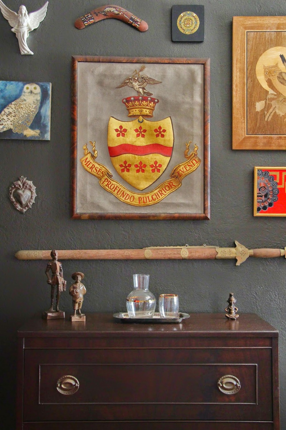
I had fun with this gallery wall. My husband has a strange collection of "anthropological" things, and one day I curated this small gallery for him. Yes, that is an actual coat of arms from his family's lineage. The desk below the display was my grandmother's.

I found the green lamp - which I love! - at a garage sale for $3. And the mid-mod end table? Free on the side of the road.

The fern was another item I stole from a different room. But, again, it looks too good in here to move back. I'll just have to buy another one.

The day bed was a recent purchase from Cost Plus World Market. It's not super fancy, and I hope to replace it with some cool vintage velvet find at some point, but for now it does its job well. And I love how the cream color brings lightness to the space. Oh- and the pillows and throws? Some are from Ross Dress for Less (I am not ashamed!) and some are vintage.

So, now you know all the dirty little secrets behind this room. Hopefully it endears you so much that you feel an overwhelming urge to head over to Apartment Therapy right this second and give it your vote! Voting ends October 3rd. I'd be much appreciative if you can share the love. I promise to send it right back atcha.
Pratt & Lambert Style & Design Guild
I've got some fun news this Friday. Pratt & Lambert Paints has officially launched their re-vamped Style & Design Guild and I'm honored to be one of the members!
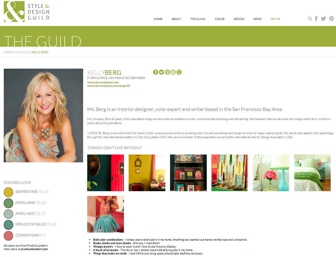
The Style and Design Guild is "a think-tank for the design industry composed of an exclusive team of interior designers, architects, stylists, writers and fashion-forward thinkers who have a shared passion for visual intrigue and for pushing the limits of design."
The other members are: Michael Bagley, Joseph Boehm, Luis Caicedo, Stacy Garcia, Maria Killam, Laura Kirar, Rae McConville, Kate Smith, Asler Valero, Kendall Wilkinson and Eldon Wong. I'm in very good color company!
So head on over when you get a chance. You can check out my favorite Pratt & Lambert colors and my top five design tips, including this one:
““Eliminate the need for perfection. It is the enemy of creativity. When we strive for perfection in design we can sometimes overlook the most beautiful solutions. It’s the imperfections of a space that make it feel most like home.””
Have a great weekend, everyone.