
There’s a huge amount of fear that creeps in with color selection for many clients and projects, but exterior color brings a whole collection of emotional challenges. “What will my neighbors think?”
Read moreMarin Home Magazine: Color, Mood & Space

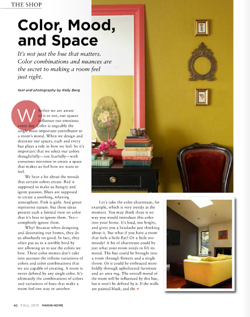
Marin Home Magazine has just launched their Fall 2013 issue. Please check it out - it's a good one! And it's where you'll find my latest article on color - "Color, Mood and Space." Give it a read and let me know what you think!
"It’s important that we select our colors thoughtfully. Not fearfully, but with conscious intention to create a space that makes us feel how we want to feel."
Five Arguments for Painting Your Room First
Another rule that I hear often is that you should always paint your room last. Again - I don't necessarily think this is bad advice, except for the word "always". Yes, it can be a good idea to select your paint color after everything else. The biggest argument for this "rule" is that paint color choices are infinite, whereas sofas, rugs, and window treatments are only available in a limited color supply. By saving your wall paint selection for the end, you won't be limited by any particular color or colorway. However, this approach to a room's design can lead to color becoming an afterthought. Something that is selected just because it goes with everything else, as opposed to a hue that is consciously vetted for is distinct mood, characteristics and our personal relationship with it.
I actually think it can be a very smart design approach to paint your room first. Before any other major design decisions are made. Not always, but it can be. And here's why:
Five Arguments for Painting Your Room First
If you are struggling with a hundred other decisions in the design of a space, start with the paint color. This selection will help you make other decisions because you've created a constant. Something to refer back to with all your other color and design decisions. Yes, you are sort of taking a leap because...oh my god, how will you know that you'll be able to find furniture that will go with your wall color after you've painted? What if you can't find anything? Then what - will you have to repaint? Maybe. Maybe not. But try to calm down and trust that it will all work out. And if you do have to repaint, remind yourself that it's not the end of the world. At least you got started!
If you need help selecting the perfect colors for your space, call me or email me. I can help.
650.867.3896
kelly@storyandspace.com
2. You Found a Color You Love
You've had your eye on a room you pinned to Pinterest for about a year now. You are obsessed. There is nothing you want more than to paint your room that color. Paint it. You will be happy. Yes, you will have to hunt and test a few colors to create the right version for your room and your lighting conditions. You might even need to hire a color expert to consult with to achieve that very particular look and mood that makes you drool. But once you do you will wonder what took you so long. And instead of staring at your computer screen admiring someone else's color, you will be admiring and living in your own beautiful space. Take that, Pinterest!
3. You Want to Create a Very Particular Mood
Maybe it's a moody Mad Men-esque office. Or a dainty, feminine powder room. Paint color is the strongest player in the mood game. Use it first. Get that mood thing going. Nothing will change the feel of a space more than paint color. Well, maybe a full, tear-down remodel, but then we're comparing apples to oranges. Or reds to oranges. Either way, designing a mood is definitely a reason to select paint color first. And, once again, if you are having trouble equating a mood to a particular color, bring in a color expert. It's what we do.
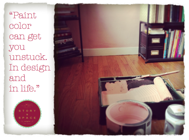
4. You Are Stuck
Maybe you are remodeling. Maybe you just moved into a new house. Maybe you need to buy a few new pieces of furniture. Maybe you're bored. Maybe you just lost your job. Or a boyfriend. Or your mojo. Paint color can get you unstuck. In design and in life. If you don't believe it, try it. Then get back to me. There is magic and power in color. Embrace it fearlessly and I promise you'll get things moving again. You may have to repaint that kooky lime green wall that you thought was a good idea right after you were dumped by what's-his-name, but big deal? It's cheaper than therapy, and the upside is you may come up with a really cool design idea through your broken-hearted artistic angst.
5. You Have Extra Paint in the Garage
Ok - this is probably the last thing you'd expect to hear from me. And I do include this argument with a cautionary warning: don't use a color you don't like just because you have an extra gallon lying around. But do re-use a color if you have an extra gallon lying around AND you still find it beautiful and amazing and it fits the desired mood and function of a space. Here's an example. I had extra paint left over from our previous house. We lived there only a year, and painted six months in. So, we really only got to enjoy the color for about six months before we moved out. When we moved into our new house, I still loved the color and wanted to use it somewhere. We had just enough left over to paint the hallway, so I painted it. It looks great. And I have one less paint can in the garage.
If you need help selecting the perfect colors for your space, call me or email me. I can help.
650.867.3896
kelly@storyandspace.com
Warm Colors, Cool Colors: What Are They and Why You Need to Know About Them
What are warm and cool colors? And why is it important to understand them when painting your home?
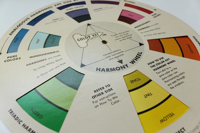
Warm colors are typically reds, oranges and yellows, and tend to advance toward our eyes. Cool colors are typically blues, greens and violets, and tend to recede when we look at them. However, there is such a thing as “cool” warm colors, and “warm” cool colors. It’s important to always work with colors in context. Because, for example, a burgundy red can look warm next to a navy, but cold next to a different shade of red.
Warm and cool colors matter because we make different psychological associations with different colors. It’s kind of like the weather - warm, sunny days make you feel differently than cool, grey days.

Paint colors in our homes can have the same effect. As humans, we are naturally drawn toward the sun, and colors that create that same warmth are just as enticing. When creating a color palette for the home, keep in mind that colors that have an overall warm feeling are going to, in general*, make us most cozy and comfortable. However, you don’t want the palette to be too warm, because too much warmth can be overstimulating. So don’t go crazy with tangerine orange ceilings and fire-engine red walls, or you’ll be running for the door. And that's not to say cooler wall colors won't work - I spec them all the time! It just means if you do opt for cooler paint hues, you're best introducing some warmth through other design elements to keep the space from getting too dreary.
And if you think sticking with “neutrals” or “white” is the safe way to go, and you’ll be able to avoid this whole warm and cool issue, think again. Every color, even beiges and whites, have undertones. Some are pink-y, some are green, some are yellow. So-called “neutrals” are anything but neutral.
*Yes, yes, I know. There are also personal associations and preferences that can throw a kink into this whole thing. But, for the purposes of this post let's keep this in general terms, ok?
The Fear of Color
I am constantly amazed at people's fear of color. I can't tell you how many times, while selecting paint colors for a client's home, I've heard "that's too bright" or "that's too dark" or "I like it, but I could never use it in my home." I ask them why they think it's too bright or too dark or too whatever, and they rarely elicit a response that makes any sense. "It just is," is the usual reply. As a designer, I want to rip my hair out!
Of course I understand that everyone has color likes and dislikes. We make associations through color. I was just in a seminar with a woman who hated the color "ochre" because it reminded her of the chalk used by a teacher she hated in elementary school. And I personally really dislike forest green. On my fifth birthday, I was forced into wearing a very uncomfortable forest green turtleneck. I’ve never really gotten over that experience.
Color likes and dislikes aside, people still seem to be afraid of using even the colors they love when painting their homes. There is this strange perception that "neutral" colors - meaning tan, beige and off white - are safe. That these colors create a "safe" environment. One where we can separate ourselves from the chaos of the outside world. One where emotions are under control. One where we can feel a sense of calm and not be distracted by something as brazen as color.
I recently paged through a copy of a popular home magazine and ran across this quote from a featured homeowner:
"I like color, but not bold color. Color evokes strong emotions, and I want my house to feel calm."
What is it that we are really afraid of? Why this need to feel "safe"?
Perhaps it is not the colors themselves, but the emotions within ourselves that create the most fear. Color is extremely psychologically powerful, and in using it we need to be comfortable enough with ourselves to accept whatever emotion it may evoke. Obviously, color can be used incorrectly and can create many unpleasant emotional responses. But, think about the most beautiful things you have ever seen. Most likely you will imagine something designed by nature.
A rich red rose.
A shimmering turquoise ocean.
A rainbow.
All of these designs have one thing in common: color. Very seldom will your vision of beauty be something beige. Now think about the emotion you feel from those images. A feeling of amazement? A sense of peace? A burst of excitement? If we can translate those feelings into our homes, why not? A beige wall paint can be fine. It IS safe. It goes with almost everything. But it can also be dull and uninspiring. And to me, a color that is dull and uninspiring is anything but safe. I would rather take a leap and try something new because, really, my biggest fear is not color, or even the emotions they may evoke, but rather the idea of living in a world with no color...and no emotion.