Vegan Chili Recipe

I used to love meaty chili as a kid. We'd often have a big bowl of it for dinner, using a flour tortilla as the base and topping it with grated cheddar cheese and a dollop of sour cream. Since I no longer eat meat - haven't for about 15 years now - I had to devise a way to get the same flavor and texture profile as my childhood favorite, vegan-style.

I've made vegetarian chili before. I simply followed a traditional meat-filled recipe and left out the meat. Good, but definitely not worth blogging about. That was before I had my secret ingredient: Rancho Gordo Beans.

If you haven't heard of Rancho Gordo Beans and you love beans (or even like them...you'll probably love them after you try them) please go check them out! They are out of Napa, and provide the most wonderful product - Heirloom beans from Mexico and Central America. 

"The Rancho Gordo Story"

 provides a great read on the company's history and philosophy.

"American cuisine seems to be in a position of re-inventing itself and I'd love to include ingredients, traditions and recipes from south of the border as part of the equation. I love the concept of The Americas. I feel as if it's just as important as the European heritage many of us share." - Steve Sando, Founder of Rancho Gordo

I love that.

Ok, on to my recipe. Enjoy!

Vegetarian Chili (w/ Rancho Gordo Ayocote Morado Beans) 

Ingredients

1/2 lb of Ayocote Morado (Purple Runner Beans), rinsed and sorted (

BUY here

)

1 Tbsp olive oil

2 carrots, diced

1 onion, diced

2 celery stalks, diced

2 cups canned diced tomatoes

2 bay leaves

1 tsp oregano

1 Tbsp Chili powder (more for spicier, less for milder)

1  tsp Chipotle powder (more for spicier, less for milder)

salt

pepper

avocado

cilantro

Soak beans in water a large stock pot in water for approximately 2 hours (or until they double in size and soften a bit.) Make a mirepoix with the carrots, onions and celery. (This just basically means you saute the ingredients together with a little olive oil and cook until softened.) Once the beans are soaked, add the mirepoix, canned tomatoes, bay leaves and oregano to the stock pot. Turn on the heat to medium-low and simmer away for a couple of hours. You may need to add more water periodically, depending on how much water the beans were soaking in. The amount of water and the cooking time will determine how thick or thin your chili will be.

Near the end of the cooking process, add the chili powder, chipotle and salt and pepper to taste. (I stick a spoon in every once in awhile to taste the beans for doneness.) You may want to add the chili powder and chipotle in gradually to adjust for your personal spicy meter. I like things on the spicy side, so these proportions might have a bit too much bite for some of you.

Then - and this is the trick to giving the chili a more meaty texture - mash up about half the beans with a potato masher. Simmer for another 15 minutes or so, and adjust the seasonings, if necessary.

Serve with warm tortillas or tortilla chips and top with fresh avocado and cilantro. (Note: photo shows cotija cheese as a topping, but this can easily be replaced with a vegan cheese or no cheese at all.)

California Paints Color Challenge (And a little color forecasting test)

Back in November, I entered a contest put together by California Paints. The contest was called "Color Challenge" and was a call "to the professional interior design community to determine the featured colors for our 2011 color card series."

Each designer could enter up to 10 three-color palettes using California Paints' hues. Five palettes for interior schemes, and five palettes for exterior schemes. I went ahead and submitted all 10 schemes thinking I would increase my chances. Well, it must have worked because last week I was contacted by California Paints and was informed that the company would be using four of my color schemes in their color cards, coming out this spring. There will also be an online "Designer Selection Gallery" featuring the winners of the contest along with further information about their selected palettes.

I decided to give you a sneak peek of my color palettes, and also provide you with a little color challenge of your own. Below are the 10 palettes I submitted. (You might notice that I named these palettes after places in California. I was trying to bring some more "California" into California Paints, because, ironically enough, you can't actually buy California Paints in the state of California. I was assured by the Marketing Director in Massachusetts that they are currently working on a westward expansion.)

Anyway, here are the palettes. See if you can guess which four color schemes were chosen for winners! (Hint: three are exterior; one is interior.) On Thursday I'll post the four palettes that will be featured in California Paints 2011 Color Cards. 

(Please note that these are photos of color cards, therefore the colors aren't 100% accurate representations of the actual paint colors.)

The Golden Gate
Crystal Cove 
Monterey Coast
Old Hollywood
Redwood Forests
California Sunset
Stormy Beaches
Napa Valley Wine Country 
San Diego Beaches
Old California Mission

If you are ready to create your own personalized color palette for your home or business,  please call me at 650.867.3896, or shoot me an email at kelly@artestyling.com to discuss your project.

To Thank + To Give

Well, I had certainly hoped to put together a more poignant, thorough post for Thanksgiving, but since it is already 3pm on Wednesday, I have resigned myself to the fact that it probably won't happen. Client design projects, interview questions and the baking of one of my favorite veggie dishes have taken precedence to a lengthy blog post. But instead of being frustrated and disappointed with myself, I realize that these are choices that I have made and that I would have things no other way.

We can all choose so many things in our lifetimes. How we want to feel. Who we want to be. What we want to do. Where we want to go. Who we want to be with. How we want to treat others...and ourselves. Something that I'm learning to understand is that we make choices in life based on either Love or Fear. When we choose something through Fear we are not making an authentic choice. We become influenced by something that doesn't represent our true self. And that can make us angry, bitter, stressed, anxious, etc.  However, when we come from a place of Love, we can then free ourselves from the burdens of inauthenticity. It can often be difficult to recognize just how many choices we have, and how many of the choices we make are based on Fear. So, this Thanksgiving, I have decided that I will give thanks for the gift of choice: the choice to live in Love, not Fear.

Happy Thanksgiving, all! Enjoy your day. Enjoy your friends and family. Enjoy yourselves.

“To educate yourself for the feeling of gratitude means to take nothing for granted, but to always seek out and value the kind that will stand behind the action. Nothing that is done for you is a matter of course. Everything originates in a will for the good, which is directed at you. Train yourself never to put off the word or action for the expression of gratitude.”
 -Albert Schweitzer

Jewelry Wall Art Project

Who stores their jewelry in something like this?
I did, until I decided I was tired of not knowing what jewelry I even owned. By having it all crammed into this jewelry box, I never could find what I needed when I needed it. And every once in awhile, when it was time to re-organize my little treasures, I'd always be surprised to find something that I had completely forgotten about. That's the problem with these sorts of boxes.

The other problem is that I have started to collect vintage jewelry that is just too beautiful to hide away in an box. Inspired by my friend Valerie, who has a lovely jewelry line which I blogged about a few months back (Introducing...Nettie & Val's Jewelry Line) I decided to ditch this ugly thing and put my jewels on display. 
Part of Valerie's personal jewelry collection.
If you need a better solution for your jewelry, too here's a step-by-step guide to my Jewelry Wall Art Project.

Items needed:
1 Canvas
Paint (Optional) 
Scrapbook paper
Spray Mount
Double-stick tape

Here's a canvas I've had laying around for a looooooong time. It was painted green ages ago. This particular canvas is a 36" x 36", but any size would work. It really depends on how much jewelry you want to hang.
I also had this scrapbook paper on hand. Kind of weird, because I don't scrapbook. But I thought it was pretty so I bought it, figuring it would come in handy at some point. These particular sheets are about 12" x 12". I used a variety of different patterns in the same color family. Some were from the same package, but I mixed in a few sheets from other paper sets. You could certainly use all the same paper, or even cover with wallpaper scraps.

Once I had my canvas and paper selected, I played around with a few ways to layout the paper. I opted for a symmetrical patchwork pattern.
I then taped the edges of the backside of each sheet of paper with double-stick tape, and sprayed the rest of the surface area with spray mount. (You gotta move quick with this stuff! Definitely know where each piece of paper is going before you commit to the spray.)
After I finished with my gluing, it was time to figure out where my hooks would go. Before I even started with the hooks, I laid my necklaces down to figure out how much space I would need between each hook. Each necklace has a different shape and different visual weight depending on its color and material, and I wanted to make sure the overall look would be balanced. 
For my jewelry hanging hooks, the perfect solution was Command™Damage-Free Hooks. These things are amazing!!! They come in different finished and sizes, so you really have a great range of options stylistically. I opted for the Antique Bronze finish to work with the metals I already have in the bedroom. I hardly need to explain how they work, because they are completely dummy-proof, but basically you just peel paper of a self-adhesive strip, stick it on the hook, peel another piece of paper off the adhesive and stick to your surface...in this case, the paper covered canvas. I used a total of 14 hooks in both the medium and small sizes.

And...here's the final product!

I'm loving my new jewelry display. Only problem? It doesn't hold everything. Guess I'll have to make another one...

(Got great ideas for Command™ hooks? They are currently hosting a contest on their Facebook page. You can win $500 and a flip camera!! You bet I'm entering! Who couldn't use $500???)

If you are ready to eliminate fear from your color and design decisions please call me at 650.867.3896, or shoot me an email at kelly@artestyling.com to discuss your project.

Potato Leek Soup with Homemade Herbed Croutons

One of my favorite fall recipes is Potato Leek Soup. Easy, hearty, healthy and veggie - can't get much better than that! The original recipe came from my parents who pulled it from some food magazine, but I've made it so many times, I don't follow a recipe any more. And the Herbed Croutons are my yummy little addition. As far as I'm concerned, everything's better with croutons.

Potato Leek Soup

2 leeks

1 white onion

6-8 potatoes (I used Yellow Wax, but other varieties are fine, too.)

2 TBSP olive oil

6 cups water and/or veggie broth

salt and pepper

Herbed Croutons

stale bread

olive oil

salt and pepper

dried herbs (I used Penzey's Pasta Sprinkle and Turkish Oregano)

1) Trim, wash and chop the leeks.

2) Slice the onion.

3) Heat olive oil in stock pot.

4) Saute onion and leeks until soft, about 15-20 minutes.

5) Peel and cube potatoes.

6) Add potatoes and broth (and/or water) to onions and leeks. Bring to a boil. Turn down heat to medium low and simmer until potatoes are soft. About 20-25 minutes. 

7) Bust out the immersion blender. This is an amazing kitchen tool. Go buy one if you don't have one. (You can also transfer soup to a blender in batches, but it's a little trickier.)

8) Puree soup to desired consistency. Add salt and pepper to taste. 

For croutons...

1) Pull out your rock hard stale bread...whatever you have on hand.

2) Chop bread into cubes. (If it's really hard, you'll need a sharp Chef's knife, not a bread knife. And you may need safety goggles to protect your eyes from shooting bits of crust.)

3) Transfer bread cubes to bowl and generously coat with olive oil and/or butter. Season with salt, pepper and dried herbs. (I use whatever's on hand, but 

Penzey's Pasta Sprinkle is a really delicious blend.)

4) Toast seasoned cubes in toaster oven (or bake/broil in regular oven) for about 5 minutes. They are easy to burn, so keep your eye on them!

Perfect little croutons! I rarely buy store-bought croutons anymore because these are so tasty and easy...and they use up something that might otherwise be thrown away.

And there you have it - Potato Leek Soup with Homemade Herbed Croutons. Mmmmmmm.

I tend to make a lot of soups in the fall and winter, so maybe I'll share more recipes as the cold weather kicks in. Soups are such a wonderfully comforting food.

Enjoy!

My New Kelly Green Dresser

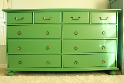
My new green dresser was delivered last week...and I'm in love!
If you happened to read my previous post, you'll know that my dad made this beautiful piece. He's been making furniture and cabinetry for years now, but just keeps getting better and better. I think this is his best piece yet!


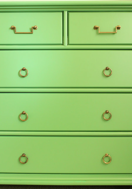
I found the pulls at Belmont Hardware, a local hardware store. This is usually the first stop for me when I am searching for hardware for clients, as they have a really broad selection. I spotted these guys first in a discontinued bin...but there were only four of them. 
They were so cool, I was determined to make them work. The dresser has four small upper drawers, so I just needed to find a coordinating pull for the other 6 large lower drawers.

Bingo! Found.
I got all 16 pieces for just under $100. Not bad.

Now, I'm sure you all want to know about the color.

I had been dying to bring a Kelly Green into the bedroom, as that was my alternate choice for the wall color when we painted. Opting for Fleeting Green by Sherwin Williams, which is a lovely but very pale blue green, I needed to introduce some highly saturated colors to bring more energy to the space. "Soft" and "soothing" is just not my thing.
After studying MANY greens in different lights, at different angles (probably even in my dreams), I landed on Benjamin Moore #566. Just the right amount of yellow without being too lime-y.
I just realized today that this color actually has a name, and not just a number. My large paper sample didn't have a name on the back - just "566". And I didn't bother to check the paint deck. This information probably would have saved my dad a big headache, but then I wouldn't be able to share the following color story...

It all started when I told my mom over the phone that I had chosen a color for the dresser. 

"I finally chose a color for the dresser. Number 566 by Benjamin Moore," I said. 

"Ok. What color is it?" she asked.

"Well," I responded, "it's like a Kelly Green."

"Oh - that sounds pretty. I'll tell your dad."

"Ok, Mom. Number 566. You're writing it down, right?"

"Yes," she said. "I'm writing it down right now."

A few days later my mom sent me photos of the painted dresser. (My dad works at warp speed.) It looked a little more blue-green than I thought it should, but it was probably just a lighting issue.
Pretty, right? 

Anxious to clear out the "shop" (aka garage) for other projects, my parents came down to deliver the piece just a few days later. Once I saw it in person, my suspicions were confirmed.

"Ummmm....is this the color I spec'd? Number 566?" I asked, hoping that I was imagining the blue-ish undertones.

"It's 'Kelly Green'," replied my Dad. "That's what your mother told me."

"Yeah, well, the number was 566. It is 'like' a Kelly Green. Did you get number 566?"

"No...I got 'Kelly Green'. When I went to buy the paint, the guy said that Kelly Green and number 566 didn't match. So I got Kelly Green cuz that's what your mother told me."

Uh-oh. Here's "Kelly Green" by Benjamin Moore next to #566, also known as "Bunker Hill Green."
Yeah. Not quite the same. The "Kelly Green" is quite a bit more saturated and has a lot of blue in comparison to the "Bunker Hill" I brought a few of the "Kelly Green" painted drawers into the bedroom to see if I could make it work, but it looked really funky and childlike. I like playful colors, but it was a little too playful.

So, we loaded everything back in the van and I handed my dad the #566 paper paint swatch. We all determined that it needed to be re-painted.

The moral of the story is that it is very important to communicate clearly (to your parents or otherwise) when you are speaking the language of color. Don't tell your mom that a color is "like" a color that might actually exist in a paint deck. And double check to see if your paint color has a coordinating name for its number. And, when in doubt, double check the specs! 

Fortunately, it was an easy enough fix (for me, anyway!) and the end product is just beautiful.

Thanks, Dad! Next time we talk color, we'll be a bit more careful. 

Does anyone else have a funny color communication story they'd like to share?

If you are ready to eliminate fear from your color and design decisions... please call me at 650.867.3896, or shoot me an email at kelly@artestyling.com to discuss your project.