What is a "Soothing" Space? And How Do You Get one?

Ah. The elusive "soothing" space. We all talk about it. Usually when referencing the ideal bedroom, but sometimes another space in the house. And it is usually characterized by the color blue...maybe green...or, most likely, "neutrals." Or even white. We like our soothing spaces to be clean, uncluttered, not fussy. We don't want bold colors and we don't want it "too dark". We want to feel calm and relaxed in the space, hence the descriptor "soothing". 

Sometimes, however, in an effort to create soothing we end up with boring. We often have the tendency to strip everything out of a space that makes it interesting in an effort to make it calm. We become so entrapped by the idea that a soothing space needs to be completely unstimulating that we can easily end up with a room that causes a sense of unease...because it's not stimulating enough. How's that for ironic design? As humans we need a certain level of stimulation in our environments. We thrive off it. Some of us can handle more stimulation that others - we don't all want a home designed to Liberace standards -  but most of us would benefit by more stimulation than what we think we need when we are aiming to create a soothing space. 

So what does this all mean? Is it really possible to create a space that is both stimulating and soothing at the same time? Yes, it is. And not only is it possible, it's necessary to create a space you love. But how, exactly, do you find the balance? How do you know what works for you?

The answer is not quick and it's not easy. It takes a little work and a little trial and error. The design journey involved in creating a space that is soothing to you may at times even feel overwhelming. How do you know where to start? And how do you know when enough is enough? Or when it's not enough at all?

I'm not going to give you the all the "right" answers here.  I could tell you that you always need three decorative pillows on your bed, and that you should always have an area rug under your bed that covers approximately 2/3 of the floor. But that would be arbitrary design advice and I don't think that helps you at all.

What I do think helps is asking the right questions. So let's start there:

  • How do you define the word "soothing"?

  • Are there any other words you can use to define your ideal space?

  • What don't you want in your space and why?

  • Are there any fears coming up around decorating your space? Are you afraid it will be "too dark", "too trendy" or "too busy"?

  • What don't you like about your current space? What do you like?

  • Why is "soothing" so important to you? Are you trying to escape from anything in your life?

The last question is a big one. Maybe you aren't trying to escape anything. But maybe you are. There is a reason many of us are drawn to soothing spaces. We want a place to unwind from all the crazy. And sometimes crazy is inevitable. But sometimes our need for soothing can be indicative of what's going on in the rest of our lives. It can be a clue that something else needs to change. Just something the chew on...

Regarding the physical design of your "soothing" space, there are a few guidelines to follow:

  • Do not, under any circumstances, have anything in your space that you don't love. If you don't love it, it won't soothe you. I don't care if it was a gift or it used to belong to your grandmother. Get. It. Out.

  • Fix anything that's broken. Broken things are not soothing. They create stress because they are a reminder of just "one more thing" you have to do.

  • Bring in your favorite colors. Not the ones everyone else is using - the colors that you love. Don't worry about if they are "in" or not.

  • Keep it tidy. Not necessarily Konmari tidy, but put your stuff away and organize it. Have a place for everything.

  • Leave some of the good stuff out. Like a pile of favorite books on the coffee table. Or a coaster for your teacup. Things that make you feel good or allow you to use the space with ease.

  • Keep it clean. Duh.

  • Make room to do what makes you happy. If it's playing the guitar, make a space to sit or stand and play comfortably and room for your instrument and music. If it's reading, have a proper reading light and a comfy chair.

  • Have at least one thing in the space that makes you smile. Maybe it's a goofy figurine...of Goofy. Maybe a quirky piece of artwork. Something that doesn't take itself too seriously.

And last but not least...

  • Bring in your authentic self. When you are in the space, you will feel most soothed if it truly lives and breathes your essence. In fact, isn't this is the very definition of a soothing space? A space that is so "you" that you are one with it? And you, my friend, are a very interesting being. For you to be one with your space means that your space needs to be interesting, too.

So, go ahead. Get to work on your soothing space. You might very well end up painting it blue. And that's ok. As long as blue is a color you love. 

How to Create an Inviting and Functional Entryway

Helloooo! It's been way too long again, hasn't it? I've missed you! Let's get this Tuesday going with a few tips on how to turn your entryway into a space that really works for you. Marin Home Magazine's Fall 2015 issue just came out and I've got an article for you on this very topic. You can head on over to the digital edition for the full read. Here's a little teaser:

"Is your home’s entryway a welcoming space? Does it greet your arrival with a smile and give you a warm, fuzzy hug you as you leave? Although it often gets overlooked in the design process, the energy of this space is not to be taken lightly. Let’s take a look at five key components to see how your entry is - or isn’t - meeting your emotional and functional needs. Once you’ve identified the problem areas you can make changes so that your entry works better for you."

How IS that entry working for you? There's no better time than now to re-vamp a space that's most likely going to get a lot of use during the holiday season and the colder, hibernation-y weather.

By the way....notice anything different around here? I had been wanting to update my website for awhile now and...here it is! It's more of a refresh than a complete overhaul. But sometimes that's all we need, right? Squarespace was my saviour. Seriously - a great tool, a great interface, great integration of social media, great tech support. Great, great, great. And now I have my blog on the actual Story & Space website as opposed to blogger, which had been bugging me for a long time. Welcome to 2015! (Never mind that it's almost 2016...)

Thanks for swinging by! And be sure to sign up with your email address over on the swanky new sidebar (right over there on your right) so you don't miss anything really important. 2015 (and 2014 for that matter) kinda knocked me out. But I've got high hopes, plans and energy for the 2016. And I just might send you something cool. 

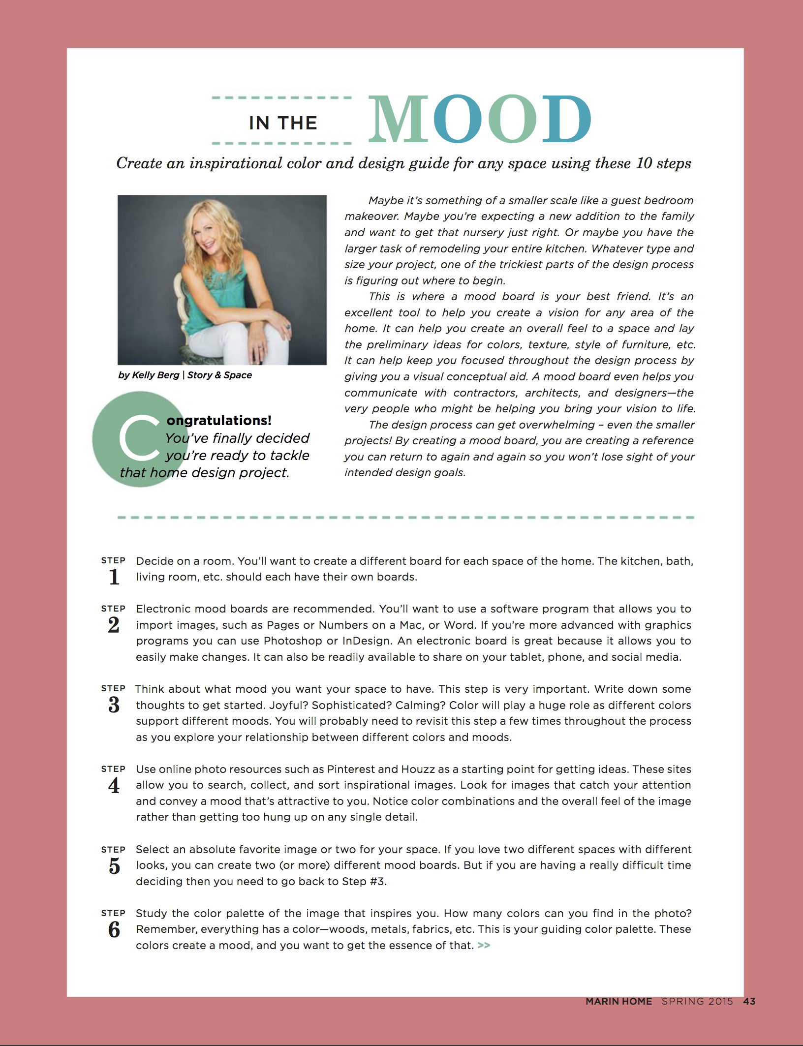
How to Create a Mood Board


The design process can get overwhelming - even the smaller projects. By creating a mood board, you are creating a reference you can return to again and again so you won’t lose sight of your intended design goals.


Hey, everyone. Just wanted to let you know that the latest issue of Marin Home Magazine is out. My article, "In the Mood", has some great tips on how to create an inspirational mood board. Hope you'll pop on over and read the FREE digital edition on issuu! Lots of great stuff in there, including an article on Frank Lloyd Wright's Civic Center design. (I can see the gold spire from my backyard - cool, huh?)

I know I haven't posted for awhile, but I'm still here. :)  For those of you who have wondered whether or not I'm still taking on clients - yes, I am! Please don't hesitate to reach out to me. I'd love to talk to you about your upcoming color and design projects.

 
Screen Shot 2018-03-20 at 4.10.12 PM.png
 
Screen Shot 2018-03-20 at 4.09.57 PM.png

The Deets on My Apartment Therapy Room For Color Contest Entry

It's time for Apartment Therapy's Room for Color contest again. I entered last year and was one of the finalists in the "Dark" category. (I wish they didn't use that word, "dark". It sounds so scary! I much prefer "deep." Because a space with deep colored walls can have lots of light and therefore not technically be "dark". But I digress...)

Here's a collage of my living room entry from last year, "Kelly's Deep Teal with a Funky Vintage Vibe":

This year I almost didn't enter. Honestly, my "Mystical Atelier" wasn't done done. There are a lot of things that are kind of wacky and unfinished, but I figured what the hell. It was a good kick in the pants to spend a little time cleaning up and styling and taking some decent photos of a space that is how it is. It's a real living space, not a perfect one. At that is a good thing to share.

Before

This room wasn't much to start with. It's a 1950s box with zero detail. The glass in the window is broken, there is a hole in the floor where an outlet used to be, the door doesn't close properly, and it has a silly central vacuuming plug that we have yet to remove from the wall. (I'm sure you can spot it if you look carefully!) The furniture is mostly hodge-podgey leftovers - pieces that didn't fit in the rest of the house - and the area rug (from Overstock) was a quick fix. We needed something for the pup to lie down on so he didn't bang up his bony little elbows. Oh - and it desperately needs window treatments. But, like I said, it is what it is. And hopefully there is some inspiration in that.

After (or rather, "in-progress")

As I wrote in my entry, I was "looking to create a masculine, intellectual, artistic space for reading and playing music. Charcoal gray on the walls was the right color to help lay that character foundation. To keep the space from getting too moody, however, I came back in and painted the bookshelves in a bright red."

The walls are painted in Sherwin Williams Sealskin, a deliciously warm and deep charcoal gray. The bookshelves got leftover front door paint in Sherwin Williams Real Red. (You can see the same color on the front door in the living room pics.)

And just for fun, here's a before of the bookshelves, which we purchased from an estate sale just across the street. Keepin' it in the hood.

As most of you know, I love vintage. The chair was a find at an antique store a number of years ago. It looks pretty, but being a real Victorian piece, it desperately needs to be re-stuffed. Someday.

The mirror is also vintage from an estate sale. I stole it from the living room to fill up the wall space for the photos. But it looks so good there, I'm going to leave it. 

The armoire - which is HUGE - was made by my dad to house our gargantuan TV back in the day before flat screens. This is literally the only room in the house where it fits. It holds a lot of junk, which is good. And not so good.  

I had fun with this gallery wall. My husband has a strange collection of "anthropological" things, and one day I curated this small gallery for him. Yes, that is an actual coat of arms from his family's lineage. The desk below the display was my grandmother's.

I found the green lamp - which I love! - at a garage sale for $3. And the mid-mod end table? Free on the side of the road.

The fern was another item I stole from a different room. But, again, it looks too good in here to move back. I'll just have to buy another one.

The day bed was a recent purchase from Cost Plus World Market. It's not super fancy, and I hope to replace it with some cool vintage velvet find at some point, but for now it does its job well. And I love how the cream color brings lightness to the space. Oh- and the pillows and throws? Some are from Ross Dress for Less (I am not ashamed!) and some are vintage. 

So, now you know all the dirty little secrets behind this room. Hopefully it endears you so much that you feel an overwhelming urge to head over to Apartment Therapy right this second and give it your vote! Voting ends October 3rd. I'd be much appreciative if you can share the love. I promise to send it right back atcha.