
There’s a huge amount of fear that creeps in with color selection for many clients and projects, but exterior color brings a whole collection of emotional challenges. “What will my neighbors think?”
Read moreEveryday Home Magazine: Paint Color Trends for 2014

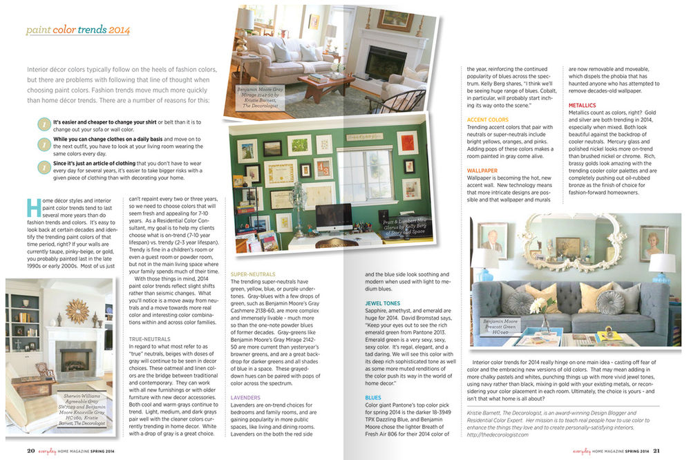
Have you picked up your copy of Everyday Home? It's a new publication that just launched with its Spring 2014 issue. (Candice Olson fans will be thrilled because she's featured on about 25 pages!) And I'm thrilled because I got a little real estate in the article "Paint Color Trends for 2014." Big thanks to my design blogger friend Kristie Barnett, otherwise known as The Decorologist, for reaching out to me to for my color insight. If you haven't checked out Kristie's blog, you really need to. She does a lot of great work in Nashville, TN and specializes in staging, an art all in itself!
"I think, in general, we'll be seeing more saturated hues as well as deeper hues. Some of my clients have been asking me 'Can we go brighter? Can we go darker?' It's been catching me off guard, but I'm thrilled! After the past few years of playing it safe, there seems to be a movement towards bigger color. Color that really says something." - Kelly Berg, Story & Space

You might recognize this bedroom. This photo has had some major mileage! I'm happy to see it published again, although every time I look at it I realize how much I need to get working on my current bedroom, which looks absolutely nothing like this right now.
Anyway, Kristie wrote a great article on paint color trends for the year, sharing her own insight along with mine and David Bromstad's. (I love being in great color company!) Now, if you've been following me for awhile, you know that my general perspective on color trends is that we really shouldn't worry about them when designing our homes. However, that's not to say that we shouldn't pay attention to them and that we shouldn't have a little fun with the "new" colors that we see each season, year and decade. It's important for me, working in color and design, that I understand color trends and am open to using "trendy" colors when appropriate. And, to a certain degree, it's impossible NOT to use trendy colors in design. When we shop at home decor stores we are essentially shopping all trends, colors included.
With that said, I do try to take a more philosophical approach to color trends, rather than focus on colors that are "all the rage" or "must haves". I don't believe that a color should be used in the home just because its trendy. There are other more important reasons to bring new color(s) into your spaces. But using color trend articles and insight like this is helpful for several reasons.
First, we get to learn about designers' perspectives on the colors their clients are gravitating towards. Sometimes these colors will be very similar, pointing to a bigger movement culturally, as different colors have different symbolic meanings. A movement towards ravishing reds carries a very different meaning than a movement towards pale beige.
Second, we also get exposure to differing color perspectives. While we may see huge similarities with some color trends, simultaneously we can also see smaller micro-trends that can vary tremendously both regionally and globally.What's popular in one region or country, might be quite a bit different from what's happening in another region or country, depending on the cultural, social and political influences at that time.
And, last... the super fun part of all this color trend talk?
We get exposure to new ways of using the same old colors. Because really, no individual color is ever "new". There's no color that's "never been used before." No color that's "never been seen before." (Ok, maybe there is if we start to get super scientific...like the color of microwaves or gamma rays or something else beyond the visible spectrum, but we'll save that for another conversation. And I won't be leading it, so I'm taking volunteers. Anyone?)
Color is all the same as it ever was. But maybe it's new to us, in the moment. And sometimes we need reminders to have fun with color again. Color trends can do that. And talking about color - keeping it at the forefront of our day-today conversations - is beyond important. It's what keeps color alive.
If you need a color consult, I'm here to help. Send me an email at kelly@storyandspace.com or give me a call at 650.867.3896. And I promise not to talk about gamma rays.
How to Select Paint Colors for a Mountain Cabin - Part II

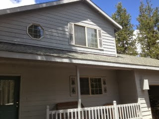
A few years ago I worked with my brother on the exterior colors of his mountain cabin in Twain Harte, CA. Then I blogged about it. Turns out, this has become one of my most popular blog posts! And when Deanie from Oregon came upon the story, she did more than read it. She took those colors and painted them on her very own mountain cabin...with some pretty fabulous results.
"Hi Kelly.
I had emailed you earlier in the summer about using your mountain cabin colors for a house we have in Bend, OR. I decided to go for it and I couldn't be happier! We needed new siding and we decided to push out the front porch too. While looking for color inspiration I came upon your post and was sold! The house needed to look more like a mountain cabin and less like a unmemorable suburban house. The builder working in it was extremely hesitant, but I was confident! He now has changed his tune and loves the colors! Here is the before and I'll send the after... Thanks again for your inspiration!!!"
- Deanie S.
Here's Deanie's before and after:
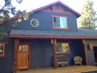
And here's my brother's cabin:

I think it's kind of fun to see the same colors applied to a different structure! I also thought it'd be fun to ask Deanie a few questions on her paint selection process. I sent her a long list and she was kind enough to answer my questions thoroughly and thoughtfully. Thanks, Deanie!
Q} How long have you owned your cabin?
We bought the house about 8 years ago and we rented it out yearly for the first 4 and we've used it for ourselves as a vacation house for the past 4 years.
Q} What prompted the new paint job?
The house was built in 1993 and is a pretty standard "suburban" type house...not very interesting architecture at all. We needed to replace some damaged siding on two sides of the house and the house needed painting also, so we thought it would be a good opportunity to make some other exterior changes.
Q} What were you hoping to achieve through color?
We really wanted to change the look of the house completely. It was a house that you could drive by and not really notice at all. It also looked like it belonged on any suburban neighborhood street, not in a mountain vacation community. The houses across the street from us have the Deschutes River right behind them and they are million dollar homes with a lot of great architecture and character. Some are beautiful log homes with slate roofs or cedar shake with dark green trim. Our house just didn't fit. We wanted to make the house look more like a cabin and more like it fit with the other homes look and feel without it costing a million dollars! :)
Q} Was it difficult to find a palette?
Yes!!! We worked with a builder who was helping us with the design elements like adding the cedar shingles on the top gable, adding braces, and enlarging the front porch. I'm sure in his line of work, it is better to go safe, but safe would have defeated some of the purpose of this project....completely changing the look! He was trying to steer us very safe with very neutral, I thought boring, colors. I had first been thinking of a cottage red, but I ended up thinking the house is a little too big and didn't have the right architecture for a cottage red.
Q} What process did you go through to find the "right" colors?
I have a Benjamin Moore color wheel that I've had for years and I've used for the interior of the Sunriver house and my house here in Washington. I pretty much carried it with me and drove around neighborhoods I liked comparing colors. I spent a lot of time on Houzz looking at cabins and craftsman type homes looking at their color selections. I also bought about $150 worth of samples from Benjamin Moore and had a big piece of plywood in the garage that had all my choices on it...but I still wasn't really inspired by any of the colors.
Q} What eventually led you to my blog post? What was it that intrigued you about this particular color palette?
I knew I wanted to go dark and rich for the colors and felt that it would make the house feel more substantial and give it more character. Besides Houzz I hadn't looked online and didn't really know where else to look. Then I just thought about what I wanted the house to look like and even thought it didn't look like a mountain cabin now, that is what I wanted it to look like, so I just typed into Google "Colors for a Mountain Cabin"...and I think your post was the first thing that popped up! And WOW! I knew it was perfect right away! I showed my husband and he really like it too! We really wanted some cedar accents and so the front door was also exactly what we wanted too! And since I had the Benjamin Moore paint wheel, I could look at the colors right away and I went down and got samples.
The interior is all Benjamin Moore too, Solitude (blue/gray) on a couple of walls and Pale Celery (soft creamy yellow) with red and green accents, so I also was excited about how the exterior would complement the interior.
Q} You had some initial resistance from others to the color selections. What were the big warnings and fears?
I brought the paint samples down to Sunriver in July and painted one big section and of course next to the faded, washed out gray/blue that the house was, the French Beret looked REALLY dark! As I said, the builder wasn't confident and seemed to be afraid that with the Hot Apple Spice trim was going to make it look "gingerbread-ish". He was still trying to steer us toward tans and beiges.
Q} What made you eventually "go for it"? How did you find the confidence to trust yourself?
I just knew myself and I knew that I would really regret it if I just went the safe route. My husband said,
"What's the worse that could happen? We don't like it? We don't like it now and it's a light color and even if we don't like it after, at least it won't be the same and it probably can't be any worse!"*
And we were paying a lot of money to make the house look very different, I would have been disappointed if we had paid all that money and just have it look a little different, so I just thought "What the hell...Go for it"! The builder absolutely LOVES the colors - the neighbors LOVE it, and we LOVE it! It achieved exactly what we wanted! The house looks like a mountain cabin now! The colors are rich and masculine and fit so well with the neighborhood and with the dark green evergreens and the rusty, red volcanic dirt of the high desert area.
(*I love this! What a smart man. It's the truth, right? )
Q} What would you recommend for others who are searching for the perfect exterior colors for their mountain cabin?
That you go outside of the box for a mountain cabin. I wouldn't have painted my house in Washington those colors. We have a farmhouse style house here with dormers and a big covered front porch. The house is white with green trim and fits perfectly the type of house it is. With a cabin, or a house that you are trying to make look cabin-ish, I really like the dark, forest-y colors that actually blend in better than light colors in those surroundings.
Five Arguments for Painting Your Room First
Another rule that I hear often is that you should always paint your room last. Again - I don't necessarily think this is bad advice, except for the word "always". Yes, it can be a good idea to select your paint color after everything else. The biggest argument for this "rule" is that paint color choices are infinite, whereas sofas, rugs, and window treatments are only available in a limited color supply. By saving your wall paint selection for the end, you won't be limited by any particular color or colorway. However, this approach to a room's design can lead to color becoming an afterthought. Something that is selected just because it goes with everything else, as opposed to a hue that is consciously vetted for is distinct mood, characteristics and our personal relationship with it.
I actually think it can be a very smart design approach to paint your room first. Before any other major design decisions are made. Not always, but it can be. And here's why:
Five Arguments for Painting Your Room First
If you are struggling with a hundred other decisions in the design of a space, start with the paint color. This selection will help you make other decisions because you've created a constant. Something to refer back to with all your other color and design decisions. Yes, you are sort of taking a leap because...oh my god, how will you know that you'll be able to find furniture that will go with your wall color after you've painted? What if you can't find anything? Then what - will you have to repaint? Maybe. Maybe not. But try to calm down and trust that it will all work out. And if you do have to repaint, remind yourself that it's not the end of the world. At least you got started!
If you need help selecting the perfect colors for your space, call me or email me. I can help.
650.867.3896
kelly@storyandspace.com
2. You Found a Color You Love
You've had your eye on a room you pinned to Pinterest for about a year now. You are obsessed. There is nothing you want more than to paint your room that color. Paint it. You will be happy. Yes, you will have to hunt and test a few colors to create the right version for your room and your lighting conditions. You might even need to hire a color expert to consult with to achieve that very particular look and mood that makes you drool. But once you do you will wonder what took you so long. And instead of staring at your computer screen admiring someone else's color, you will be admiring and living in your own beautiful space. Take that, Pinterest!
3. You Want to Create a Very Particular Mood
Maybe it's a moody Mad Men-esque office. Or a dainty, feminine powder room. Paint color is the strongest player in the mood game. Use it first. Get that mood thing going. Nothing will change the feel of a space more than paint color. Well, maybe a full, tear-down remodel, but then we're comparing apples to oranges. Or reds to oranges. Either way, designing a mood is definitely a reason to select paint color first. And, once again, if you are having trouble equating a mood to a particular color, bring in a color expert. It's what we do.
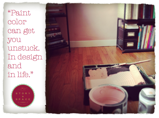
4. You Are Stuck
Maybe you are remodeling. Maybe you just moved into a new house. Maybe you need to buy a few new pieces of furniture. Maybe you're bored. Maybe you just lost your job. Or a boyfriend. Or your mojo. Paint color can get you unstuck. In design and in life. If you don't believe it, try it. Then get back to me. There is magic and power in color. Embrace it fearlessly and I promise you'll get things moving again. You may have to repaint that kooky lime green wall that you thought was a good idea right after you were dumped by what's-his-name, but big deal? It's cheaper than therapy, and the upside is you may come up with a really cool design idea through your broken-hearted artistic angst.
5. You Have Extra Paint in the Garage
Ok - this is probably the last thing you'd expect to hear from me. And I do include this argument with a cautionary warning: don't use a color you don't like just because you have an extra gallon lying around. But do re-use a color if you have an extra gallon lying around AND you still find it beautiful and amazing and it fits the desired mood and function of a space. Here's an example. I had extra paint left over from our previous house. We lived there only a year, and painted six months in. So, we really only got to enjoy the color for about six months before we moved out. When we moved into our new house, I still loved the color and wanted to use it somewhere. We had just enough left over to paint the hallway, so I painted it. It looks great. And I have one less paint can in the garage.
If you need help selecting the perfect colors for your space, call me or email me. I can help.
650.867.3896
kelly@storyandspace.com
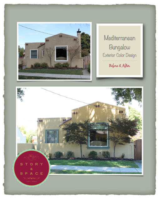
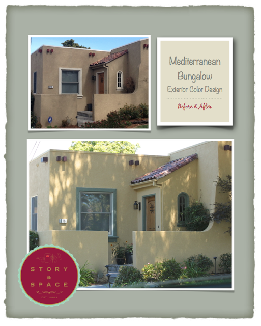
Mediterranean Bungalow: Exterior Color Design Before and After
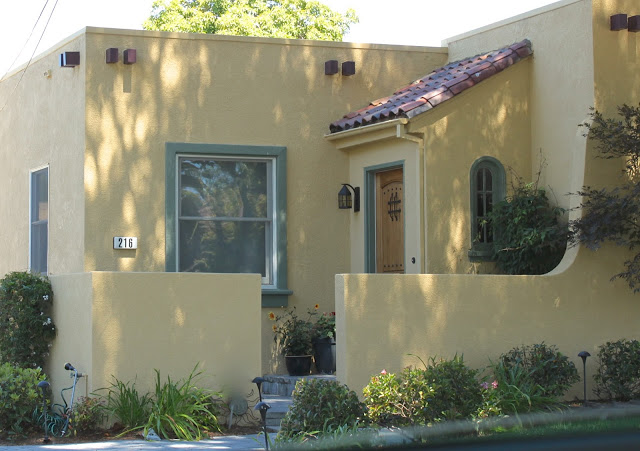
I had the pleasure of working with my clients on their Burlingame home's exterior this past spring. I was in the neighborhood for another exterior color consultation yesterday, and finally swung by to take a few pics. And wow - what a transformation! Sometimes the end result of a project is even better than imagined. I'm hoping to get back to take a few more photos soon. We did some cool color design on the back patio add-on that I can't wait to see. In the meantime, take a look at the before and afters. Goodbye dreary beige box, hello sunny California bungalow!
If you are getting ready to paint your home's exterior and need help selecting colors, call me at 650.867.3896 or send me an email at kelly@storyandspace.com. I can help!
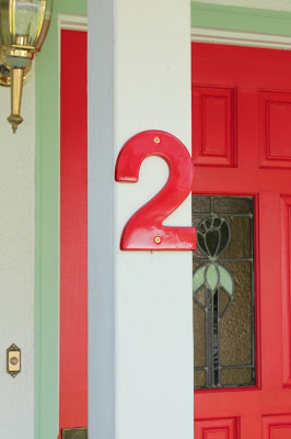
Front Door: Before and After
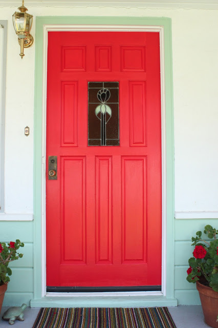
I finally got to painting our front door and siding this past weekend. What a difference, huh? I still have to paint the porch and some trim (and get a new light fixture!!!) but I'm amazed at the transformation already.


I also painted our house number and mailbox.

Ahhh....the magic of color.