My new green dresser was delivered last week...and I'm in love!
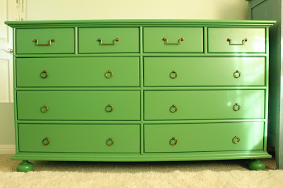


If you happened to read my previous post, you'll know that my dad made this beautiful piece. He's been making furniture and cabinetry for years now, but just keeps getting better and better. I think this is his best piece yet!
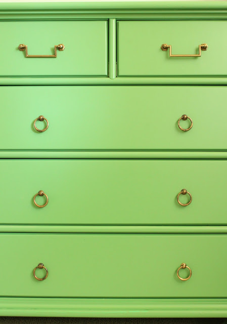
I found the pulls at Belmont Hardware, a local hardware store. This is usually the first stop for me when I am searching for hardware for clients, as they have a really broad selection. I spotted these guys first in a discontinued bin...but there were only four of them.
They were so cool, I was determined to make them work. The dresser has four small upper drawers, so I just needed to find a coordinating pull for the other 6 large lower drawers.
Bingo! Found.
I got all 16 pieces for just under $100. Not bad.
Now, I'm sure you all want to know about the color.
I had been dying to bring a Kelly Green into the bedroom, as that was my alternate choice for the wall color when we painted. Opting for Fleeting Green by Sherwin Williams, which is a lovely but very pale blue green, I needed to introduce some highly saturated colors to bring more energy to the space. "Soft" and "soothing" is just not my thing.
After studying MANY greens in different lights, at different angles (probably even in my dreams), I landed on Benjamin Moore #566. Just the right amount of yellow without being too lime-y.
I just realized today that this color actually has a name, and not just a number. My large paper sample didn't have a name on the back - just "566". And I didn't bother to check the paint deck. This information probably would have saved my dad a big headache, but then I wouldn't be able to share the following color story...
It all started when I told my mom over the phone that I had chosen a color for the dresser.
"I finally chose a color for the dresser. Number 566 by Benjamin Moore," I said.
"Ok. What color is it?" she asked.
"Well," I responded, "it's like a Kelly Green."
"Oh - that sounds pretty. I'll tell your dad."
"Ok, Mom. Number 566. You're writing it down, right?"
"Yes," she said. "I'm writing it down right now."
A few days later my mom sent me photos of the painted dresser. (My dad works at warp speed.) It looked a little more blue-green than I thought it should, but it was probably just a lighting issue.
Pretty, right?
Anxious to clear out the "shop" (aka garage) for other projects, my parents came down to deliver the piece just a few days later. Once I saw it in person, my suspicions were confirmed.
"Ummmm....is this the color I spec'd? Number 566?" I asked, hoping that I was imagining the blue-ish undertones.
"It's 'Kelly Green'," replied my Dad. "That's what your mother told me."
"Yeah, well, the number was 566. It is 'like' a Kelly Green. Did you get number 566?"
"No...I got 'Kelly Green'. When I went to buy the paint, the guy said that Kelly Green and number 566 didn't match. So I got Kelly Green cuz that's what your mother told me."
Uh-oh. Here's "Kelly Green" by Benjamin Moore next to #566, also known as "Bunker Hill Green."
Yeah. Not quite the same. The "Kelly Green" is quite a bit more saturated and has a lot of blue in comparison to the "Bunker Hill" I brought a few of the "Kelly Green" painted drawers into the bedroom to see if I could make it work, but it looked really funky and childlike. I like playful colors, but it was a little too playful.
So, we loaded everything back in the van and I handed my dad the #566 paper paint swatch. We all determined that it needed to be re-painted.
The moral of the story is that it is very important to communicate clearly (to your parents or otherwise) when you are speaking the language of color. Don't tell your mom that a color is "like" a color that might actually exist in a paint deck. And double check to see if your paint color has a coordinating name for its number. And, when in doubt, double check the specs!
Fortunately, it was an easy enough fix (for me, anyway!) and the end product is just beautiful.
Thanks, Dad! Next time we talk color, we'll be a bit more careful.
Does anyone else have a funny color communication story they'd like to share?
If you are ready to eliminate fear from your color and design decisions... please call me at 650.867.3896, or shoot me an email at kelly@artestyling.com to discuss your project.


