Small Bath Remodel: Before and After

IMG_0806.JPG

Last week I popped over to a client's home to take photos of her recently completed bath remodel. Turned out pretty cute, right?

We had a VERY small space to work with, which is pretty common for older homes in San Francisco. We ended up keeping the existing toilet and tub to keep costs down, and it worked just fine. Not all bathroom remodels need to begin with a complete gutting.

Finding a vanity to fit in the small space was tough. The original pedestal sink looked cute, but had no storage. And with this being the only bath for two young kids to share it needed some sort of storage. Fortunately, I found this great piece, only 21" wide, with a bit of a rustic style, and sink included, by Fairmont Designs.

We kept the tile design pretty simple, using a basic white subway field tile in the shower surround, and accenting with some gorgeous marble mosaics by AKDO purchased through Ceramic Tile Design in San Rafael.

The client wanted to add a niche - a great storage option when you have none! - so we took the opportunity to highlight it with more decorative tile. The same tile, in fact, that was used on the floor. Isn't it gorgeous?

The ironic thing is, as soon as the bath remodel was completed my client bought a new house. So, the lucky new owners of this property will get to enjoy the redesigned bath more than my client ever did. Not a loss, though, as we all know that updated kitchens and baths help sell real estate properties and have a high return on investment. 

If you need help with your kitchen of bath design, give me a call or send me an email to discuss your project. Even the smallest remodels can benefit with an hour or two of design guidance. 

fullsizeoutput_269.jpeg
fullsizeoutput_40b.jpeg
Before

Before

After

After

Pratt & Lambert Style & Design Guild

I've got some fun news this Friday. Pratt & Lambert Paints has officially launched their re-vamped Style & Design Guild and I'm honored to be one of the members!

Screen Shot 2014-08-06 at 5.05.31 PM.png

The Style and Design Guild is "a think-tank for the design industry composed of an exclusive team of interior designers, architects, stylists, writers and fashion-forward thinkers who have a shared passion for visual intrigue and for pushing the limits of design."

The other members are: Michael Bagley, Joseph Boehm, Luis Caicedo, Stacy Garcia, Maria Killam, Laura Kirar, Rae McConville, Kate Smith, Asler Valero, Kendall Wilkinson and Eldon Wong. I'm in very good color company!

So head on over when you get a chance. You can check out my favorite Pratt & Lambert colors and my top five design tips, including this one:

 
“Eliminate the need for perfection. It is the enemy of creativity. When we strive for perfection in design we can sometimes overlook the most beautiful solutions. It’s the imperfections of a space that make it feel most like home.”
 

Have a great weekend, everyone.

Everyday Home Magazine: Paint Color Trends for 2014


Have you picked up your copy of Everyday Home? It's a new publication that just launched with its Spring 2014 issue. (Candice Olson fans will be thrilled because she's featured on about 25 pages!) And I'm thrilled because I got a little real estate in the article "Paint Color Trends for 2014." Big thanks to my design blogger friend Kristie Barnett, otherwise known as The Decorologist, for reaching out to me to for my color insight. If you haven't checked out Kristie's blog, you really need to. She does a lot of great work in Nashville, TN and specializes in staging, an art all in itself!


"I think, in general, we'll be seeing more saturated hues as well as deeper hues. Some of my clients have been asking me 'Can we go brighter? Can we go darker?' It's been catching me off guard, but I'm thrilled! After the past few years of playing it safe, there seems to be a movement towards bigger color. Color that really says something." - Kelly Berg, Story & Space 


You might recognize this bedroom. This photo has had some major mileage! I'm happy to see it published again, although every time I look at it I realize how much I need to get working on my current bedroom, which looks absolutely nothing like this right now.

Anyway, Kristie wrote a great article on paint color trends for the year, sharing her own insight along with mine and David Bromstad's. (I love being in great color company!) Now, if you've been following me for awhile, you know that my general perspective on color trends is that we really shouldn't worry about them when designing our homes. However, that's not to say that we shouldn't pay attention to them and that we shouldn't have a little fun with the "new" colors that we see each season, year and decade. It's important for me, working in color and design, that I understand color trends and am open to using "trendy" colors when appropriate.  And, to a certain degree, it's impossible NOT to use trendy colors in design. When we shop at home decor stores we are essentially shopping all trends, colors included. 


With that said, I do try to take a more philosophical approach to color trends, rather than focus on colors that are "all the rage" or "must haves". I don't believe that a color should be used in the home just because its trendy. There are other more important reasons to bring new color(s) into your spaces. But using color trend articles and insight like this is helpful for several reasons. 

First, we get to learn about designers' perspectives on the colors their clients are gravitating towards. Sometimes these colors will be very similar, pointing to a bigger movement culturally, as different colors have different symbolic meanings. A movement towards ravishing reds carries a very different meaning than a movement towards pale beige. 

Second, we also get exposure to differing color perspectives. While we may see huge similarities with some color trends, simultaneously we can also see smaller micro-trends that can vary tremendously both regionally and globally.What's popular in one region or country, might be quite a bit different from what's happening in another region or country, depending on the cultural, social and political influences at that time.

And, last... the super fun part of all this color trend talk? 

We get exposure to new ways of using the same old colors. Because really, no individual color is ever "new". There's no color that's "never been used before." No color that's "never been seen before." (Ok, maybe there is if we start to get super scientific...like the color of microwaves or gamma rays or something else beyond the visible spectrum, but we'll save that for another conversation. And I won't be leading it, so I'm taking volunteers. Anyone?) 

Color is all the same as it ever was. But maybe it's new to us, in the moment. And sometimes we need reminders to have fun with color again. Color trends can do that. And talking about color - keeping it at the forefront of our day-today conversations - is beyond important. It's what keeps color alive. 

If you need a color consult, I'm here to help.  Send me an email at kelly@storyandspace.com or give me a call at 650.867.3896. And I promise not to talk about gamma rays.

Marin Home Magazine: Make the Most Of Your Space

Hello! How is everyone this beautiful Friday? The sun is shining here. The birds are chirping. And business is BUSY. It is definitely the season of home improvement.

I'm happy to share

my latest article

in Marin Home Magazine on space planning. The digital issue just came out on Tax Day (hopefully some of you are getting refunds???) and local peeps should see the print version in their mailboxes any day now. 

If you're struggling with space planning challenges - for a Great Room or any room -  this story's for you. So head on over and take a peek. There's lots of other good stuff in the magazine, too! And don't forget - I offer space planning as one of my design services. So if you need some help getting out of a layout rut, give me a call. I just might be able to help you see your space differently.

Tips for Using Radiant Orchid and Exclusive Plum: My Full Interview with Better Homes & Gardens

I haven't yet weighed in on the whole Pantone Color of the Year thing. And to be honest, I wasn't sure if I had too much to say about it. But, apparently I did back in January 2012 when Better Homes and Gardens interviewed me about violets! I was doing some file purging on my computer this past week and was kind of excited when I realized how ahead of the color game we were. Kudos to BHG for featuring a hue that was just a hair before its prime. (See the orchids in the styling? Kinda makes you wonder where Pantone gets its inspiration...)

In case you have been living under a color-deficit rock, Pantone crowned Radiant Orchid as the official 2014 Color of the Year in December. And shortly after that, paint giant Sherwin Williams officially named Exclusive Plum as their own Color of the Year.

There are many opinions floating around out there on these hues. Some love them, some are haters. I like to look at the colors of the year as more of a concept, rather than actual specific paint suggestions. And, as a concept, I think violets are gorgeous. I've actually found violets, in general, to be extremely popular with my clients for at least the last five years. I've been spec-ing different variations of them for exteriors and interiors, as well as bathroom and kitchen tile! I wonder if I'll be getting more requests - maybe bolder requests - in the near future. I'll be sure to keep you posted.

In the meantime, I'd love to share the full Q&A I did with Better Homes and Gardens for their January 2012 issue. Enjoy!

Oh, and to clarify, the BHG color story was focused on red-violets. Radiant Orchid falls in the red-violet category, while Exclusive Plum falls more in the blue-violet category. A quick color lesson: the red-violets tend to read a little sweeter, warmer and more feminine than the blue violets. Not always, but it's a pretty good rule of thumb.

Q} For each color represented on a lid, tell me how you’d use it in a room and what color(s) it pairs well with?

A} "Purple Davenport" (deepest red-violet): 

Love the idea of a bed or bath painted in this hue. It could be used in place of more traditional reds, perhaps in a dining room or a front door. Also could be as an accent color in pillows, upholstery fabric and drapery. 

Pair with:

Buttery creams or warm, pale greys for a more sophisticated palette. Black, dark browns, grays and even indigo blues for a more mysterious effect. Other equally saturated hues such as turquoise, jade, grass-y or limey greens, golds and oranges for a playful, energetic look. 

Bath Materials Design board by Story & Space for BHG's digital edition

"Mouthwatering" (bright berry violet)

 Would be stunning in a bathroom or entryway. It’s pretty potent, so use it in a space where you want to get attention. As an accent, like "Purple Davenport", would be lovely in pillows, upholstery and drapery. 

Pair with:

Whites, greys and blacks for a more graphic, contemporary feel. Like "Purple Davenport", could also be paired with any of the equally saturated hues listed above. Would look amazing with deep charcoal greys which would bring an edge of sophistication and mystery. Also a good match for creams which could soften this boisterous hue.

Inspiration Board by Story & Space. Violets and Navy = yum!

"Sweet Surrender" (nearly-white violet) :

Could be used as trim and ceiling for a room in painted in "Purple Davenport" or "Mouthwatering".

Pair with:

Because this hue is so pale, it can handle being layered with other deeper red-violets...and even truer reds. For a softer effect that doesn’t go too girly, use it with pale silvery greys. 

"Spangle" (dusty pale violet):

Beautiful hue for anything silk or linen. A duvet in this color fabric would be heavenly.

Pair with:

Would work well, like the others, with blacks, whites, and greys.  Also could work with very pale olive greens or khakis, which ground this heavily scented hue.

Color Design project by Story & Space. Violets layered with greens.

Just a touch of violet in these greys. Color Design by Story & Space.

"Storybook Charm" (mid-tone dusty violet):

Fun color for a laundry room. Also could work as trim and ceiling color for a room in 

"Purple Davenport" or "Mouthwatering".

Pair with:

  Like "Sweet Surrender", this hue can also be paired with other red-violets. It would also look stunning with the deepest blue-violets and smokey taupes. 

"Red-violets aren’t just for girls. The deepest of these hues can be mysterious and powerful."

Q} What mood does violet set? 

A} This particular group of hues is comprised of red-violets, as opposed to blue-violets which means that they have more of a red undertone. This inherently makes them warmer-feeling than their blue-violet counterparts. 

Each of these hues will provide a very different mood when painted on all four rooms of a space. "Purple Davenport" would create a somewhat rich and mysterious space that wouldn’t necessarily read as feminine, depending on what colors and textures it is combined with. "Storybook Charm", on the other hand, lends itself to a softer much more feminine feel. "Mouthwatering" is red-violet with a little spunk. It is a fearless hue, for sure. This paint color would have a candy-like presence with a sweetness you can almost taste. "Sweet Surrender" is the softest of the group, with just a shimmer of red-violet. A room painted entirely in this hue feel like a whisper of pink...soft and romantic. "Spangle" might look dainty, but get it up on all four walls and it’s no shrinking violet. Like the other lighter hues, it is sweet and romantic, but it would also have a strong presence. This is by far the girliest hue of the bunch.

Kitchen Design by Story & Space. This client went bold with the backsplash - so much fun!

Q} How can you make violets look less girly?

A} We all have very complex psychological associations with colors -not just violets - that are based on our cultural upbringings, amongst other things. Although there is an inherent sweet and floral association with many of these red-violet hues simply because they are the color of familiar flowers, much of our perception of red-violets is taken from what we’ve learned over time. Violets weren’t always associated with girly-ness. Purple was, and still is, a color of royalty. Red-violets can be very powerful and mystical...it just depends on the exact hue we are referring to. 

With that said, color is never viewed in a vacuum. That means that we experience a color with everything else that surrounds it. When we use a paint color on the walls of a room there are always other design elements that come into play and affect how we perceive that hue. To keep a red-violet room from becoming “too girly” it’s important to consider the other colors and textures in the space. Adding lace, dolls, floral fabrics and more red-violets to an already “lilac” room is only going to emphasize the girliness. 

"The palest red-violets are like a sweet, fragrant whisper, while the deepest shades are a symphony for the senses."

To create a less girly space, it’s important to bring in elements that are inherently less girly. Black and white photography, industrial inspired decor, streamlined furniture designs are just a few ideas on how to tame the romantic quality of red-violets. Also, pairing red-violets with colors that are not perceived as feminine, such as greys, blacks, browns, deep blues, etc, can help combat that girly feel.

This client took a deep eggplant-y violet accent from inside to out. Color Design by Story & Space.

Q} What tricks are there for using violets? Does a little go a long way with the richer shades?

A} The deeper shades of red-violet are actually less feminine and, in my opinion, easier to decorate with. The deeper the hue, the less sweet and romantic they are. The lightest tints of red-violets read as the most delicate and feminine, whereas the deepest shades read as more powerful and masculine. They also read more passionate. I would suggest to anyone painting their walls in these hues who is trying to steer clear of a romantic effect to go deeper in value. 

Look closely - that's a deep red-violet on those pillows! Color Design by Story & Space.

Q} How can you make lilacs/violets/purples more livable? 

A} I think the first thing to do is to eliminate that assumption that they aren’t livable. And the idea that violet/lilac/purple is one hue. There is a huge range of violets, and, like any other hue, different variations create entirely different moods and effects. Next thing, remember that colors do not live in a vacuum. These red-violets can look very different depending upon what colors and textures they are paired with. Think about the overall mood you are going for in a space and then select a violet that supports that mood. Sophisticated and mysterious can be achieved using red-violet just as well as sweet and romantic can. 

Q} What rooms are they best used for?

A} They can be used in any room. Depends on what mood you are trying to create and what specific red-violet is being used. Also depends on your personal preference, color tolerances and psychological associations. I wouldn’t ban or promote violet for any particular space.

This client went violet all the way! Bath Design by Story & Space

Q} Is it a trendy color? Classic? Timeless? What tricks are there to giving it longevity?

A} Any color can have longevity as long as it speaks to you. If you love violet, use it. If you don’t love it and you are using it simple because it’s trendy, it won’t have any longevity. 

"Think red-violets aren’t versatile? Think again. While the softest tints speak of romance and sweetness, the deepest shades are rich and powerful."

Will you be using Radiant Orchid or Exclusive Plum...or any other variation of violet in your home this year? Are you inspired, or ready to move on already?

When Life Happens...


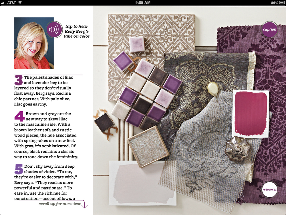
I've been writing this blog post in my head for a long time. And the fact that I never officially wrote it is the main reason I haven't been writing much at all. I mean, how do you write about anything authentically when there's this big Radiant Orchid elephant in the room?

So here goes. Time to get some crap off my chest. This won't be about design, so if that's what your looking for today, my apologies. Come back next year. I'm hoping once I take care of this little order of business I'll clear up some room to create more of what I love. But the truth is, life and design are not mutually exclusive. You cannot create independently of life. So, in my effort to compartmentalize my business and career from my personal life, I've actually shut down most of my ability to be creative. Again, my hope is that by opening up in this way, I can open up in all ways.

My dad was diagnosed with esophageal cancer in April. It was the most crushing piece of information I have ever received. My world stopped. I froze. I couldn't breathe. I couldn't move. I could not believe. But, it was true. And once I started breathing again I felt. I felt and I felt. And I cried.


My dad received chemotherapy and radiation treatments for about 5 months. He handled the treatments ok in the beginning, but towards the end the radiation the side effects were brutal. He couldn't move. He couldn't mow the lawn. He couldn't do anything. It was very difficult to see him that way, because my dad is such a do-er. He is always doing something. He's building. He's cooking. He's fixing things around the house. He's always doing something. It's what makes him happy.

At the end of September he had a clear scan. The cancer treatments had destroyed the tumor. While my husband and I were out of town for a memorial we got the news. We both sobbed with joy. It was just the kind of news we needed while we were grieving the sudden loss of my husband's dear friend and mentor. (I know, right? Enough already.) It meant my dad was healed - for now. It meant that he didn't have to have his esophagus removed or ask the question, "what next?" It meant that, for now, we could all take a big sigh of relief.

For now.

Funny thing about chemo and radiation is that it has a very dark side. Yes, it cleared the cancer. But it caused my dad to lose a good portion of his hearing. And it also affected his heart.

A couple of weeks ago, my dad started having an irregular heart rhythm, shortness of breath, and fatigue. He was hospitalized for a night. Not a fun call to receive. My world stopped all over again. But he was released and prescribed a few meds to fix the issue. Well, then it happened again. Changed the meds. And then, again. Only this time it was different. His heart almost stopped. He had cardiac tamponade, where the fluid around the heart basically squeezes the heart and shrinks it down to a point where it doesn't provide blood to the body. Not unlike a heart attack. He had an emergency procedure to drain the fluid around the heart, but if that procedure wasn't done in time he would have died. He would have died. I've said those words again and again, and it still doesn't seem real. But that's exactly what happened. I mean, how can I write a blog post on Pantone's 2014 Color of the Year while this is happening? How can I possibly care what fabric my client uses on his sofa? Or how many new likes I have on Facebook?

My dad stayed in the ICU for five days. He was released on Tuesday. That's the good news. And some more really good news is that they tested for the presence of cancer and it was negative. The bad news is that the cardiac tamponade could happen again.

I spent the afternoon in the cardiologist's office yesterday. This was not my original plan. I have work to do. I have Christmas gifts to buy. I have business plans to make for 2014. I have writing to do. I have a home office that badly needs to be decorated. I have a dog to walk. I have to be creative. I have to be social. I was going to make cookies. I was going to send out holiday cards to my clients. I was going to make some more Shiny Brite wreaths. I have floor plans to draw. And emails to send. And color and design stories to post on social media. Oh - and I had some great vintage holiday articles and crafts I wanted to share. (You may get those in July...)

But right now, all I can think about is my dad. And I just want him to be healthy.

I know that life goes on. Regardless of what happens, life does go on. And it's so important to create and spread joy, despite what may or may not be happening around you and in you. But it's also important to give your grief and your sadness a voice. And that's what I'm trying to do. I want to be so many things - so many positive things. And I want to share that positivity on this blog. Writing about my dad just seemed like such a downer. And, really, lots of people have cancer. Lots of people go into the hospital. I'm not experiencing anything more "special" than anyone else. I know that.

But, I also know that this has become too big for me not to write about.

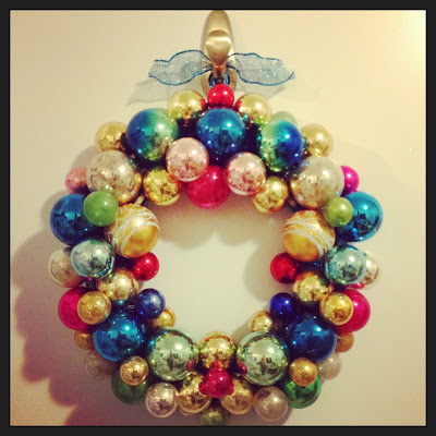
The designer and business person in me is sooooooo frustrated right now. Life has happened...IS happening...and it seems to be leaving me in the dust. I feel so far behind, and, quite honestly, a little down on myself about what I haven't been able to do. The photo above is a Shiny Brite wreath I made somewhere in the madness of the last couple of weeks. I was planning a fun little blog post about it with some instructional photos, but it just stopped mattering. So you get a photo. One photo. Of a wreath made of Shiny Brites.

I also styled the house somewhere in the madness. I have no energy to take photos and share them. But maybe it's enough to tell you that it's styled?

I keep hoping to bounce back. I've done it before. I've been an emotional rubber band this year. After the shock and the sadness, the resilience kicks in. But the bounce back rate is slowing. It's taking me longer this time. It's difficult to go back to "normal", whatever that is anymore. Or maybe that's not the point.

My dad may be just fine. He may recover from all of this fully and completely. He may not. That's the big question mark in my life right now. Learning to live with question marks has never been an easy thing for me to do. I like to wrap things up in perfect little packages and have answers for everything. Then I can move onto the next puzzle. The next project. The next challenge. Somehow I now have to figure out how to move forward and through everything while this thing is not wrapped like I want it to be. I keep wrapping it, and it keeps coming unwrapped. I keep trying new paper and bows and ribbon and tape - I even tried staples! - but it won't stay wrapped.

What a metaphor for the holiday season, huh? My dad is a package that won't stay wrapped.

So, maybe I need to stop trying to wrap him. And everything else. But I'm a designer! That's what I do. I essentially - metaphorically- wrap packages for a living. Even writing is like wrapping a package. Ugh.  I just may be doomed.

With that said, if I have any useful advice to give anyone this holiday season, it would be to slow down. Just slow down. Step away from social media (which I find extremely depressing right now with everyone's happier than happy posts), and just live in the moment. Your moment. If that moment is happy, great. If it's sad, that's ok, too. Feel what you feel. And let life happen. Because it's going to happen whether you can wrap it in a perfectly beautiful little package or not.