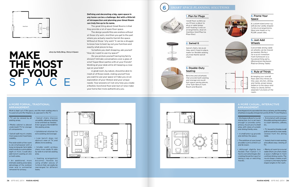
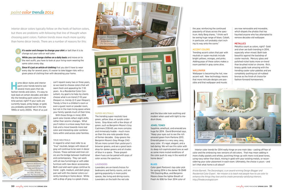
Have you picked up your copy of Everyday Home? It's a new publication that just launched with its Spring 2014 issue. (Candice Olson fans will be thrilled because she's featured on about 25 pages!) And I'm thrilled because I got a little real estate in the article "Paint Color Trends for 2014." Big thanks to my design blogger friend Kristie Barnett, otherwise known as The Decorologist, for reaching out to me to for my color insight. If you haven't checked out Kristie's blog, you really need to. She does a lot of great work in Nashville, TN and specializes in staging, an art all in itself!
"I think, in general, we'll be seeing more saturated hues as well as deeper hues. Some of my clients have been asking me 'Can we go brighter? Can we go darker?' It's been catching me off guard, but I'm thrilled! After the past few years of playing it safe, there seems to be a movement towards bigger color. Color that really says something." - Kelly Berg, Story & Space

You might recognize this bedroom. This photo has had some major mileage! I'm happy to see it published again, although every time I look at it I realize how much I need to get working on my current bedroom, which looks absolutely nothing like this right now.
Anyway, Kristie wrote a great article on paint color trends for the year, sharing her own insight along with mine and David Bromstad's. (I love being in great color company!) Now, if you've been following me for awhile, you know that my general perspective on color trends is that we really shouldn't worry about them when designing our homes. However, that's not to say that we shouldn't pay attention to them and that we shouldn't have a little fun with the "new" colors that we see each season, year and decade. It's important for me, working in color and design, that I understand color trends and am open to using "trendy" colors when appropriate. And, to a certain degree, it's impossible NOT to use trendy colors in design. When we shop at home decor stores we are essentially shopping all trends, colors included.
With that said, I do try to take a more philosophical approach to color trends, rather than focus on colors that are "all the rage" or "must haves". I don't believe that a color should be used in the home just because its trendy. There are other more important reasons to bring new color(s) into your spaces. But using color trend articles and insight like this is helpful for several reasons.
First, we get to learn about designers' perspectives on the colors their clients are gravitating towards. Sometimes these colors will be very similar, pointing to a bigger movement culturally, as different colors have different symbolic meanings. A movement towards ravishing reds carries a very different meaning than a movement towards pale beige.
Second, we also get exposure to differing color perspectives. While we may see huge similarities with some color trends, simultaneously we can also see smaller micro-trends that can vary tremendously both regionally and globally.What's popular in one region or country, might be quite a bit different from what's happening in another region or country, depending on the cultural, social and political influences at that time.
And, last... the super fun part of all this color trend talk?
We get exposure to new ways of using the same old colors. Because really, no individual color is ever "new". There's no color that's "never been used before." No color that's "never been seen before." (Ok, maybe there is if we start to get super scientific...like the color of microwaves or gamma rays or something else beyond the visible spectrum, but we'll save that for another conversation. And I won't be leading it, so I'm taking volunteers. Anyone?)
Color is all the same as it ever was. But maybe it's new to us, in the moment. And sometimes we need reminders to have fun with color again. Color trends can do that. And talking about color - keeping it at the forefront of our day-today conversations - is beyond important. It's what keeps color alive.
If you need a color consult, I'm here to help. Send me an email at kelly@storyandspace.com or give me a call at 650.867.3896. And I promise not to talk about gamma rays.