Crafty 3M Command Project #2: Memory Party Game with Vintage Postcards

flickr
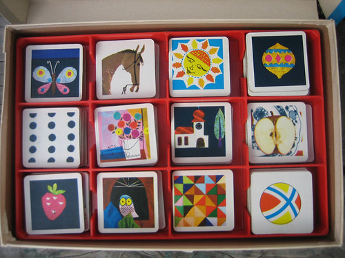
For my second project using 3M Command hooks, I designed a wall mounted "Memory Party Game." I used to LOVE this matching game as a kid. Here's the version I remember playing:
I adore the artwork! I think I'll have to buy myself a set on Etsy or something.


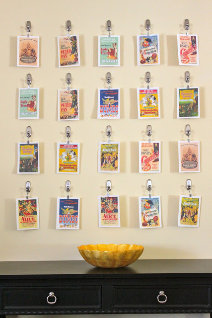
For my project, I wanted to make something a little larger in scale so it truly could be a party game. I also thought by bringing it to the wall, instead of playing on the floor or a table top, the game would be more out of the way, and could also be left up after the party is over as a funky piece of artwork.

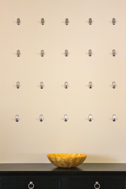
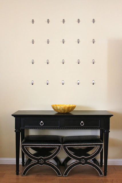
Wall Before
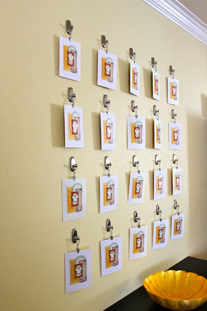
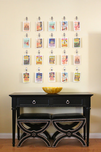
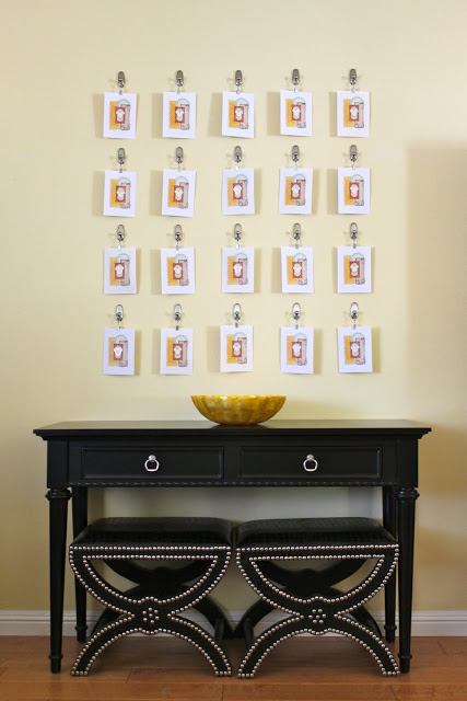
Wall After

Want to make a Memory Party Game yourself? It's easy. Here's how:

Memory Party Game with 3M Command Hooks

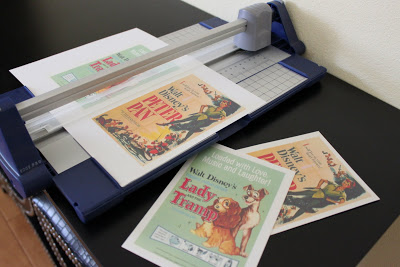
I began with some vintage postcards that I picked up at an...you guessed it...estate sale. I made two copies of each postcard and trimmed them to equal sizing.


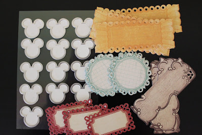
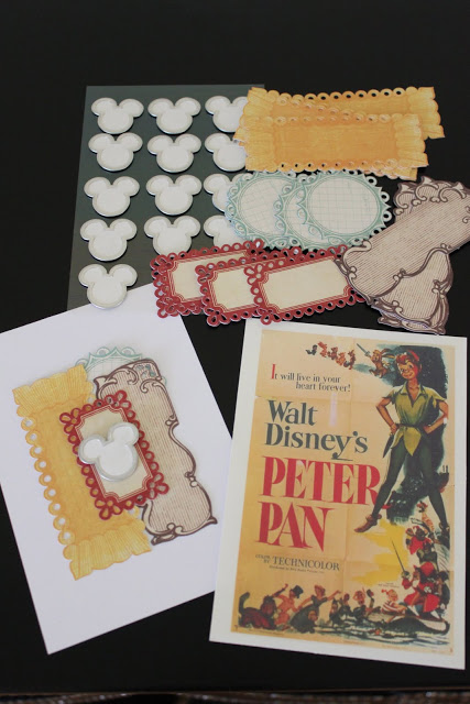
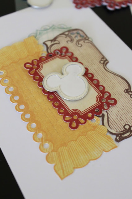
Because I made copies, the back side of each postcard was just a boring old white. I picked up some crafty scrapbooking supplies at Michael's to jazz them up. 


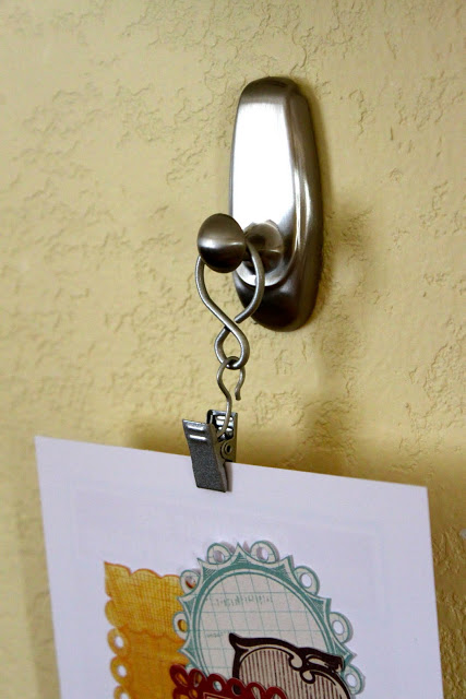
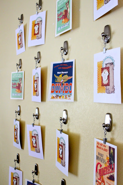
 Then I adhered 20 hooks to the wall in a grid pattern.

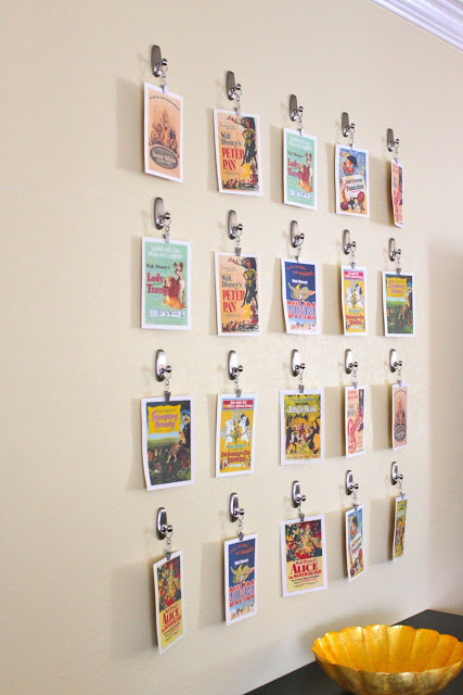
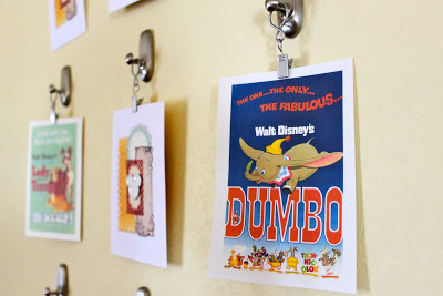
I clipped each postcard with a curtain clip and hung them on the wall.


Here's the backside of all the cards. This is how you would begin the game...


And here's the front side, after all the cards are turned over.


And here's my instructional video where you get to see me in live-action mode!


(Disclosure:  I worked with Command Brand by 3M on this project. They kindly supplied me with the necessary Command products as well as monetary compensation for my work. I am not in partnership with Command Brand by 3M nor am I any sort of official spokesperson for their products. However, I genuinely am a big fan of the damage free hooks and highly recommend them for many applications.)

Crafty 3M Command Project #1: Vintage Hat Display


Back in December 2010 I entered 3M Command's "Take Command of Your Space Contest" and was a winner with my Jewelry Wall Art Project. Believe it or not, the project is still in one piece and I still love it! It's by far the best way I've ever organized my jewelry.

A few months ago I was invited to create three more projects using 3M Command products. After much brainstorming and a bit of creative space planning (I'm moving right now, so wall space is hard to come by!), I landed on three projects that I hope you'll find fun, useful and inspiring. 3M Command products are ingenius (and I'm not just saying that because they are paying me.) I absolutely LOVE these products. Their uses are only limited by the imagination. Let me tell you, once I got going, it was hard to edit my ideas down to just three. (You reading this Command? I've got more!!)


Here's project #1...

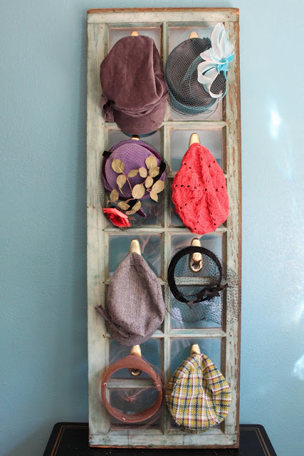
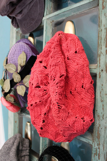
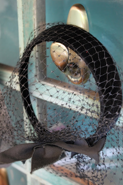
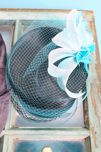
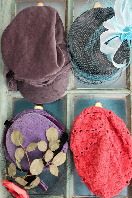
Hat Display with 3M Command Hooks

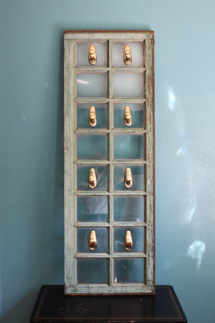
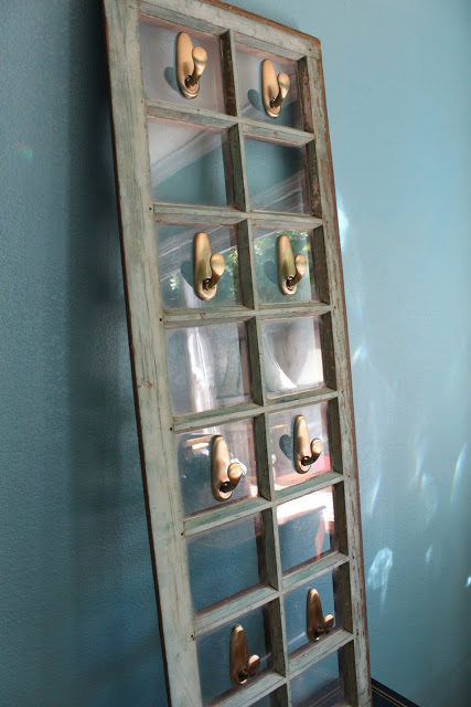
Step 1: Pick up an old window at an estate sale, salvage yard, dumpster, etc.

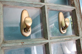
Step 2: Secure 3M Command Metal Hooks to glass panels. (Hooks shown - Large Antique Brass) 

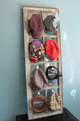
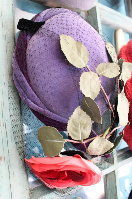
Step 3: Hang hats


And here's my instructional video:


Hope you enjoyed this project! Stay tuned for two more...

(Disclosure:  I worked with Command Brand by 3M on this project. They kindly supplied me with the necessary Command products as well as monetary compensation for my work. I am not in partnership with Command Brand by 3M nor am I any sort of official spokesperson for their products. However, I genuinely am a big fan of the damage free hooks and highly recommend them for many applications.)

Bedroom Makeover: A Few Small Changes Create a Brand New Look

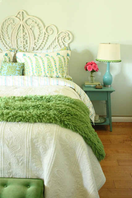
Last spring, my bedroom underwent a bit of a makeover. It took about a year, but after a very painful deliberation process, I landed on its new wall color - Sherwin Williams' Fleeting Green.

Well, the bedroom now has received a mini-makeover.  Though the paint color remains the same, a few tweaks in the accessory department awarded me a brand new look. 

I could tell you that this makeover happened over the weekend, but I'd be lying. It's been a gradual process, starting with the introduction of this amazing dresser that my dad built last October.

Then we had new hardwood floors installed, one of the more positive outcomes of a burst kitchen pipe.

I picked up a few new bed linens a couple of months ago, including the crazy, furry green throw which has acquired the nickname "The Magic Woobie" due to its incredible healing powers. (It's amazing how a soft, cuddly throw can somehow make you feel better on really crappy days.)

I also gave the table lamps a little love with some green pom-pom trim and a few squeezes of fabric glue. 
 
I scored this green velvet upholstered bench at a recent estate sale for $30. Let's just say I was pretty excited that day. Major shopper's high.

Here's the before and after. 

Now, there was nothing really wrong with the before. I still adore the turquoise and yellow color combination and might go back to it at some point. But sometimes we need a change. Sometimes before and afters aren't about what's better and what's worse. Sometimes a before and after merely reflects the evolution of a space as we move through our lives. So for now, I will make a conscious choice not to judge and compare and analyze every little detail and just enjoy the space that it is today, knowing that when I'm meant to evolve it will evolve right along with me. 

If you need help with your design evolution, please call me at 650.867.3896, or shoot me an email at kelly@artestyling.com to discuss your project.
The Top Five Most Useless Interior Design Terms


There are a lot of terms that get thrown around when people discuss design. Many of these terms are necessities in the design process - communicators of what a space should look like, how it should feel and what sort of function it should perform. Other terms are completely meaningless. Their very existence relies upon an extremely passive approach to design, creating a mindless vortex in which we all can get sucked into if we aren't careful.

I'm not going to lie. I've been guilty of using these terms from time to time when speaking to design. But the more and more I see the following descriptors getting tossed around like croutons on a salad, the more and more I have begun to despise - yes, despise - these words and what we're supposed to think they mean. Why such strong feelings towards such seemingly harmless groupings of letters? Because these words don't help anyone. They don't help me, they don't help you and they don't help my clients. These terms are so vague, they only create confusion when applied to design and a sense of inadequacy for those who think they don't understand them. I am here to tell you that if you don't understand how these terms relate to your home, don't worry about it. You don't need to. And if you hear a design professional use one of these words, ask them what they mean by it. If they can give you a logical, cohesive, sensical answer and can go on to describe a space or a style on a deeper level, you've got yourself a good designer. If they start babbling nonsensical gibberish, beware. Good design starts with a good concept...and a good designer should be able to speak to that concept without making you feel like a deer caught in headlights.

Ok, on to...

The Top Five Most Useless Interior Design Terms

1) Timeless 
Also known as Classic. I see this one over and over again. At first glance, it might seem completely harmless. But when this word is used to describe an interior or a style I cringe. Timeless essentially means eternal, infinite, and ageless. Now, tell me, how exactly does this transfer to a design direction? Perhaps it's a brown leather club chair in front of a brick fireplace? Or a colorfully painted fresco depicting a biblical scene on your ceiling? Or maybe it's a stone cave carved out of the side of a mountain? It would be difficult to argue that any of these designs aren't timeless. So when a client tells me they like timeless design, which of these styles are they referring to? Exactly. We don't know. None of us know until we dig a little deeper.

2) Eclectic
This is a good one. I've certainly used this term myself and I'm vowing to eliminate it from my design vocabulary right now.

Here's the definition of eclectic design according to dictionary.com:

noting or pertaining to works of architecture, decoration, landscaping, etc., produced by a certain person or during a certain period, that derive from a wide range of historic styles, the style in each instance often being chosen for its fancied appropriateness to local tradition, local geography, the purpose to be served, or the cultural background of the client.

Huh? 

Maybe it's a decent definition of what eclectic design is, but it doesn't help much when we are designing spaces. If a client tells me they have eclectic tastes, that's fine. I get it. They have different tastes and like to mix different things together. But what sort of different are we talking about? Eclectic can mean a whole lot of things to a whole lot of people. Is  it an art collection from the 1960s mixed with a Room and Board sofa? Is it a grouping of Arts and Crafts style pottery resting on grandma's sideboard? Is this really eclectic...or is it just authentic, meaningful design? Shouldn't all homes have a sense of being eclectic?  If we don't embrace eclectic - if we don't embrace the different - then we embrace sameness. And that's just boring. 

3) Clean 
I don't have much to say on this other than...what, do we want dirty? Clean is a state of not being dirty. It is not a design goal.

4) Ethnic 
Otherwise known as Global. This is a funny one to me. If the design style doesn't originate in our own backyards then it's ethnic. Usually we see this term describing anything that's overly colorful or filled with trinkets from far-off lands. I'm all for incorporating meaningful artifacts and artwork from a client's international travels...but usually these places have a name. If something is from Tibet or Mozambique or Singapore, why does it have to be ethnic? It just is what it is, and should be celebrated. Using the term ethnic really dumbs us down by allowing us to group together anything "foreign" into one big lump of design.

5) Transitional
My favorite. Or, rather, my least favorite. Can someone please tell me how I made it through three years of design school without hearing so much as a whisper of this "design style"? This is, in my opinion, the absolute worst word to use in reference to design. Transitioning from what to what, exactly? To me, this word represents all that is generic, uninspired and unthoughtful about design. The very nature of the word suggests that the space is temporary, in transition...transient. Maybe this is a a good design descriptor for a subway station, but not a home. When a designer uses this word to describe their work, I get very concerned. It is usually used as an attempt to be all-encompassing...and I know that some designers stand by this term whole-heartedly. But, I can tell you that if a client ever uses the word transitional with me to describe their design style, it gives me absolutely nothing to go off of. Does it mean crown molding and a Mission style dining table? Or no molding with a trestle style table made of reclaimed wood? Oh wait - now we're probably getting into Green Design. Geez. Even I start to get confused.

So, are you with me? Will you vow to stop using these terms to describe design styles and to define design goals? Or is there a term here that you just can't live without?

Is there any other Useless Interior Design Term you'd like to add to the list?

Colorful Kitchen Remodel: Violet and Green

I'm not a huge fan of all-white kitchens. They can look beautiful on the pages of a magazine, but, in general, I don't find them very livable. I'd much rather infuse a kitchen with color. For a recent kitchen remodel, I had the wonderful opportunity to work with clients who were ready to embrace unique color combinations. Although they ultimately decided on white cabinetry (gray, black and green were in the running), we were able to bring in a lot of color through the backsplash tile, paint and accessories. The final  design resulted in a fresh, playful, authentic space that the clients absolutely adore.

Before
After
Before
After
Before

After
Before

After
Tile design drawings. Clients wanted an organic feel, so they went with #3. The tile installer interpreted it perfectly!
Tile backsplash installed

Before

After
Before

After
Before

After
Before

After
Before
After


 All photos © Kelly Berg, 2011

If you need guidance with your kitchen remodel please call me at 650.867.3896, or shoot me an email at kelly@artestyling.com to discuss your project.
Color is NOT Easy...and Why That's a Good Thing

If anyone ever tries to tell you that color is easy, be skeptical.

The very idea of color (color is, after all, just an idea...or perception) is highly complex. Since the beginning of time color has been a subject so integral to our understanding of life itself. Some of the greatest minds in history have devoted years, decades - even lifetimes - trying to make complete sense of how color works. Thanks to this devotion, and modern technology, we have a pretty good understanding of color from a scientific perspective. We know about rods and cones, additive versus subtractive, and the whole prism thing. Ok, well "we", meaning me, know some of it. The point is, the information and training is available if I ever wanted to become a color scientist. Probably not going to happen in this lifetime, but never say never. And although the training is available (you can get a Master's in Color Science from Rochester Institute of Technology) I highly doubt it is an "easy" subject to major in, as the program encompasses physics, chemistry, physiology, statistics, computer science and psychology.

Ahhh...color psychology. We've all heard about this. Personally, I think color psychology could be a major all on its on, because that's really where things start to get complicated. And because it gets so complicated it is an immediate target for what I consider one of the most dangerous words in the English language: "Easy."

Dangerous? Isn't that a bit harsh?

No, I don't think so...and let me tell you why.

"Easy" leads to magic recipes which in turn lead to color myths.

We've heard that red makes you hungry, and that blue is an appetite suppresent. So if you want to lose weight, just paint your kitchen blue. Easy enough, right? Zippo-zammo - you've solved two of life's biggest problems with one easy stroke of a brush. You know what color to paint your kitchen AND you're gonna drop a few pounds. Where did this idea come from? Some studies were done a number of years ago that, like a bad game of telephone, become diluted and misinterpreted over time. The information was then hijacked by "color experts" in an effort to prove their own worth as professionals. That's my story and I'm sticking to it.

"Easy" also leads to arbitrary color "rules."

Ever heard something like "All trim should be painted white" or "Never paint a small room in a dark color"? These "rules" attempt to simplify color and neglect to take into account the ever-evolving and highly unique set of circumstances, preferences and personas involved in each color project. Creating color "rules" certainly makes for easy-to-follow advice and looks great as a quote in a magazine. But, in my opinion, it is completely irresponsible for any color professional to design, sell, or subscribe to any of it.
And why is all of this bad? Well, for a few reasons. First, simplifying color doesn't lead to well-designed, well-functioning spaces. Color does, in fact, play an extremely important role in the function of our environments, and following "easy" color advice can often lead to bad design. Bad design can make us feel icky in our spaces. Imagine telling someone who despises blue that she needs to paint her kitchen blue simply because she's trying to lose weight? Every time she goes in her kitchen she's going to hate it. Maybe she'll lose weight, but it might be because she can't stand being in the space long enough to grab some food. Or, maybe that space will stress her out and she'll consume MORE food because she's an emotional eater.  Sound ridiculous? Sure - but no more ridiculous than the original color myth.

Making color "easy" also can create a sense of fear. What happens if we don't adhere to these color "rules"?  Will we ruin our baby's development if we paint the wrong color in the nursery? Will the value of our home decrease if we don't have all the trim painted in Decorator's White? Funny how "easy" doesn't seem so easy anymore. Although the "rules" are set up to guide us, they actually confine us, often times making us too frightened to appreciate and explore color by our own free will.

Ultimately, "easy" deprives us of a deep sense of satisfaction.

You still with me?

When we try to turn something into "easy", we immediately take away the prospect of hard work and reward. If something is deemed easy, we also have expectations that it won't take much time or energy.What's more rewarding  - walking to the end of the street or running 10 miles? Running that 10 miles is probably going to be hard work (unless you're Carl Lewis or something), but you will no doubt feel an exhilarating sense of accomplishment when the run is completed.

Setting up this idea that color is "easy" takes away our ability to truly appreciate color and all it has to offer. Color is hard work. But it is in the hard work that we reap the sweetest reward. I believe that we are all capable of learning color. This idea that it's supposed to be easy is outdated and dangerous. It leaves people afraid and feeling inadequate...and leads to thoughtless designs. It's time to embrace the idea that color is NOT easy. Never was, never has been. And as soon as we stop trying to make it easy and give it the thought that it deserves, we will be able to harness its full power and beauty.

If you need help harnessing the power and beauty of color please call me at 650.867.3896, or shoot me an email at kelly@artestyling.com to discuss your project.