Warm Colors, Cool Colors: What Are They and Why You Need to Know About Them


What are warm and cool colors? And why is it important to understand them when painting your home?

Warm colors are typically reds, oranges and yellows, and tend to advance toward our eyes. Cool colors are typically blues, greens and violets, and tend to recede when we look at them. However, there is such a thing as “cool” warm colors, and “warm” cool colors. It’s important to always work with colors in context. Because, for example, a burgundy red can look warm next to a navy, but cold next to a different shade of red. 

Warm and cool colors matter because we make different psychological associations with different colors. It’s kind of like the weather - warm, sunny days make you feel differently than cool, grey days. 


Paint colors in our homes can have the same effect. As humans, we are naturally drawn toward the sun, and colors that create that same warmth are just as enticing. When creating a color palette for the home, keep in mind that colors that have an overall warm feeling are going to, in general*, make us most cozy and comfortable. However, you don’t want the palette to be too warm, because too much warmth can be overstimulating. So don’t go crazy with tangerine orange ceilings and fire-engine red walls, or you’ll be running for the door. And that's not to say cooler wall colors won't work - I spec them all the time! It just means if you do opt for cooler paint hues, you're best introducing some warmth through other design elements to keep the space from getting too dreary.

And if you think sticking with “neutrals” or “white” is the safe way to go, and you’ll be able to avoid this whole warm and cool issue, think again. Every color, even beiges and whites, have undertones. Some are pink-y, some are green, some are yellow. So-called “neutrals” are anything but neutral. 

*Yes, yes, I know. There are also personal associations and preferences that can throw a kink into this whole thing. But, for the purposes of this post let's keep this in general terms, ok?


The Ten Commandments of Paint Color Selection


An old post from 2010. You may remember it; you may not. Some things just bear repeating. Oh - and feel free to add to the list in the comments section! Who says we need to be limited by just 10 Commandments? 

1) Thou Shall Not Refer to Colors as "Right" or "Wrong"

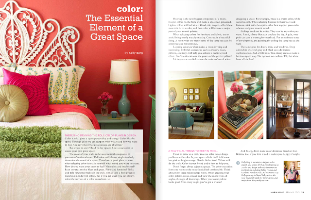
There are many color options for any given space. It's important to let the idea go that there is just one "right" color and you must find it. In attempting to search for the perfect color, you may fail to recognize some very beautiful possibilities for a space. Additionally, many colors you think are wrong, aren't wrong at all. They simply create a different effect.


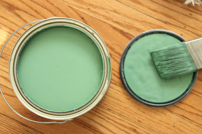
2) Thou Shall Not Select Paint Colors Based on a Tiny Paint Chip

The color chips you pick up at the paint store are not a fair representation of any color. They are very, very small, and are surrounded by other colors that make them more than difficult to visualize. Use the small paint chips as a starting point, but always work off of larger samples before making final color selections.


3) Thou Shall Test Colors

Lighting always changes. Day and night; cloudy day and sunny day; south facing windows and north facing windows, etc. It's imperative to test colors before you go all the way. Painting sample boards is the best option, because you can move them around easily, but painting test patches on the actual wall works, too. The point is...TEST.


4) Thou Shall Not Go on Vacation While the Entire House is Being Painted

The colors you may think you like might not appear how you anticipated once an entire room is painted. It's important to be available so that you can check in on the progress of things. Even if you are working with a color professional. Because we all have different relationships with different colors, the approval of your designer may not be enough. Only you can determine whether or not you like the final effect of a color.


5) Thou Shall Not Rush

Do not wait until the painters are scheduled to begin selecting colors. Give yourself time to explore different options. Selecting paint colors is not always an easy process and the last thing you want are the painters standing and starting at you while you try to figure out if you want your kitchen to be Honeysuckle Gold or Pumpkin Brulee.


6) Thou Shall Not Panic

If you have waited until the last minute, don't panic. Stay in control of the situation. If the painters are scheduled and you don't have your "perfect" colors selected, reschedule them. What's the worst that could happen? Panicked decisions are usually not the best decisions - especially when it comes to color.


7) Thou Shall Not Covet Thy Neighbors' Colors

Just because a color works on or in your neighbors' house does not mean it will work for yours. Be original. Find your own palette of colors.


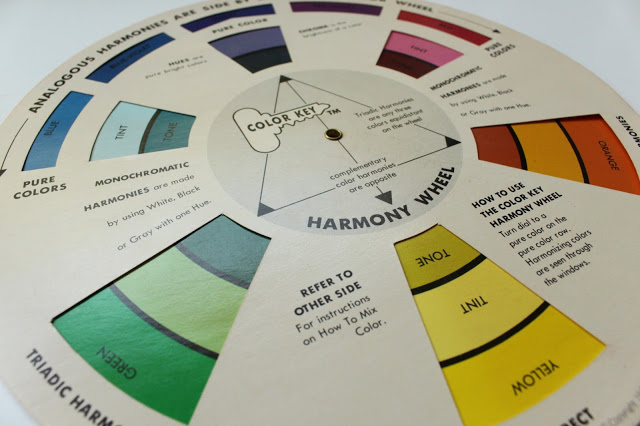
8) Thou Shall Not Obey Color "Rules"

Most color rules are usually color myths. So many of them are based on uneducated opinions. Yes - opinions. Break those chains and live in color however you choose. You'll have a lot more fun if you forget about all those rules and do what you want.


9) Thou Shall Not Fear

Do not fear your color decisions. Remember the First Commandment? There are no right and wrong colors. And don't fear others' judgements. If you select paint colors based on fear, you will never be truly happy with any color selection.


10) Thou Shall Trust Thy Self

Above all else, trust your color decisions. Don't let anyone else bully you into going whiter, brighter, softer, less muted, more muted, etc. Don't let anyone, designers included, talk you into using colors that you don't like just because they "look good." A color only looks good if you like it. Trust your relationships with colors. If you base your color decisions on trust rather than doubt, you will have a much happier connection to your home because it will reflect confidence and authenticity.

11)...?

How I Can Help You Overcome Your Fear of Color


I talk a lot about the fear of color. I believe it is the single most important issue we all must battle when selecting colors for our homes. Even I find myself coming up against fears in my own home design, and many of these fears are the exact same as my clients. Will the color be too strong? Will I make the space feel too dark? What will the neighbors think? Fortunately, I can usually talk myself out of these fears. It's not always easy, but it's well worth the extra time, effort and struggle.

Awhile back I was interviewed by Better Homes and Gardens about this very topic. I'm sharing my answer with you here because I think it's important stuff!

Q: How do you help homeowners overcome any fear of using color or pattern they may have?

A: I guide them towards what they truly love. Or, I try. Trusting yourself and your own color preferences is an integral part of the color selection process. However, fear is very, very powerful. Sometimes I have full-on counseling sessions with my clients! I try to help them see that in the world of color, there is no right and wrong. Because there really isn’t. We don’t select colors in a vacuum. Color is always relative, and, in the home, it is very personal. If I can help them see that their color selections are really about what THEY like as opposed to what’s right or wrong, then I know I’m guiding them out of their fear.

If you are struggling with color selections maybe all you need is to realize that you are not alone. Or maybe you need a little help. It's important to now that you can get help. It's out there. You just have to admit you need it and then call or email me. ;) I promise - I can help you overcome your fear.

Don't Be Ruled by Fear! 7 Color Myths You Need to Know About Right Now


Myth #1 “Dark” colors make a room look smaller. “Light” colors make a room look bigger.

Not necessarily true! Sometimes a darker color can actually make a room feel larger by giving the space greater visual weight. And even if a “darker” color does make a room feel smaller, so what? Why is that a bad thing? Sometime smaller equals cozier. A room isn't all about its size.


Myth #2 Pale colors are soothing and relaxing.

This also is not necessarily true. Light colors can often be under-stimulating, therefore creating anxiety and restlessness. Not everyone responds to all colors in the same way.


Myth #3 A neutral color has to be white, off-white or beige.

Actually, a neutral color is just a background color that works with many other colors. Neutrals can come in the form of blues, pinks, yellows, greens - really anything!


Myth #4 Ceilings and trim should always be painted white.

Definitely not! Trim can really be any color you want it to be. White is popular because it’s an easy solution. But stark white can often times be too harsh. And, remember, there isn’t just one white anyway. There are thousands of different whites, and if you pick the wrong one it can have an undesirable effect.


Myth #5 I’m supposed to match my paint color with my furniture and accessories, right?

No - you don’t need to be matchy-matchy! The most beautiful environments have a certain amount of contrast, much of that created by color.


Myth #6 If I paint a “color” on my walls, won’t it go out of style?

Not if it’s a color you love. Color trends are fun, but they come and go. Stick to your own palette and it won’t go out of style.


Myth #7 Beige is the best color to use in a home because it goes with everything.

Not all beiges are the same. Some are warm, some are cool. It is essential that the undertones of the beige you select works with the undertones of the overall space. Just because you select a “beige” paint color, it won’t necessarily go with everything.

Need help selecting the colors for your home or business? Give me a call at 650.867.3896 or send me an email to kelly@storyandspace.com. 

Marin Home Magazine: Color: The Essential Element of a Great Space

Once again, I'm honored to be part of Marin Home Magazine. The latest issue is online ready for your viewing pleasure. And, guess what I'm talking about?!? Color!

A little teaser:

The color of your walls is the most critical component of your room’s color scheme. Wall color will almost single-handedly determine the mood of a space. Therefore, a good place to start when selecting color is to ask yourself what mood you want to create. How do you want your space to feel? Masculine and intellectual? Lean towards smoky blues and grays. Flirty and feminine? Pinks and pale turquoise might do the trick. It may take a little practice matching moods with colors, but if you get stuck you can always enlist the services of a color consultant. 

Head on over to

Marin Home Magazine

to learn more about how to use color to create a great space! And if you need help with your colors, you know who to call. ;) Number? 650.867.3896. There. I made it easy. I also like email. kelly@storyandspace.com